Page MenuHomePhabricator

Split notifications into Alerts and Messages
Closed, ResolvedPublic

Description

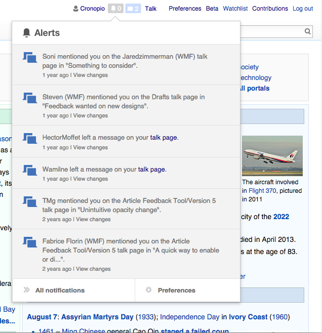
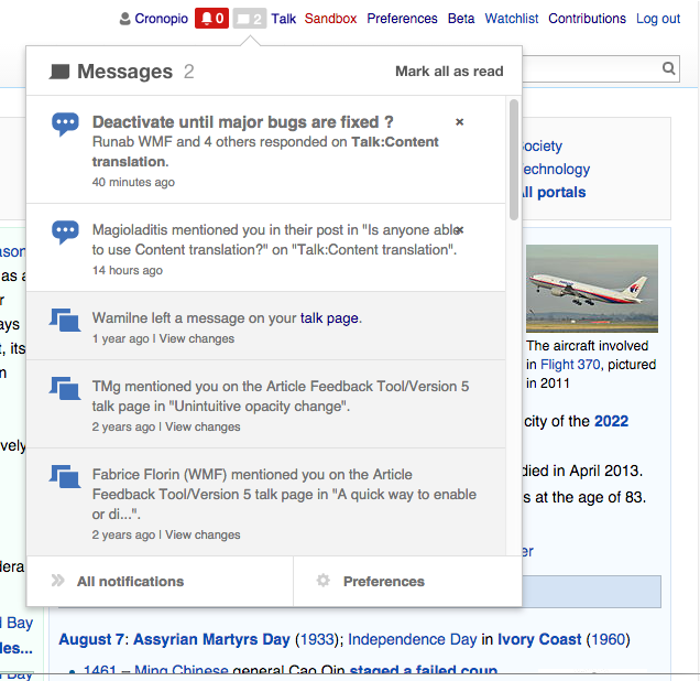
Notifications are organised in two big categories: alerts and messages. According to @DannyH and @Quiddity, these groups represent different priorities. While alerts represent actions very directly connected with the user (e.g., the user being mentioned or thanked) while messages can represent new activity of interest for the user (e.g., someone replied to a conversation you are following).

Active editors may benefit from being able to identify the kind of new notifications they receive before opening the notification panel. In that way, they can react immediately to alerts while not getting distracted by new messages they can reply to later.

It is worth considering that we don't want to add additional complexity for those users who are getting a low volume of notifications (and may be able to react to them as they come).

Although this may result in a small change, since it is an always visible element users make repeated use of it for their daily work, I would strongly recommend testing the idea well before it is delivered to our users.

We expect the change to result in a reduction of the ignored alerts. Thus, it would be great to measure changes in that regard (T108208).

Separate counters with different prominence

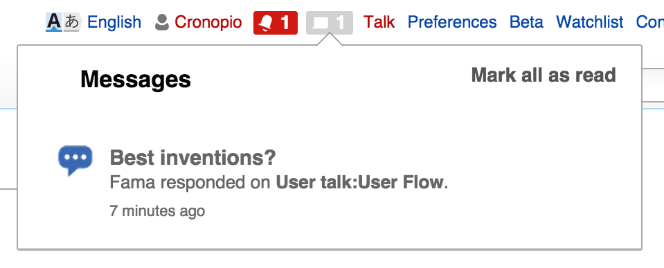
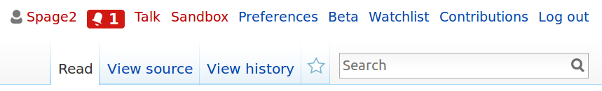
  • Distinguish the counters for alerts and messages. We can surface the number of unread notifications of each kind. The categories can be represented by icons: a bell for alerts (consistent with mobile web notification icon) and a chat bubble for messages (consistent with all the conversation-related icons). Both items will be present even if there are no unread notifications to provide a persistent entry point for them (except for users who never got a message notification before).
  • "Use separate notification badges." By presenting separate entry points for each kind of notification users have a persistent place to find the kind of content the are interested in. That allows to communicate urgency in a way that is better aligned with the priority of each kind of notification. Alerts can be presented in red since it represents a quick to consume high priority info, while messages can be highlighted in blue to avoid adding too much pressure for communications to be dealt with (it is also aligned with the use of blue for progressive actions since messages are expected to have a follow-up action: open them to continue the conversation). (Color probably needs to be adjusted for Modern and CologneBlue)

Mockups:
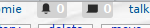
When there are no unread notifications, both badges are visible but with low prominence:

separate-notifs-none.png (726×1 px, 504 KB)

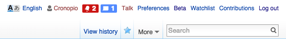
When there are new alerts, they are highlighted in red. The alert badge will become grey once the notification panel is open.:

separate-notifs-alerts.png (726×1 px, 491 KB)

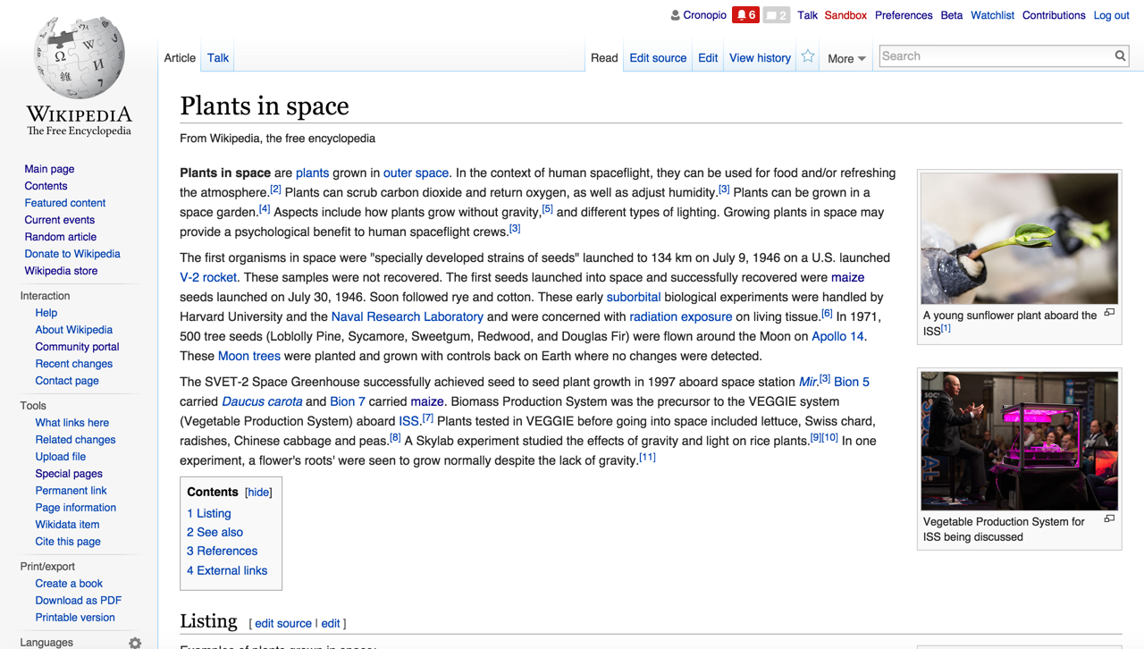
When there are new messages, they are highlighted in blue. While still noticeable, a user getting notifications frequent may feel less pressured to respond to them immediately while still aware of the new activity.

separate-notifs-messages.png (726×1 px, 491 KB)

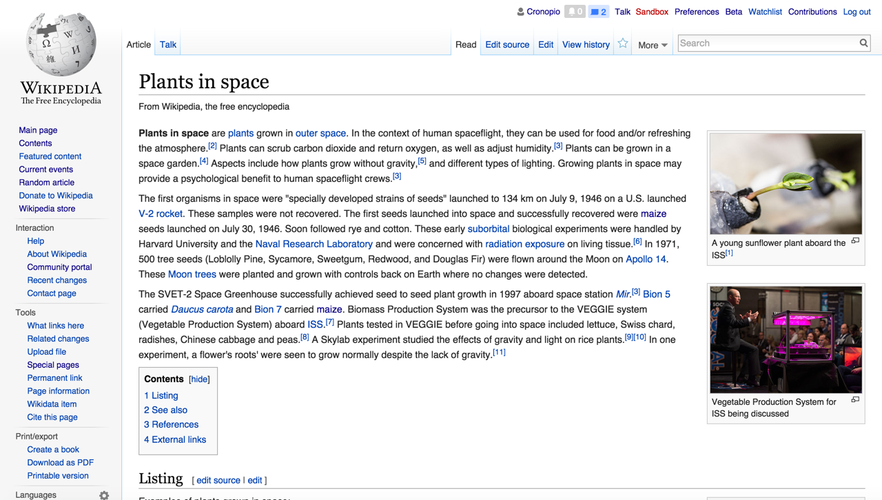
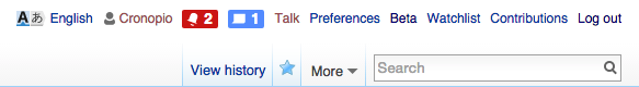
When there are both new alerts and messages, alerts are highlighted in red and messages in blue. The response time for opening alerts is expected to be lower for users, so it makes sense to present them more prominently:

separate-notifs-both.png (726×1 px, 491 KB)

We need to adjust the notification panels. Instead of having the choice between alerts and messages we are presenting just one kind of information. We may need to make it clear what the panel is about to avid confusion (e.g., by adding the icon and presenting the text as a title for the panel):

panel-alerts.png (658×636 px, 150 KB)

panel-messages.png (618×636 px, 148 KB)

Related Objects

Event Timeline

There are a very large number of changes, so older changes are hidden. Show Older Changes

Yeah, we talked about this more in today's team meeting, and we feel confident in moving ahead with the two-badge solution. If we want to play more with colors, then we can always do that later. @Trizek-WMF's suggestion about orange might work. Pau's away for the next couple weeks, but I'm sure he'll have ideas and opinions when he comes back. :)

DannyH renamed this task from Surface new notifications in a way alerts and messages can be anticipated to Split notifications into Alerts and Messages.Aug 11 2015, 11:13 PM

Change 231200 had a related patch set uploaded (by Mooeypoo):
[wip] Split alerts and messages in Echo

https://gerrit.wikimedia.org/r/231200

I proposed to use blue to highlight messages, to avoid presenting them as a problem that needs immediate attention by the user to be solve. We should definitely evaluate that the standard blue is enough to make the user aware of messages without creating any anxiety for not being able to reply to them immediately.

Due to the particularities of this kind of interaction (e.g., notifications happening asynchronously while the user performs other actions, contrast produced by colour change of counters that are disabled most of the time, repetition of actions and the effects of muscle memory, etc.) it is hard to evaluate the idea merely on static mockups. I strongly recommend both observing the user behaviour in a controlled setting that reproduces a problematic situation we are trying to solve and measuring the obtained benefits for this change:

  • Observing user behaviour. We can create a prototype, deploy to a test server, or enable an experimental beta feature. In any case, we need to define a specific example that illustrates the issues of the current system (e.g., participation in several discussions and missing and receiving an important alert you don't want to miss) in order to simulate it (if we are using a prototype or test instance), or ask users to reproduce it (in the case of a beta feature).
  • Measuring the impact. Notifications are the support for many other activities. Even if our changes align with the goal of helping to distinguish alerts and message notifications more clearly, we need to verify the change produces the intended benefits at a bigger scale beyond personal initial impressions. Otherwise it is hard to know how much we have improved the system. I created T108208 to discuss this.

Given where we are in the quarter, we don't have time to do any more testing on current Flow functionality. This notification split is a blocker for enabling opt-in, because I don't want to spread opt-in too widely without fixing this notifications problem. There are also some other design questions that are more pressing for this week.

So -- we need to get this out the door. The color that Moriel is using is fine; let's use it. The JS/no-JS problem is annoying but not a blocker for release.

The real blocker at the moment is the bug that's occasionally making the notification count inaccurate.

Moriel is still working on a bug in the number that's displayed, which is a real blocker.

Given where we are in the quarter, we don't have time to do any more testing on current Flow functionality. This notification split is a blocker for enabling opt-in, because I don't want to spread opt-in too widely without fixing this notifications problem.

Ok. One option to consider would be to make this change also part of the Flow opt-in beta feature in order to provide a more gradual deployment (while making sure that users that opted-in to Flow are getting the new system).

I don't know how much effort that would represent, so the decision on whether that fits in our current available effort is up to you, but we need to consider that deploying this everywhere at once may result in feedback that also requires effort to deal with.

I reviewed the current patchset, adjusted the styling and added some more comments to it. The result is shown below:

Screen Shot 2015-08-26 at 16.57.47.png (160×1 px, 38 KB)

The main issue I found is in the notification panel, where the icon next to the title is invisible (technically there is a white icon over a white background before "Messages" title):

Screen Shot 2015-08-26 at 16.59.45.png (387×959 px, 53 KB)

Change 231200 merged by jenkins-bot:
Split alerts and messages in Echo

https://gerrit.wikimedia.org/r/231200

Checked in betalabs

  • all events(edits, thanks, adding topics on watched pages, mentions, and User pages messages) that are recorded in Alerts and Messages are checked
  • Board description editing/adding is not recorded in Alerts/Messages - by design

Filed T111411 and T111432 - for some display issues.

I just saw this at http://en.wikipedia.beta.wmflabs.org , very nice! Some unrequested drive-by feedback :) :

  • The red badge color just doesn't work when surrounded by redlinks in your personal toolbar:
    Echo split notifications red.png (131×859 px, 18 KB)
  • The badge text should align better with the other personal toolbar links, it's lower (see screenshot).
  • The badges need title text tooltips (the current Echo badge tooltip is "Your notifications").
  • The two badges are too far apart. Logically they're a button group (you can't show both flyouts at once). As I understand it a mediawiki.ui button group would put the two bright colors adjacent which would look odd, but they should be closer together.

Thanks for the feedback @Spage. Regarding the alignment, I did some adjustments in the CSS (as illustrated in T108190#1575579), but I'm not sure if those got lost in the patchset iterations or the resulting CSS is being overwritten by other CSS rules in production.

@Pginer-WMF We rearranged the less file after your fix and added LESS variables, organized for better nesting and removed duplication. I was fairly sure we kept your changes, but I will go over it again and see if I can retrace them.

@Spage thanks for the feedback! Let me go with the points:

  • The colors of the badge + the closeness of the two badges are design issues I leave for @Pginer-WMF to decide. I am not sure I know how to fix this (or even if it is needed)
  • The badge text alignment - I'll submit a fix
  • The badge title - I'll submit a fix

Thanks!

Change 236689 had a related patch set uploaded (by Mooeypoo):
Align notification badge higher on the personal navigation bar

https://gerrit.wikimedia.org/r/236689

Change 236691 had a related patch set uploaded (by Mooeypoo):
Add a tooltip to the notification badges

https://gerrit.wikimedia.org/r/236691

Change 236689 merged by jenkins-bot:
Align notification badge higher on the personal navigation bar

https://gerrit.wikimedia.org/r/236689

Change 236691 merged by jenkins-bot:
Add a tooltip to the notification badges

https://gerrit.wikimedia.org/r/236691

Works great on beta...

Change 236956 had a related patch set uploaded (by Mooeypoo):
Add a tooltip to the notification badges

https://gerrit.wikimedia.org/r/236956

Change 236956 merged by jenkins-bot:
Add a tooltip to the notification badges

https://gerrit.wikimedia.org/r/236956

In case you want some feedback on this: I personally find the spacing to be somewhat excessive (especially in Monobook) and it looks particularly ugly in Monobook with black icons next to a white number on a grey background.

echo.png (28×150 px, 2 KB)

The colors of the badge + the closeness of the two badges are design issues I leave for @Pginer-WMF to decide. I am not sure I know how to fix this (or even if it is needed)

For the red badge we are using the standard red color in the palette (which should be the same used before in the badge former badge). I talked with @violetto and @Volker_E for them to check the consistency of that red with the one used for links and to decide at which end it needs adjustment (the red in the palette or the one used for links).

Regarding the item separation, I agree it needs some adjustment. Conceptually both badges are more closely related to each other (and probably to the user) than to the rest of the concepts of the menu. So it makes sense to better connect them together. I'll try to adjust the styling to find the right values.

Change 237129 had a related patch set uploaded (by Pginer):
Reduce distance between notification badges

https://gerrit.wikimedia.org/r/237129

Change 237129 had a related patch set uploaded (by Pginer):
Reduce distance between notification badges

https://gerrit.wikimedia.org/r/237129

I have uploaded a patchset to reduce the distance between badges.

Before:

Screen Shot 2015-09-09 at 18.22.00.png (80×583 px, 16 KB)

After:
Screen Shot 2015-09-09 at 18.21.54.png (80×577 px, 16 KB)

I read the task description and some early replies, and only a glance of all the other messages.

Screenshot 2015-09-09 11.55.08.png (32×495 px, 20 KB)

The notification on this shot has mixed associations. Looking at this the first time it wasn't immediately obvious what these notifications mean or what kind of notification they contain.

Screenshot 2015-09-09 11.55.18.png (26×463 px, 19 KB)

In this screenshot, I thought the first notification belongs to Talk and second one belongs to Sandbox, and the space between first notification and "Talk" link and second notification with the "Sandbox" link look like design bugs. The reason being there is an icon before the username, so I associated the second notification as something that belongs to second link, and so on. These misassociations could also stem from the increasing clutter on that top bar.

This can be solved with making sure the notifications associated to a link, or non-association, is obvious with adequate space. Or reusing the links on the bar like you mentioned @Pginer-WMF. Perhaps the first notification can be combined with the user icon like..:

Photo Sep 09, 12 10 56 PM.jpg (426×3 px, 198 KB)

Here's a quick sketch below on how the colors could look like and how the associations could be improved. The idea here is to have Username and Talk preserve their own link destinations and the notification buttons invoke a list of notifications, while showing them as a unit. On the blue color note to make it not so called-out, you might be able to get away with just using gray when there's notifications vs. white when there is none. Since it's already a button, it already has an obvious presence on the top bar, so if we want to play it down, it doesn't even need to be blue. Hope you don't mind me chiming on other areas besides the color, other elements might also play a role in the problem that you're looking to solve.

Screenshot 2015-09-09 12.23.17.png (68×840 px, 19 KB)

Screenshot 2015-09-09 12.36.31.png (66×841 px, 19 KB)

Change 237129 merged by jenkins-bot:
Reduce distance between notification badges

https://gerrit.wikimedia.org/r/237129

The new notification design looks horrible in modern skin with its grey rounded icon boxes. Also the boxes are too high to fit in the bBody navigation bar.

The new notification design looks horrible in modern skin with its grey rounded icon boxes. Also the boxes are too high to fit in the bBody navigation bar.

Can you please file a separate issue for that? There are already some other issues with Modern that we're looking into (e.g. T111825)

In Monobook the icons are black but should be white like in Vector.

in vector when updating page icon blinks once from black to white
and when 0 gray color is very dark (on a light background) and conspicuous

in vector when updating page icon blinks once from black to white

Separate followup issues are welcome in separate bug reports. See T112168 for this (fixed already).

Change 237669 had a related patch set uploaded (by Legoktm):
Reduce distance between notification badges

https://gerrit.wikimedia.org/r/237669

Change 237669 merged by jenkins-bot:
Reduce distance between notification badges

https://gerrit.wikimedia.org/r/237669

This can be controlled by the section notification parameter, right? If so, please document that.

This can be controlled by the section notification parameter, right? If so, please document that.

Done.