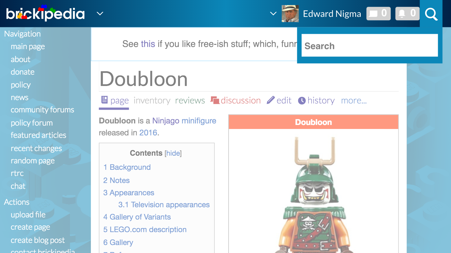
Currently there's 3 different dropdown menus in the Refreshed skin, they should have consistent styling for a unified visual experience. Users shouldn't be surprised and having this would remove that. I won't go too much on explaining visual consistency but there's plenty of articles around the web that go about this concept :)
Description
Description
Related Objects
Related Objects
- Mentioned In
- T200303: Refreshed skin v4
- Mentioned Here
- T134851: Top bar (#header-wrapper) menus in Refreshed should be usable without JavaScript
Event Timeline
Comment Actions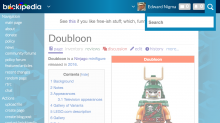
The top header and toolbar dropdown menus look fine to me, but the search dropdown does look out-of-place. Perhaps it should share the same colour as the depressed search button.
Comment Actions
That can work, I wrote a temporary revision to MediaWiki:Refreshed.css at Special:Diff/1066561 on Brickipedia but something like should be done in the skin itself perhaps, e.g with the active search button and active sharing a JS variable which is then applied with the css() function in jQuery
(I might end up writing a new issue for color configurability but put it on low priority)
Comment Actions
I support unifying search to be consistent with the other header dropdowns, but what do you envision for the toolbar dropdown? The toolbar matches the content background color because it's within the content area and distinct from sitewide actions like navigation, search, etc.
Comment Actions
Not sure yet actually but I'll come up with a concept! Do you believe there should be a differentiation between site dropdowns(search/header) and content dropdowns (toolbar)?
Personally, I don't think it make sense, since if you look at it, there's only 1 content dropdown, while 2 site dropdowns - the content dropdown might as well be the same since it's outnumbered. There's also some things I'd like to point out with the current top-header dropdown menu:
- Why is it semi-transparent? This just allows the content behind it to show through, and it makes it harder to read. I suggest this menu should at least be a flat color instead.
- To further differentiate between it and the content, I suggest a subtle drop shadow (box-shadow) to imply that the menu is at a higher level (similar to Material Design's concept of paper and applying world-life physics such as 3 dimensions to web development). Thoughts? :)
- The font weight should not be so light (font-weight: 300;). I suggest 400 (font-weight: 400;) as it's the default font weight for body text on browsers and most websites so this is what people will expect, plus it's easier to read.
Based on these points, I'll try to come up with concepts around these :D feel free to come up with concepts too if you want!
Comment Actions
@MtMNC remember this? :D https://github.com/Brickimedia/brickimedia/issues/274 (check page actions section)
That would be extremely simple to replicate and convert to CSS; I'll post a screenshot once it's done. (This should be the done for the toolbar too). I mean..
04:26, 17 August 2016 ToaMeiko (Talk | contribs | block): yeah the toolbar is the most significant difference from my design for Refreshed and what the production version looks like
Comment Actions
All the changes you recommended sound good.
Yep! Go for it. Actually if you want, try that design out for the skin dropdowns too. I'd be cool with unifying the content and skin dropdowns if they all look like that instead of all looking like the semi-transparent black ones. :P
Comment Actions
Bump. There's possible overlap with T134851 if we decide to completely re-design the dropdowns so they don't use JS.