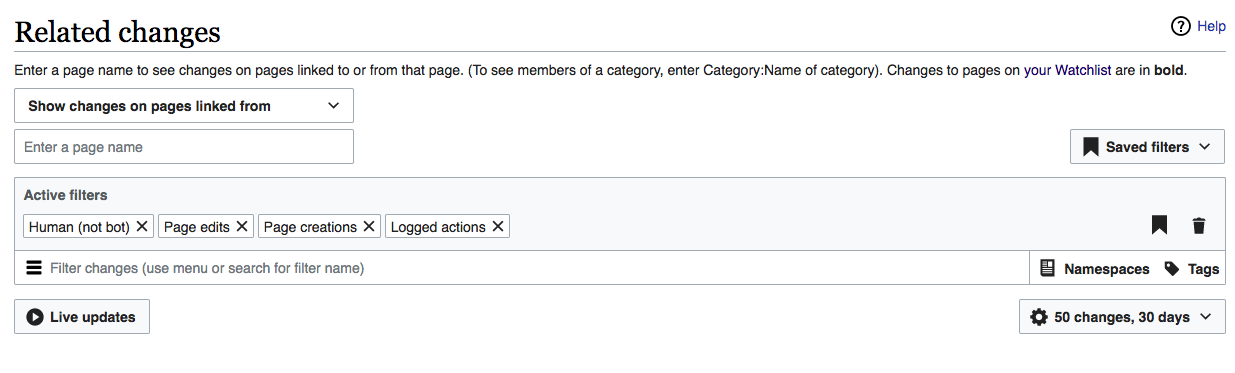
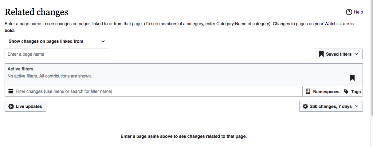
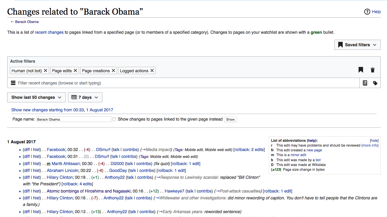
The Related Changes page is almost identical to Recent Changes. The one different element is its tools specific to Related Changes. This page is on the main nav, on en.wiki anyway, and gets a surprising 50K pvs per day there. We will therefore integrate the Related Changes tools into the new UX.
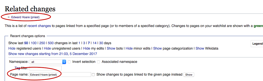
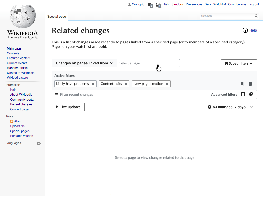
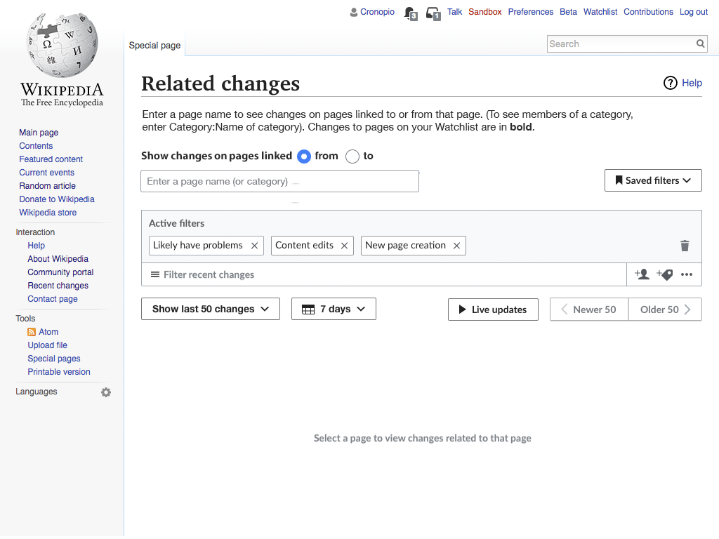
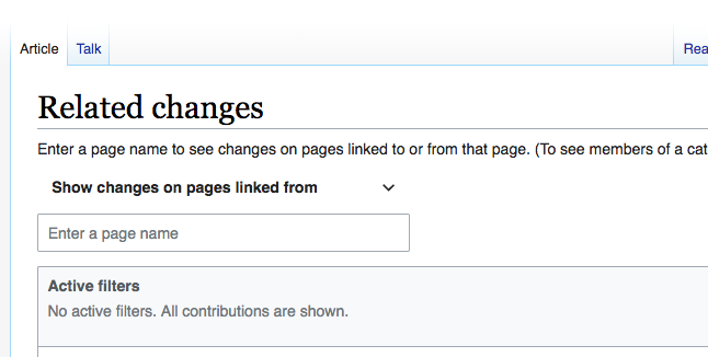
For reference, here is the current design of the beta Related Changes page
Design Specifications
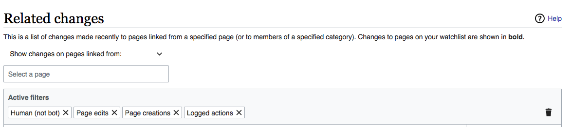
- Since the page selector tools are the sine qua non of this page, they move above the filters (instead of underneath, as now).
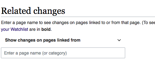
- The text at page top changes to the following wording (NOT shown in mockups):
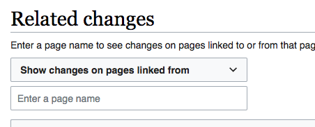
- Enter a page name to see changes on pages linked to or from that page. (To see members of a category, enter Category:Name of category). Changes to pages on your Watchlist are in bold.
- The page-entry box contains the following instruction text (which is different from illustrations):
- Enter a page name
- If no page is named in the page-entry box, no results are displayed, and a message is shown in the search results area that is more specific than the general no-results message on RC page and Watchlist. Wording of the message:
- Enter a page name above to see changes related to that page.
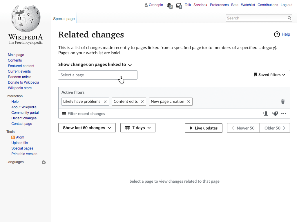
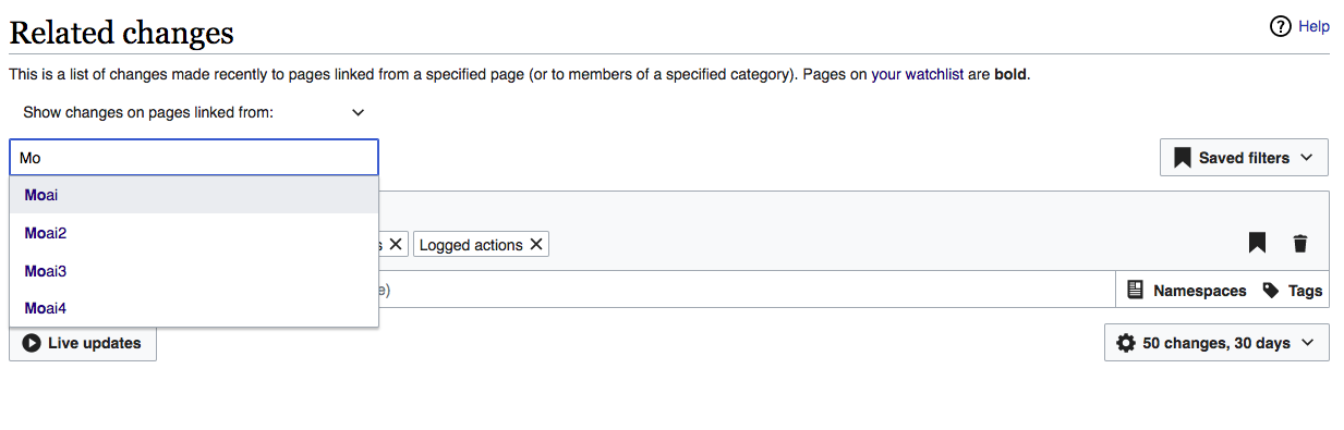
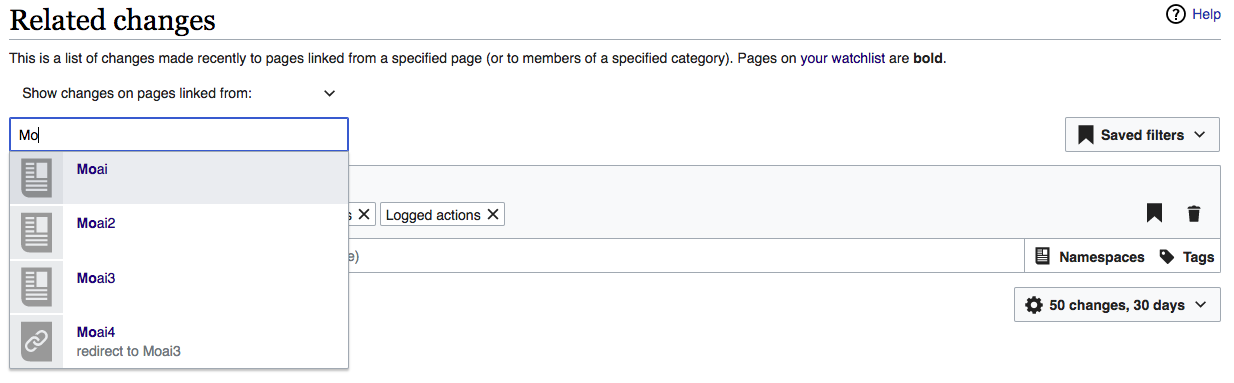
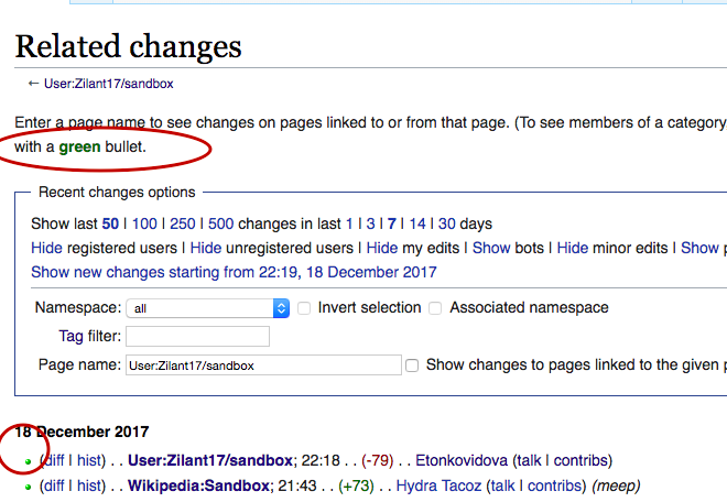
- When the user begins to type in the page selector box, the standard auto-completion mechanism for pages is shown as in wikipedia.org or the link selector of VisualEditor. See illustration below.
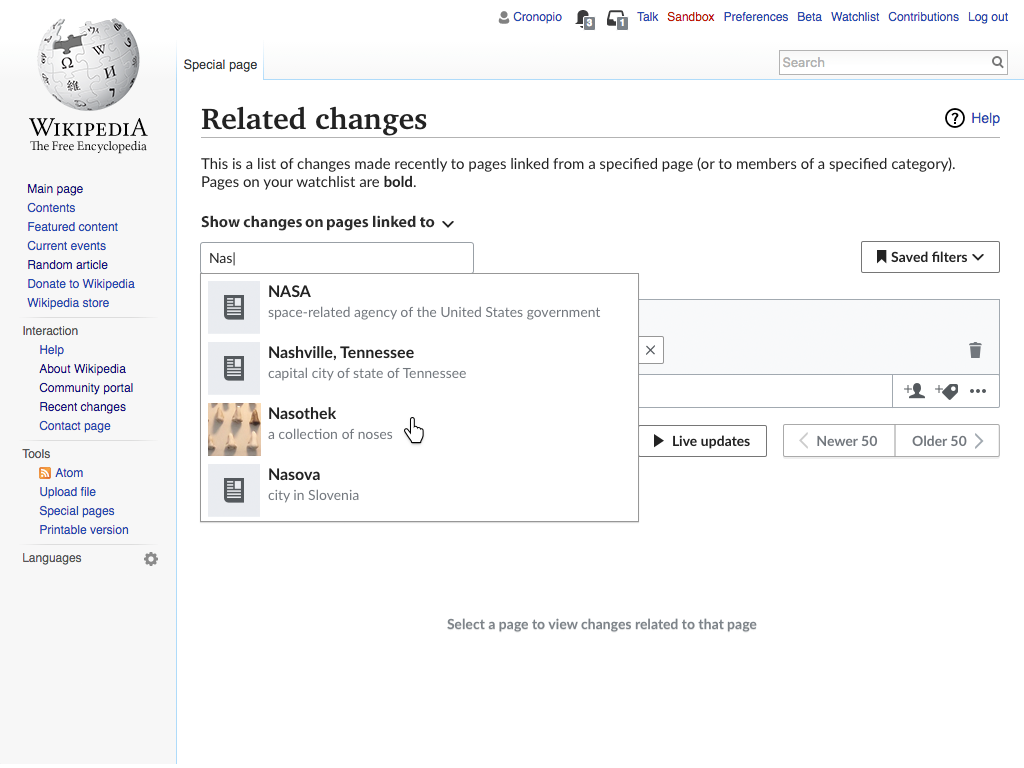
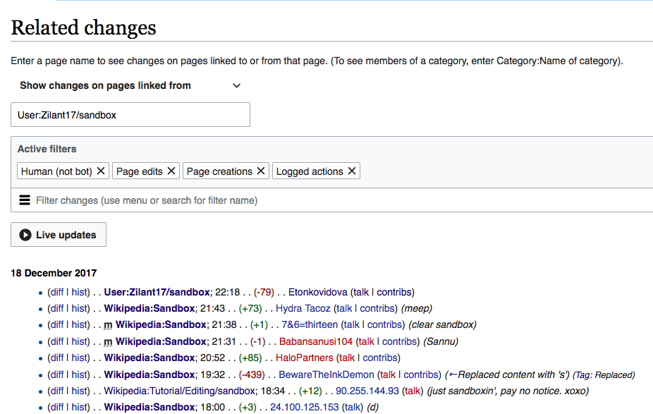
- Selecting a page replaces the selector with an element representing the article. This makes the selection more explicit. In this way, recent changes only need to be loaded when the user makes the selection and not as the user types in the previous step.
-
An "X" icon allows to undo the selection and go back to the previous step. See illustration below.no longer required
-
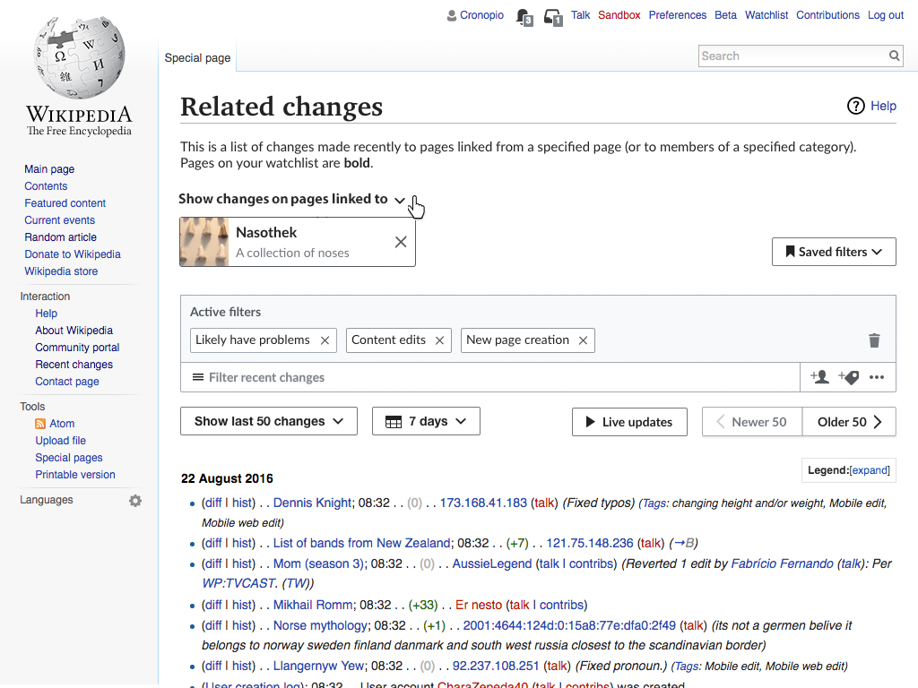
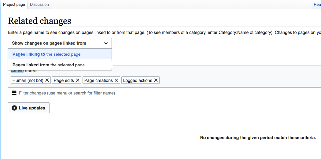
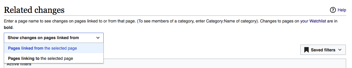
- As now, the user can search for changes on pages that are linked TO the selected page or that are linked FROM the selected page.
- The default option is From.
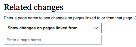
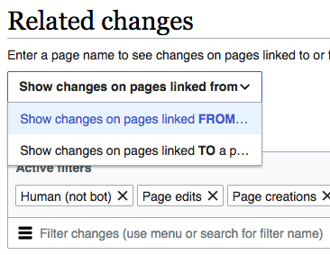
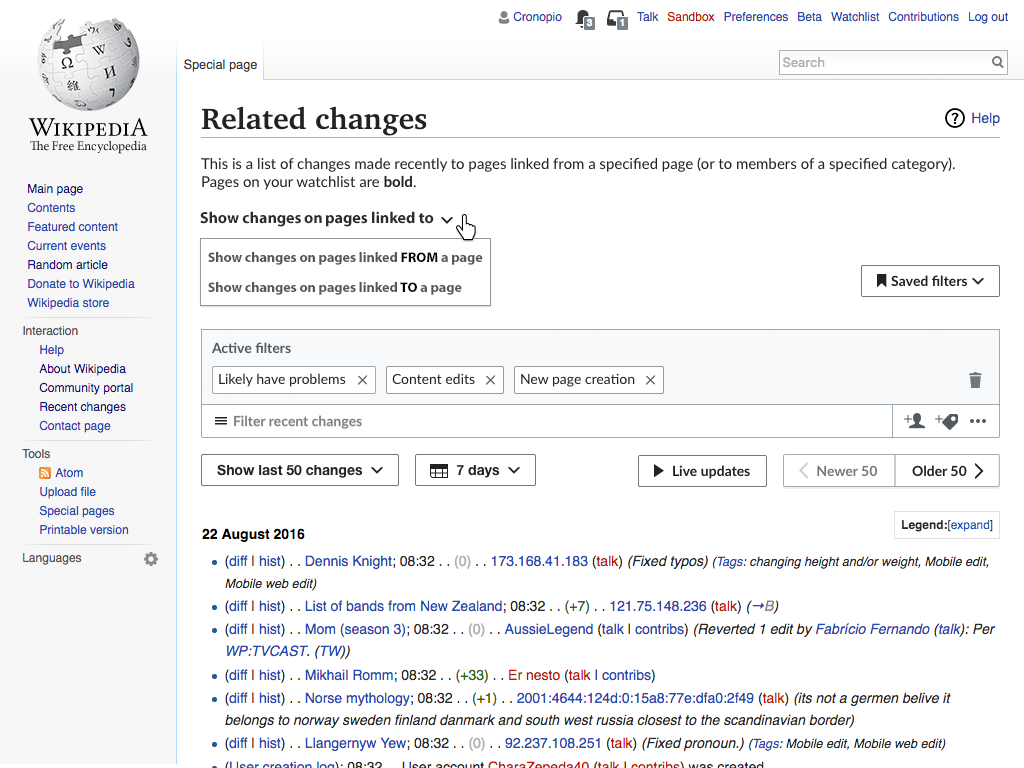
- To switch modes, the user clicks on the label "Show changes on pages linked from." This label produces a menu (see illustration below).
- In the menu, the crucial words, TO and FROM, are emphasized i for easier understanding. The wording of the two options is as follows:
- Show changes on pages linked FROM a page
- Show changes on pages linked TO a page
- In the menu, the crucial words, TO and FROM, are emphasized i for easier understanding. The wording of the two options is as follows:
- When a user changes the current selection, the selector label above the selection box changes to reflect the new state. Wording of the two labels is as follows:
- Show changes on pages linked to:
- Show changes on pages linked from:
Functionality changes
This page will function almost identically to how it does now, except for the following changes, alluded to above:
- The auto-completion mechanism, referenced above, makes searching easier.
- The user no longer needs to click the "Show" button; the page updates automatically when a page is positively identified via autocompletion.