Page MenuHomePhabricator

Spell out Tags and Namespaces menus on top-level UI in order to increase discoverability
Closed, ResolvedPublic

Description

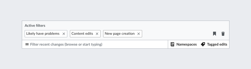
In testing, we saw that users sometimes missed the Advanced Filters icons on the top UI level and discovered the menus only through the main filter menu, at the bottom. On the feedback page, several people seem to have had this same experience, and are asking to have a better way to access the Namespace menu—without even realizing there is top-level route.

Data recently pulled by Roan (scroll down to see his monotype data pulls) show that the Namespace filters are very commonly used. Given all this, it seems like making these filters more discoverable would be a good idea.

The reason we were using icons to represent the Advanced menus is that a) we were planning to have 4 or 5 Advanced menus eventually, and b) we were going to spell out the names of all the Advanced menus and associate them with their respective icons in a dropdown, as detailed in T172232. Sadly, however, we are NOT planning to add any more Advanced Filter menus in the foreseeable future. Given this, I think we can make the Tags and Namespaces menus more discoverable wth minimal changes to the UI.

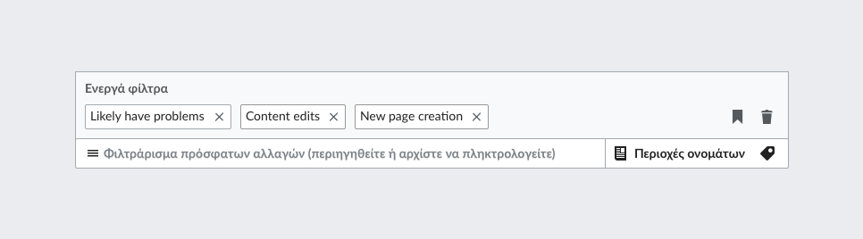
Since we won't be adding those additional menus or the dropdown, an obvious solution is just to spell out the names of the Tags and Namespaces menus over where the icons now are. This will have two advantages: making that area bigger will draw users eyes to it, and using the explicit names instead of the icons will remove another hurdle to discoverability.

See the design below:

RC-expose-advanced-both-short.png (268×966 px, 20 KB)

Event Timeline

I think this make sense, @jmatazzoni. Namespaces seem to be used more frequently than what we expected. So I think it makes sense to surface more their shortcut access (especially since we don't have an icon that reads as "namespaces" perfectly). My only concern is that surfacing alternative entry points could distract from the main one, so this is something we want to observe (e.g., if users try to find the regular filters through the tags menu or similar confusions).

I explored the options of exposing both labels and just the namespaces one:

RC-expose-advanced-both.png (268×966 px, 21 KB)
RC-expose-advanced-ns.png (268×966 px, 20 KB)

I think exposing just the namespace label has the advantage of clarifying the less clear icon and serving as an example to help understand the tag one. Surfacing both makes the UI more explicit but also clutters it especially in other languages less compact than English (a comparison in Greek below).

RC-expose-advanced-both-greek.png (268×966 px, 26 KB)
RC-expose-advanced-ns-greek.png (268×966 px, 25 KB)

I love the clarity of spelling out both names. The version with one spelled out doesn't make sense to me. It almost looks like Namespaces just has two icons. I see your point about length, so here are two ideas:

  • We can just go back to the name everyone is familiar with for Tagged Edits, "Tags."
  • We could skip the icons for these and just make them buttons...

What do you think?

What do you think?

Using the "tags" label could help to keep the advanced area not too prominent compared to the main entry point.

RC-expose-advanced-both-short.png (268×966 px, 20 KB)

Change 387779 had a related patch set uploaded (by Petar.petkovic; owner: Petar.petkovic):
[mediawiki/core@master] RCFilters: Spell out Tags and Namespaces labels

https://gerrit.wikimedia.org/r/387779

Change 387779 merged by jenkins-bot:
[mediawiki/core@master] RCFilters: Spell out Tags and Namespaces labels

https://gerrit.wikimedia.org/r/387779

Checked the fix in betalabs:

Note: in the mockup above the tag icon is slanted to a different direction.

Screen Shot 2017-11-02 at 5.14.16 PM.png (193×1 px, 36 KB)

QA Recommendation: Resolve

In T178539#3731391, @Etonkovidova wrote:

Note: in the mockup above the tag icon is slanted to a different direction.

Screen Shot 2017-11-02 at 5.14.16 PM.png (193×1 px, 36 KB)

@Pginer-WMF, it's a small point to be sure, but I like the version in your mockup better. The icon Petar has used is slanted as it is on Production currently. Do you want to provide a reversed Tags icon? Or should we let it go?

@Pginer-WMF, it's a small point to be sure, but I like the version in your mockup better. The icon Petar has used is slanted as it is on Production currently. Do you want to provide a reversed Tags icon? Or should we let it go?

We use icons from a standard repo. That is, the "tag" icon will look the same in all our products and we should not make different versions per product.
We are in the middle of a big icon update (M229) so icons are expected to change in many places, I'll pass the feedback about the tag icon to the designers working on that part of the icon set.

OK. I'll resolve this tag and you guys can update the icons in the normal course of things. Thanks.