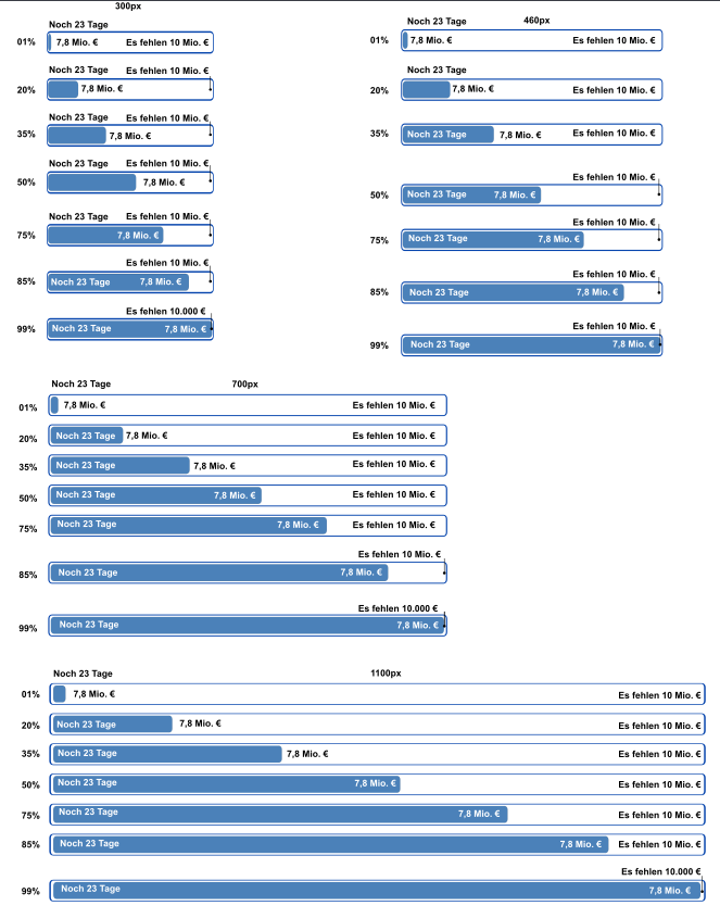
With this story dev and UX wants to develop one responsive banner design for all platforms & screen sizes that also encodes a all patterns of where and if to display labels depending on screen size and progress level.
Caveat: This is not about visual design, but about arranging boxes, so any color, font… should not be hard coded.
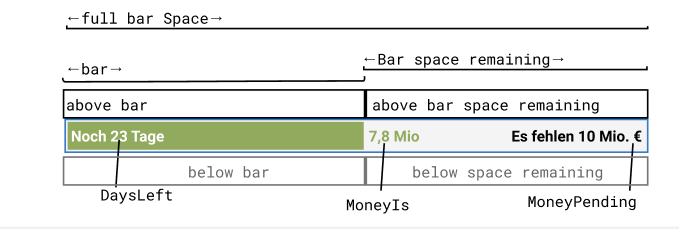
Definitions:
- DaysLeft: e.g. "Noch 23 Tage"
- MoneyIs: e.g. "3.2Mio"
- MoneyPending: e.g. "Es fehlen 10Mio"
there are 7 areas with limited space:
- Bar (the growing bar itself)
- Bar space remaining (the space right of the bar)
- Above bar (the space above the growing bar)
- Above bar space remaining (above the space right of the bar)
- below bar (the space below the growing bar)
- below bar space remaining (below the space right of the bar)
- FullBarSpace (the full width)
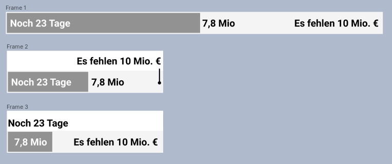
Here is where the elements should be:
- MoneyPending: Show in Bar space remaining, right aligned. If there is not enough space, show above space bar remaining. If shown above bar space remaining, there will be a right aligned pointer, starting below the label, going vertically and ending in the Bar Space remaining,
- MoneyIs: Show in bar space remaining, left aligned. If there is not enough space, show in bar, right aligned. This, if needed, overrules space needed for DaysLeft (pushing it to AboveBar).
- DaysLeft: Show in Bar, left aligned. If there is not enough space, show above bar. If there is not enough space above bar (because Money pending it taking almost all the space already) show below bar, still left aligned
Examples:
other styling (note that the rounded corners effectively shrink the usable area for text!)

Notes:
- Show above could also be below; this does not matter much
- For space saving reasons, we might want to have a switch which just discards elements that do not fit in the bar (instead of displaying above)
- There should be 4 colors that can be set independently: bar space color, bar color, font light, font dark (which is also the color for the pointer)
- It makes sense to consider that the bar space might get a border
- It makes sense to consider that either/and bar and bar space might get rounded corners in some designs. In this case the rounded border area needs to be subtracted from the usable area.
- We need few build in styling, but labels should not be shrinkwrapped, but have min 0.2em padding to the next element, less makes no sense.
illustration of the behavior (e.g to derive unit tests), not design-accurate.