Page MenuHomePhabricator

"View new changes..." prompt lost when Active Filters is collapsed
Open, Needs TriagePublicBUG REPORT

Description

The Watchlist (English Wikipedia, Vector skin) displays a "View new changes since ..." prompt when new changes have been detected by the background Ajax thread.

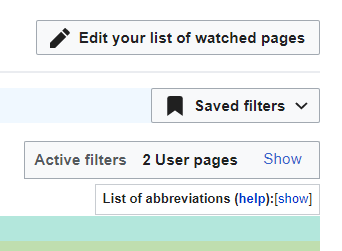
This prompt is positioned with the area that is collapsed by the Hide button of the Active Filters panel.
This means that the prompt is hidden when the Active Filters panel is collapsed.

Move the prompt out of the area that is hidden by the collapse.

The following jQuery code is used in a user script to make a suitable correction to the layout:

x$ = $('.mw-rcfilters-ui-filterWrapperWidget-showNewChanges').detach();
$('.mw-rcfilters-ui-markSeenButtonWidget').parent().after(x$);

mw.util.addCSS(`
  .mw-rcfilters-head {
    min-height: 0em !important;
    margin-bottom: 0em !important;
  }
`);

Event Timeline

kostajh moved this task from Inbox to Triaged on the Growth-Team board.
kostajh added subscribers: KStoller-WMF, kostajh.

cc @KStoller-WMF and #growth-design for opinions on this.

Thanks for opening this task, @GhostInTheMachine! Have there been community conversations about this?

I'm not opposed to this change, but some questions and design considerations come to mind:

  • This is more than just a minor change to the Watchlist, right? Isn't this also an issue on Recent changes?
  • It seems like the "Live updates" button and the "View new changes since ..." prompt logically make sense together. Are we also moving the "Live updates" button outside the collapsed panel? If yes, will people who prefer hiding that panel always want to see that button?

I am the editor who opened bug T329422. I noticed that simply wanting to hide excess controls on the page also hid an important and, most importantly, dynamic control that resets every time the page reloads! This is a bad UX if we can't even tell the status of "Live Updates" because it is hidden behind an unrelated cluster of controls. The "View new changes since..." control is also dynamic, and of course related to this fundamental "Live Updates" button.

There is no reason whatsoever to hide these controls, especially not with the unrelated filter controls. The "Live Updates" button can easily be placed to the right side of the hidden, collapsed filter controls; this would conserve vertical space in an economical fashion and would not interfere with anyone's UX. I honestly can't think of good use cases to hide these dynamic and fundamental controls, but since they do not need to consume any vertical page real-estate, there is no reason to hide them anyway. The filter controls are an obvious target for collapse, since they are set infrequently and (I personally) don't need to twiddle them very much at all.

Since reloading the page always disables the Live Updates feature, this (along with the "Show new changes..." button) must be exposed controls if we are to make any use of these live feeds. Thank you, WMF devs.

Also I should mention that the "Hide" and "Show" links are diametrically opposed, on the far right and far left side of the page, respectively, so toggling them makes for laborious, wide mouse movements and a bad UX, and toggle them is exactly what we must do every time we need to toggle "Live Updates"...

FYI
My WatchlistTidy user script moves the "View new changes since ..." prompt out of the collapsed area and also moves the Hide/Show toggle to the right as show here:

image.png (251×342 px, 9 KB)

It would also be A Good Thing, if the three different Hide/Show controls used the same "modern" down/right chevron control.