Page MenuHomePhabricator

Explore improvements to the navigation of the components pages in Codex
Closed, ResolvedPublic

Description

Background & Goal

Currently, the component pages in Codex incorporate Guidelines, Demos, Vue usage, and CSS-only on a single lengthy page, presenting the following problems:

  • Lengthy pages can be overwhelming for users.
  • Navigation is unclear, making it difficult for designers or developers to find relevant information.
  • Duplication of information between Guidelines and Demos leads to confusion.
  • Some demos are duplicated between the "Demos" and "CSS-only version" sections.

User stories

  • As a designer, I need to quickly locate design-related details and best practices on the component page.
  • As a developer, I need to easily access coding information and also learn about best practices for implementing the component.
  • As a Codex user (e.g., PM), I need easy access to all component-related information on the component pages.

Open questions

Design proposal

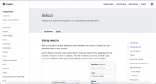
We will use Tabs to organize the content on the components pages effectively:

  • "Guidelines" tab will host design-focused content, including existing guidelines and new content migrated from Figma spec sheets.
  • "Code" tab will contain development-related content, including Vue demos and CSS-only demos.

Acceptance criteria for Done

  • Explore design solutions to improve the navigation and consultation of components page in Codex
  • Review the proposals with the DST and decide on the best solution

Future tasks
NOTE: Once we complete these 2 tasks (T358798, T358854), we will be bale to update the Codex site with this proposal.

Event Timeline

CCiufo-WMF renamed this task from Improve the navigation of the components pages in Codex to Explore improvements to the navigation of the components pages in Codex.Feb 29 2024, 2:43 PM

After exploring various solutions to improve the usability of the current components pages for designers, developers, and other users, and reviewing these proposals internally with DST designers and engineers, the final decision is as follows:

We will use Tabs to organize the content on the components pages effectively:
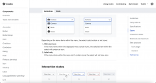
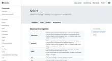
  • Two tabs will be utilized: "Guidelines" and "Code". The "Guidelines" tab will host design-focused content, including existing guidelines and new content migrated from Figma spec sheets. The "Code" tab will contain development-related content, including Vue demos and CSS-only demos.
  • This proposal is focused on using tabs to organize the content in the components pages. But the design is iterable, and we could use either Quiet or Framed tabs.
  • When scrolling the page, the tabs will be fixed on top under the main navigation.
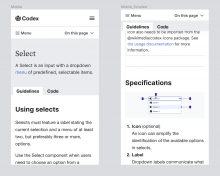
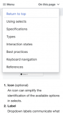
  • When scrolling on mobile, the "On this page" dropdown menu will be displayed over the tabs.
    Captura de pantalla 2024-03-01 a las 12.48.04.png (1×634 px, 134 KB)
  • This initial iteration with two tabs is open to future iterations for further organization if needed.
  • Potential future tabs could include "Accessibility" for accessibility-related information and "Content" for specific UX writing recommendations for the component.
    Captura de pantalla 2024-03-01 a las 12.45.49.png (1×2 px, 242 KB)
  • We will explore if this Tabs navigation and scrolling is possible in VitePress T358798.
  • The placement of the Configurable demo is under consideration, with the possibility of including it in either the "Guidelines" tab or the "Code" tab, depending on visibility preferences. A decision will be made in T358854.

Once the feasibility of implementing Tabs in VitePress is confirmed in T357714 and the placement of the configurable demo is decided in T358854, the proposal will be implemented.

bmartinezcalvo updated the task description. (Show Details)

Solving this task since the design explorations have been completed and we've decided on a solution. We will continue this work in: