Page MenuHomePhabricator

Place the "Add more files" at the top of the page
Open, LowPublicFeature

Description

Author: veradekok

Description:
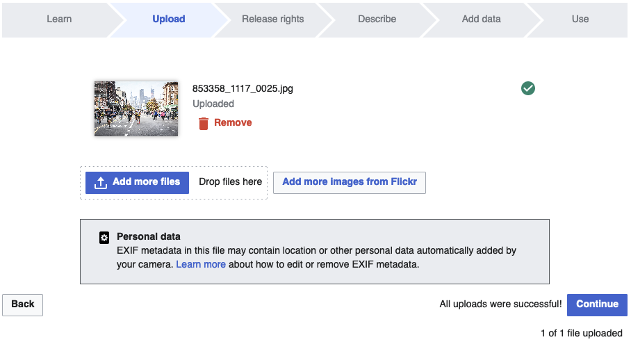
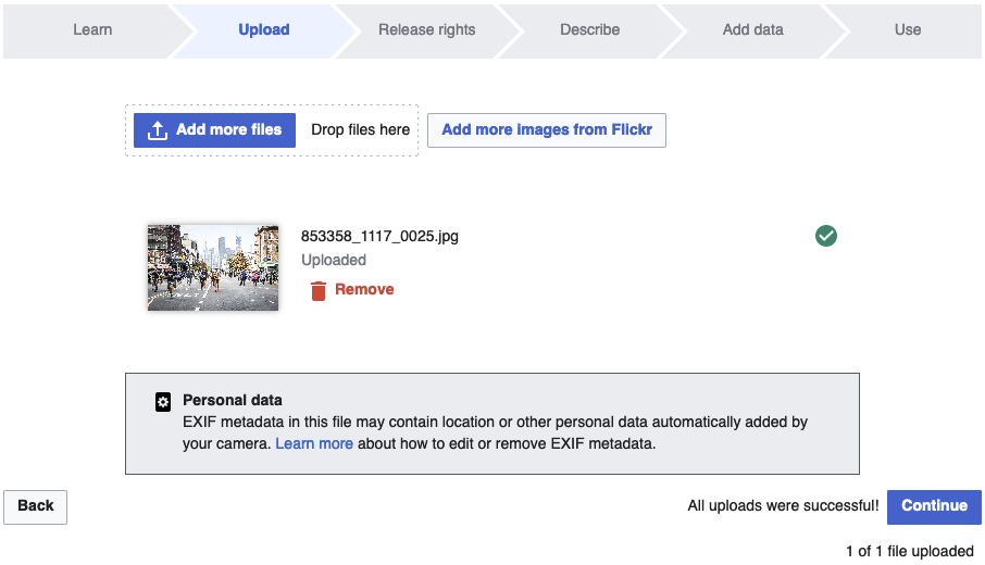
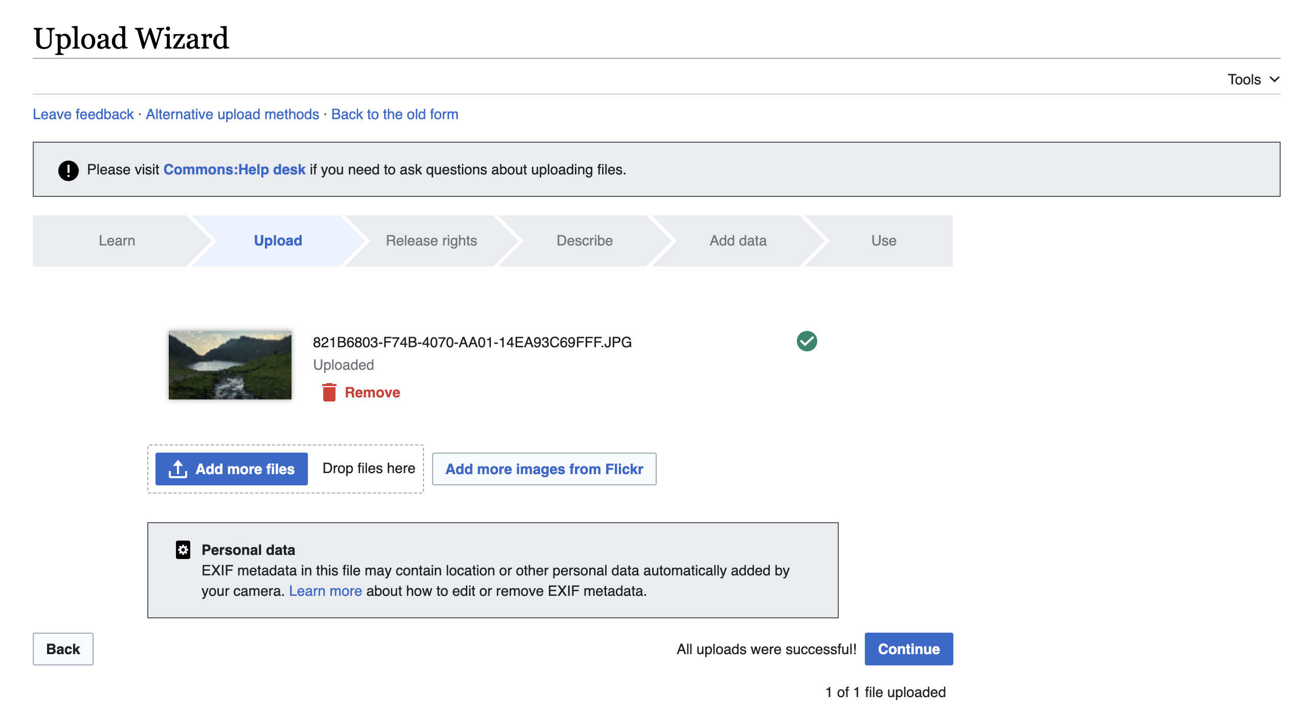
Screen capture of buttons on top

If the "add file" buttons are placed at the top of the page, they don't change position as more files are added. This way the user doesn't have to scroll down in order to push the button and more quickly add multiple Flickr URL's without having to reposition the cursor.


Version: unspecified
Severity: enhancement

Attached:

Capture.JPG (546×929 px, 51 KB)

Event Timeline

bzimport raised the priority of this task from to Low.Nov 22 2014, 3:18 AM
bzimport added a project: UploadWizard.
bzimport set Reference to bz65941.
bzimport added a subscriber: Unknown Object (MLST).
Aklapper changed the subtype of this task from "Task" to "Feature Request".Feb 4 2022, 11:13 AM

Change 970431 had a related patch set uploaded (by Punith.nyk; author: Punith.nyk):

[mediawiki/extensions/UploadWizard@master] Place the "Add more files" at the top of the page

https://gerrit.wikimedia.org/r/970431

Jdlrobson subscribed.

Tagging "Structured Data team" since there is an open patchset from a volunteer.

Thanks for bringing to our attention, @Jdlrobson

Patch LGTM from a code perspective, but I'll let @Sneha chime in from a design perspective.

Here's what before (current) looks like:

before.png (492×908 px, 88 KB)

And here's the after, once this patch would be merged:

after.png (520×906 px, 88 KB)

@matthiasmullie thanks for tagging.

I think moving the buttons to the top may be a problem because when more things are uploaded they all go to the bottom of the list... and the user would not have any visual feedback on them being uploaded. We would then have to reverse the order so the latest uploads goes on the top of the list. I think there might be other ways to tackle this problem and I would need to think a bit more about it.

@matthiasmullie I played around with this flow a bit. And if we want to move the buttons to the top we would also need to move the 'personal data" warning to the top (under buttons) because if the user is uploading multiple files they will not see this warning if it is placed at the bottom of all images. Also we would have to reverse the order in which files show so the new ones show at the top. Also not sure if by doing so there will be enough space left to see uploaded content on mobile or will it push things down. So there are some considerations here before we change things. I added this to the list that me and Alexandra needs to discuss for next iteration of UW. And if it makes the cut we can more holistically redesign this page. If it does not make the cut we can do this quick fix.

Circling back to this problem.

Solution 1: Keep the button where it is at the bottom but autoscroll to the bottom of the UI whenever new media is added and that way the "add button" is also accessible. In addition the warning regarding EXIF data that is currently on the page (see image below) will also be visible at all times.

Solution 2: We move the button to the top but also reverse the order in which media is shown so that the newly added media is at the top. We leave the exif warning where it is at the bottom with the assumption that users will only need to see that once when they come to the page and its okay if it goes off the screen as more media is added.

Screenshot of current UI

UW upload step.png (1×2 px, 297 KB)

@matthiasmullie @Cparle which solution seems more feasible in your opinion?

Both similarly feasible, but I have a preference for #2 (mostly due to not being a big fan of autoscrolling)