Page MenuHomePhabricator

MediaWiki theme: Alter the toolbar and dropdown menu design
Closed, ResolvedPublic8 Estimated Story Points

Description

Addressing:
T85998 Toolbar popup widgets have no visible anchor
T85974 Toolbar border too strong

Toolbar will have a gray background to separate chrome from content but still be unified with the site's aesthetic.
On hover and selected states tools will have a clear indication that they are selected. They will be connected to the dropdown menu to show a clear relationship.
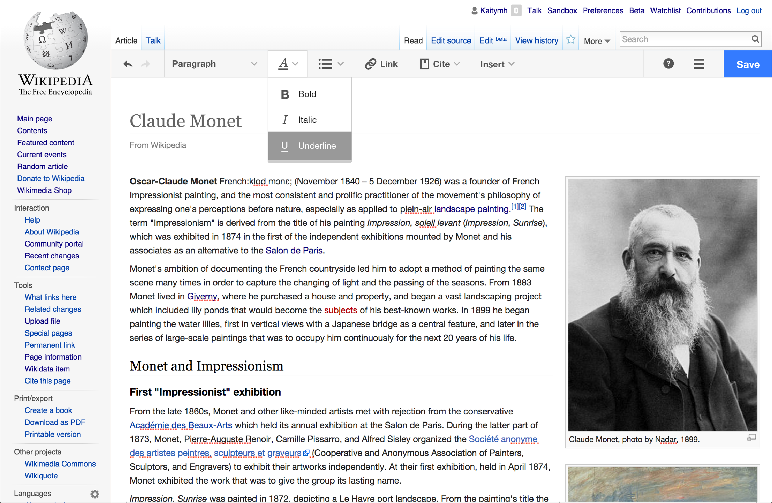
Toolbar

  • toolbar background #F6F6F6
  • border on top and bottom #DDD (top border will replace blue line)
  • lines within toolbar #DDD - after undo/redo, after headings, and before help
  • remove box around headings
  • Icons at 65% black according to T86047

Tools and dropdowns

  • On hover and select, tool gets a white background with #CCC border
  • Dropdown anchored to bottom of toolbar
  • Dropdown white background with #CCC border
  • Dropdown item on hover background #DDD
  • Dropdown item selected background #999
  • Dropdown item selected text and icon #FFF
  • remove margin above first item in dropdown

1b_toolbar-02.png (1×2 px, 1003 KB)

2_dropdown_hover-02.png (1×2 px, 1007 KB)

3_dropdown-selected-02.png (1×2 px, 1007 KB)

*Other changes in mockups such as tool position and labels are just experimenting!

Event Timeline

KHammerstein raised the priority of this task from to Needs Triage.
KHammerstein updated the task description. (Show Details)
Ryasmeen triaged this task as Medium priority.Jan 15 2015, 12:48 AM
Ryasmeen set Security to None.
Jdforrester-WMF renamed this task from Toolbar and dropdown menu design to MediaWiki theme: Alter the toolbar and dropdown menu design.Feb 2 2015, 3:38 AM
Jdforrester-WMF raised the priority of this task from Medium to High.
Jdforrester-WMF added a project: OOUI.

The proposed grey background is very similar to the grey background used for disabled widgets.

I prefer separating the toolbar with a background colour over a thick border, however the grey is very similar to the page background colour making it look transparent, and more bound to the interface than the content.

Separately, using white variant icons means serving twice as many icon files, so we should consider that choice carefully. We may have backed ourselves into a corner a bit by only letting the background colour change on state change.

As a product decision, we decided to remove this as a blocker to the release; instead, this potentially will be part of our polish effort instead. Consequently, we decided to remove this from the Q3 blockers list at the triage meeting on 2015-02-11.

What css files should I be looking at if I want to work on this?

Hi, where is the help-icon loaded from? Also, the icons available in the codebase are of the inverted color scheme (i.e, gray question mark on a white background inside a gray circle). The help-icon in the images provided here is different. Is that available anywhere? or is it part of some skin? I have the default skin enabled.

What css files should I be looking at if I want to work on this?

Primarily /src/themes/mediawiki/tools.less, probably. Possibly also the ones in /src/styles that have "tool" in their names (but note that the styles defined there apply to all OOjs UI themes, and not only the MediaWiki theme).

Hi, where is the help-icon loaded from? Also, the icons available in the codebase are of the inverted color scheme (i.e, gray question mark on a white background inside a gray circle). The help-icon in the images provided here is different. Is that available anywhere? or is it part of some skin? I have the default skin enabled.

The SVG source file for the 'help' icon in MediaWiki theme is /src/themes/mediawiki/images/icons/help.svg, and it is indeed black on transparent background. During the build process (when you run grunt build), an "inverted" white-on-transparent version is generated (as well as PNG versions for both color variants).

You can make an OOjs UI widget use that version by adding the .oo-ui-image-invert CSS class to the DOM node available via its .$element property. Usually you wouldn't do this manually; instead, define the rules for icon color variant in /src/themes/mediawiki/MediaWikiTheme.js and call this.updateThemeClasses() in the widget. For example, look at how the icon for colored ("flagged primary") and grey (disabled) buttons is white in the demo (http://tools.wmflabs.org/oojs-ui/oojs-ui/demos/, scroll down to "Button style showcase") – that's how it works.

It saddens me that T85998 is still broken months after we launched this skin. Instead of fixing the issues identified we end up coming with larger redesigns which don't get implemented because their increased scope increases complexity.

Change 206161 had a related patch set uploaded (by Jforrester):
[WIP] VE toolbar polish

https://gerrit.wikimedia.org/r/206161

Change 206161 merged by jenkins-bot:
MediaWiki theme: Polish the toolbar design

https://gerrit.wikimedia.org/r/206161