File Metadata
- Mime Type
- image/png
- Attributes
- Image
- Storage Engine
- blob
- Storage Format
- Raw Data
- Storage Handle
- 8304033
- Default Alt Text
- set-units.png (257×676 px, 13 KB)
Event Timeline
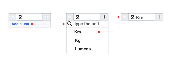
So, that's going to look pretty much like this:

My thoughts:
- I find the "add a unit/type the unit/hide unit input once selected" workflow very confusing, and much prefered the Wikibase-inspired (with checkboxes) alternative (see https://phabricator.wikimedia.org/T239474#5845117)
- I prefer the checkbox version because it is always clear exactly what the state is, and how to change it
- In this version, it's not exactly clear how to get rid of a unit, or change the unit, once you've selected one, for example. The checkbox version makes that very clear & explicit, IMO
- And the version with the checkbox is the workflow people are already used to on Wikidata
- I like the idea of including the unit inside of the input field
- ...though it can't be exactly as in above mockup, where it's right after the input text in different color/height because of input field limitations
- ...but the default right-hand-side inside input "label" position provided by OOUI seems to work quite well, IMO
- Don't really have much of an opinion about getting rid of +/- buttons. It's slightly cleaner without them, but it's going away from OOUI's usual numeric input field
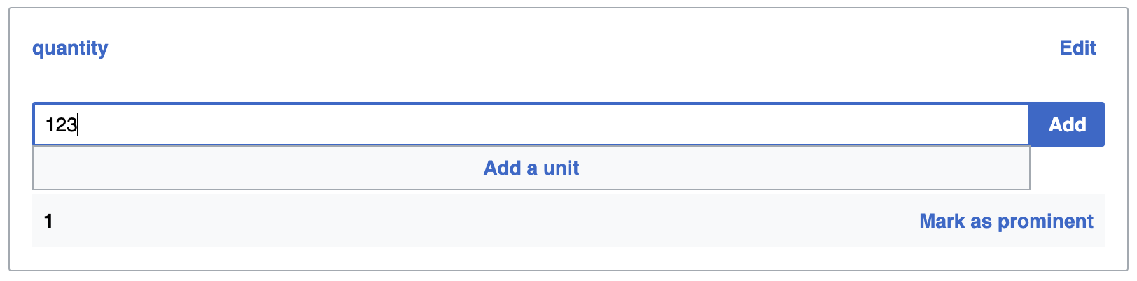
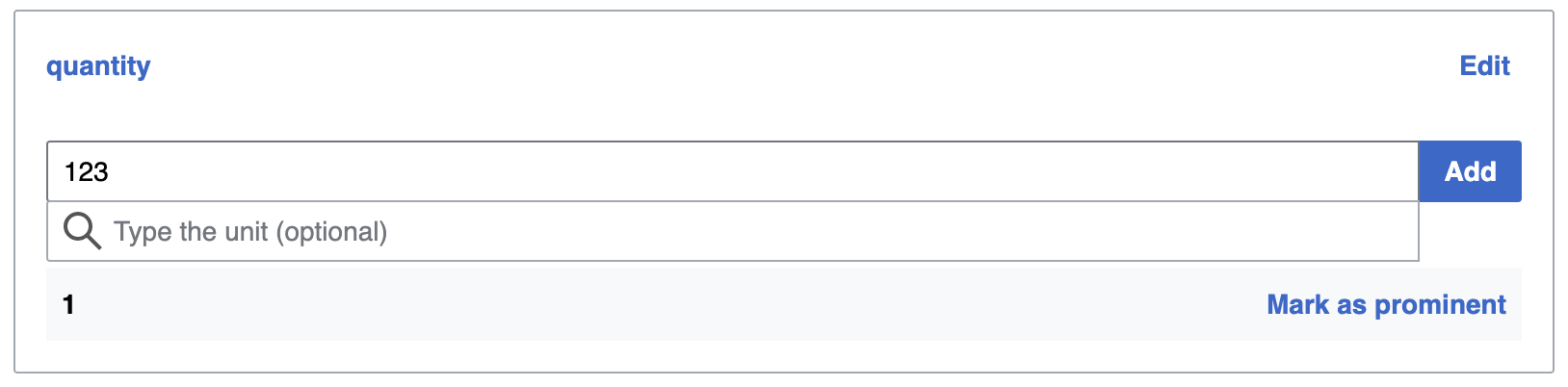
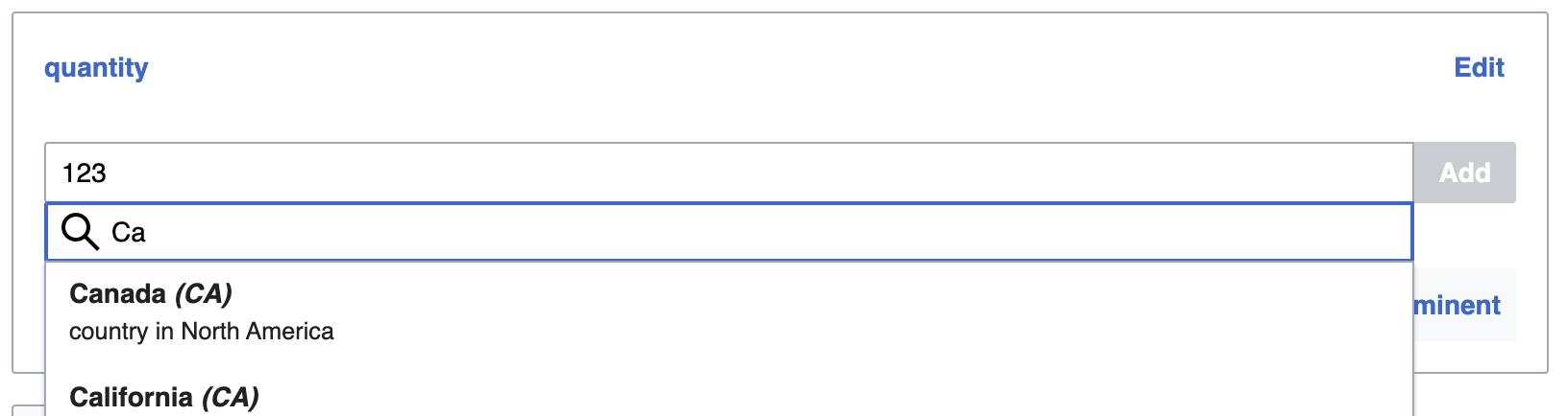
Patch is ready to add unit support and make it work like to above screenshot.
However, I would suggest to reconsider the original (checkbox-based) version, since I feel that it's more intuitive to use, and it's what people are already used to on Wikidata.
I am more than happy to implement the other changes, though (including selected unit into unit input field, and getting rid of [+/-] buttons)
Thoughts?
The mockup was just a quick illustration while in a meeting, to present some ideas: (a) replace unit-related controls with a single entry point, (b) surface common/recent units early to facilitate selection, and (c) make the units visible next to the value when applied.
The mockup does not illustrate all states and some more polishing would be needed to refine the idea. When selecting an entry with units, an option to either remove them or edit them (which should also allow to remove) is definitely needed.
I created a more complete version of the sequence to help clarify:

Also, the same ideas can be executed in an in-line version:
I like option #2, but that's not natively part of OOUI and would require a massive amount of work.
As for #1 - this workflow seems to work quite well for me now.
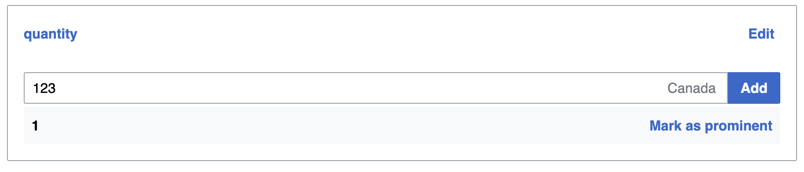
How does this look? (some mild differences, mostly because we're somewhat stuck width this width, and constrained by what OOUI provides)
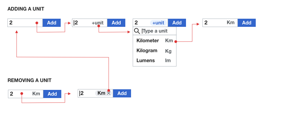
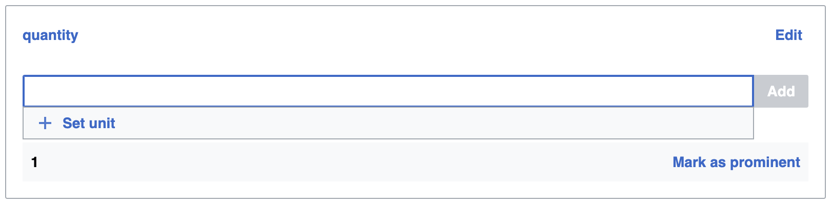
On focus, 'add unit' button becomes visible:
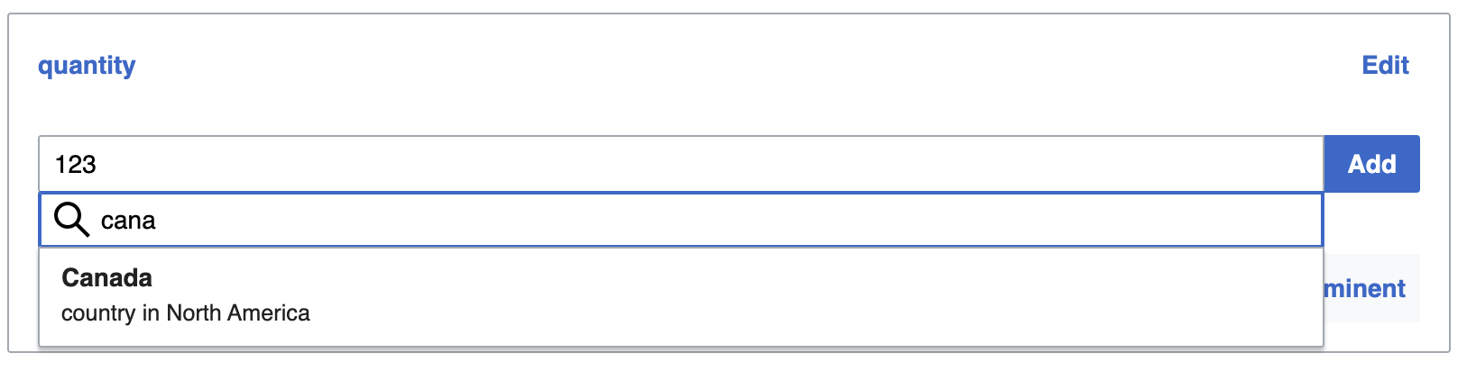
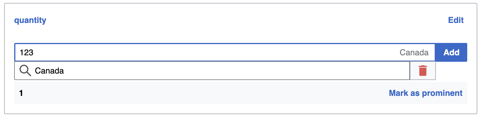
On clicking that button, it turns into an autocomplete field to find units:
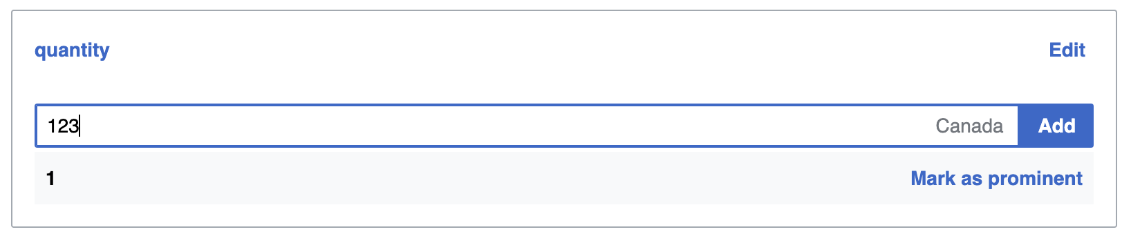
Selecting a unit adds it inside the input field, and removes the unit autocomplete thing:
Focusing input field again opens the autocomplete again, this time with a "delete" icon next to it:
Clicking "delete" removed the unit: it disappears from the quantity input field, and the autocomplete vanishes again:
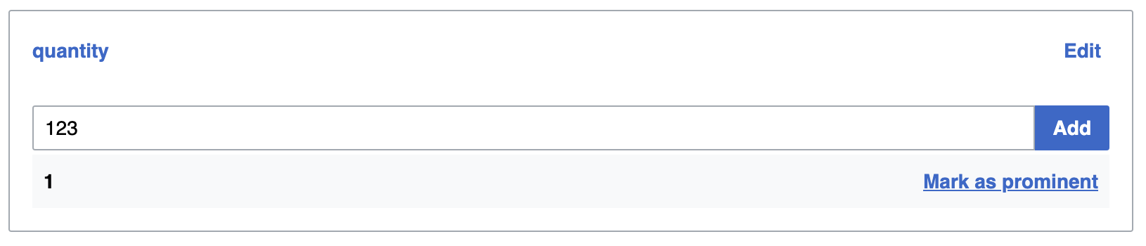
Focusing input field brings us back to step 1 - 'add unit' button becomes visible:

Looks good in general.
My only concern is the use of the search bar to both search and represent the value (for the step illustrated in F31554026). That may make it a bit ambiguous whether the information is the value or only a search box to select it. But that is an aspect that is common to all the previous options, so maybe could be considered a separate issue for future iterations (based on how this works in practice).
Would it help to disable the search box once something has been selected?
This should make it obvious that the only 2 options are to keep it or remove it, and that it can no longer be used for searching?

(We could make it something other than the search box, but the last step in this mockup (https://phab.wmfusercontent.org/file/data/j7vzjjevwiepp7hh5pnt/PHID-FILE-umpgh4vpvs3ukt3t7ol2/set-and-unset-units.png) has it look quite similar to the autocomplete results, and that's going to be quite hard to replicate and maintain without using the same search box elements again...)
That helps to clarify the interactions available in each step, but the search icon may still add some ambiguity.
Would it be possible for that step to replace the search icon with just a "Unit:" label? That would make the communication much more explicit.
