Here I share some thoughts around the history of "responsive" MediaWiki skins and how we might want to think about it for Vector.
The buzzword "responsive" is thrown around a lot in Wikimedia-land, but essentially what we are talking about is whether to include a single tag in the page. The addition of a meta tag with name viewport, will tell the page how to adapt to a mobile device.
<meta name="viewport" content="width=device-width, initial-scale=1">
More information: https://css-tricks.com/snippets/html/responsive-meta-tag/
Since the viewport tag must be added, by default websites are not made mobile-friendly. Given the traditional Wikimedia skins were built before mobile sites and this tag existed, CologneBlue, Modern, Vector did not add this tag.
When viewing these skins on mobile the content will not adapt to the device and instead will appear zoomed out. One of the benefits of this is that the reader sees a design that is consistent with the design they see on desktop. The interface is familiar and easy enough to navigate as the user can pinch and zoom to parts of the UI. The downside is that reading is very difficult, and requires far more hand manipulation to move between sentences and paragraphs, and for this reason, many search engines will penalize traffic.
Enter Minerva
The Minerva skin (and MobileFrontend before it) were introduced to allow us to start adapting our content for mobile. This turned out to be a good decision as it avoided the SEO of our projects from being penalized. However, building Minerva showed that making content mobile-friendly was more than adding a meta tag. For example, many templates used HTML elements with fixed widths that were bigger than the available space. This was notably a problem with large tables. Minerva swept many of these issues under the rug with generic fixes (For example enforcing horizontal scrolling on tables). Minerva took a bottom-up approach where it added features only after they were mobile-friendly. The result of this was a minimal experience that was not popular with editors.
Timeless
Timeless was the 2nd responsive skin added to Wikimedia wikis. It was popular with editors as it took a different approach to Minerva, in that it took a top-down approach, adding features despite their shortcomings on a mobile screen. It ran into many of the same issues that Minerva had e.g. large tables and copied many of the solutions in Minerva.
MonoBook
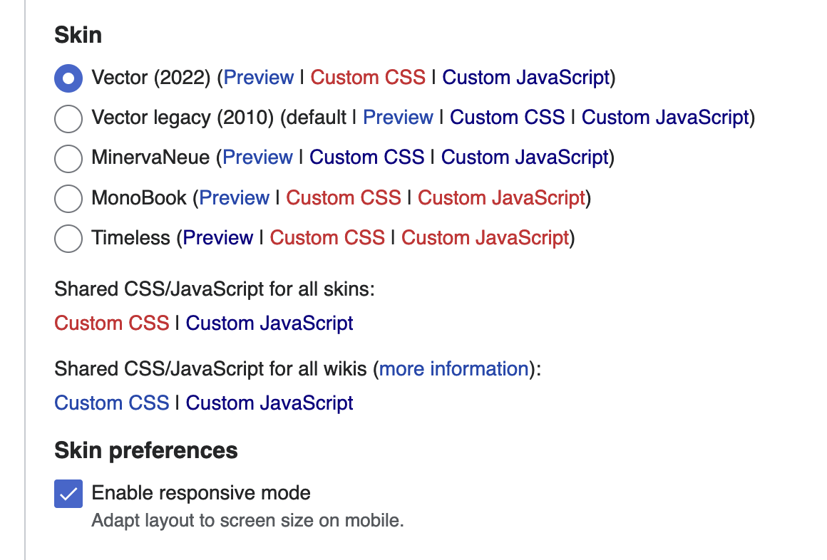
During the building of Timeless, the Monobook skin was made responsive (T195625). Interestingly this led to a lot of backlash from users (particularly on German Wikipedia), revealing that many users did not want a skin that adapted to the screen (presumably because of the reasons I outlined earlier - while reading is harder, it's easier to get around a complex site. Because of this, a preference was added to allow editors to disable responsive mode (the viewport tag). This preference was later generalized to apply to all skins:
Responsive Vector
Around the same time, several attempts were made by volunteers to force Vector to work as a responsive skin. This was feature flagged given the backlash for MonoBook's responsive mode. The feature flag saw little development, presumably because many gadgets popped up that were providing the same service.
Vector 2022
The feature flag for responsive Vector was removed for legacy Vector in T242772 and efforts were redirected into making the new Vector responsive. Currently, the Vector skin can be resized comfortably down to 500px. It currently does not add a viewport tag, so does not adapt to a mobile screen.
However, during the building of the table of contents, many mobile users started complaining (T306910). The reason for this was that when you don't define a viewport tag the browser makes decisions for you. To avoid these kind of issues popping up it might make sense for us to define an explicit viewport to request content that appears scaled out at a width of our choosing. For example, we could explicitly set width 1200px with a zoom level of 0.25 and users would see:
If Vector was responsive, it would encourage people to think about mobile-friendly content as they edit on mobile. If editors insist on using the desktop skin on their mobile phones rather than Minerva, they have their reasons, but by not serving them a responsive skin, we are encouraging them to create content that does not work in Minerva and skins that adapt to the mobile device.
There is a little bit more work needed on our part to deal with content that cannot hit into 320px e.g. below 500px. Currently if the viewport tag is set, a horizontal scrollbar will be shown - for example the header does not adapt to that breakpoint:

Decisions to be made
- Should we enable Vector 2022's responsive mode? The only downside of doing this is that some users may dislike it, and need to visit preferences to opt-out.
- When a user doesn't want responsive mode, should we be more explicit about what we serve them? For example, should we tell a mobile device to render at a width of 1000px with a scale of 0.25 ( 1/4 of the normal size) ? This would avoid issues like T306910. Example code [1] demo
- Should we apply the responsive mode to legacy Vector too? This would fix T291656 as it would mean the option applies to all skins.
[1]
<meta name="viewport" content="width=1400px, initial-scale=0.22">
- Projects
- Subscribers
- Izno, Jdrewniak, Mainframe98 and 5 others
- Tokens
Event Timeline
Some notes to accompany my analysis in T306910. @Mainframe98 @Lens0021 @ovasileva @alexhollender_WMF @Ammarpad @Jdrewniak @bwang may be interested.
Should we enable Vector 2022's responsive mode? The only downside of doing this is that some users may dislike it, and need to visit preferences to opt-out.
I think the end objective should be (if it isn't already) one skin displayed on both mobile and desktop domains. Making it 'responsive' in this way moves us in that direction. Yes, a million times yes.
@Izno from a technical point of view, that makes sense to me and is my preferred option. I think the concern on the product side is we'll see a repeat of the fallout we saw for responsive Monobook (even though there would be a preference to turn it off).
FWIW, I think an RFC on wiki formally requesting this direction for Vector 2022 would be really useful input if anyone has capacity to push for it.
A learning point since I wrote this blog post.
In T306910 we decided to be explicit about what we served to mobile users viewing the desktop site (1200px at 25%). This led to T311119. The zooming proved problematic on iPad so was removed and the 1200px was shortened to 1000px to avoid CSS rules at this breakpoint which led to undesirable features in this environment such as a fixed width.
The feedback suggested that users expect the content area to be at a "readable" font-size (which appears to be 9px-10px). Readable was subjective. One user commented that category pages were unreadable. Before the change, galleries showed 7 images on a single row and afterwards 4.
The text is only readable because of a text inflation algorithm used on some smartphones and tablets . We can disable this, but based on this feedback should never try to do that: https://developer.mozilla.org/en-US/docs/Web/CSS/text-size-adjust
Users did not seem bothered by the surrounding UI size (which remains unchanged) but even though the buttons were small, did notice if they got smaller.
[1] https://en.wikipedia.org/w/index.php?title=Wikipedia:Village_pump_(technical)&oldid=1094611682#Global_projects_being_too_wide_since_yesterday
[2] https://it.wikipedia.org/w/index.php?title=Wikipedia:Officina&oldid=128033788
[3] https://commons.wikimedia.org/w/index.php?title=Commons:Village_pump/Technical&oldid=667794615