WikimediaUI icons, refined and aligned in OOUI's arrangement, see current icon demos. See T177432: Unify and refine WikimediaUI icon set for principles leading to this proposal.
Note: Pink is the before state/black the proposed overhaul.
| F16628574: 2018-04-03_14.44.06.png | |
| Apr 3 2018, 12:22 PM |
| F15980430: image.png | |
| Mar 23 2018, 2:05 AM |
| F15962940: unClip.svg | |
| Mar 22 2018, 1:06 PM |
| F15962939: clip.svg | |
| Mar 22 2018, 1:06 PM |
| F15953484: image.png | |
| Mar 21 2018, 11:56 PM |
| F14365552: Icon overhaul _ OOUI Demos icons with canvas highlight 2018-03-03.png | |
| Mar 15 2018, 5:03 AM |
| F12270092: T184313 caret indicator after M229 - OOjs UI Demos 2018-01-05.png | |
| Jan 5 2018, 11:08 PM |
| F12238765: Unbenannt-1.png | |
| Jan 4 2018, 9:05 AM |
WikimediaUI icons, refined and aligned in OOUI's arrangement, see current icon demos. See T177432: Unify and refine WikimediaUI icon set for principles leading to this proposal.
Note: Pink is the before state/black the proposed overhaul.
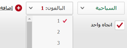
Some RTL comments:
@Amire80 @Ladsgroup @Mooeypoo Integrating your first-hand feedback and asking some more at another round of mockups…
Thanks @Amire80 and @Ladsgroup! Very helpful.
@Amire80, we don't want to just provide the must-haves here, but also shine with a harmonious and pleasant as possible interface here. So your beyond usability comments are welcome!
For my understanding, I've quickly searched for checkmarks in Arabic but haven't found websites with mirrored ones, exemplified Emirates Airlines:
There is a disruptive, inharmonious text-indicator size disparity with current indicator carets. I propose not to update them in the first round of patch sets connected to T177432 starting with https://gerrit.wikimedia.org/r/400091.
I feel like the colors would need to be a little soft as the current pallette seems too sharp on the eyes. I might suggest a better color but it may end up too bland
@sr229 Thanks for your inputs!
Notice, that we're providing monochromatic icons as unifiying principle, easy base to modify from and for leaner code reasons (SVG defaults to black on paths and fillings).
Nevertheless, in none of our current products we're using black as default color, in OOUI for example the icons are aligned to the surrounding text which defaults to #222 – a dark grey. We're overwriting the default colors per opacity and other measurement on a product-specific base
@Volker_E That's nice to know, I was referring to the colored icons (not the black ones as I believe this would improve readability) since they're a bit too sharp. I suggest a softer pallete for them. #ef3228 might be a good color
@sr229 If you refer to the blue (in Accent50 also referred to as “Progressive”) or red (in Red50, also referred to as “Destructive”) please see “Colors” section of our Style Guide for further explanation on contrast necessities behind them.
@sr229 From the description above: ”Note: Pink is the before state/black the proposed overhaul.“
Pink are the icons before the overhaul.
I welcome the addition of the light bulb very much as it could fill the need for an information icon that is language independent and not Latin based.
That being said I think there's still a discussion to be had on whether that should be universally applied on all wikis which you can find here: T178568
I'd be very interested in sparking up that conversation again and get some more opinions and insight into the topic.
@Charlie_WMDE Great, that 'lightbulb' helps you too. It's already part of our library OOUI, see 'interactions' pack.
The discussion at T178568 seemed missing information from “Stockholm workshop“. We need better evidence of which way is best useful and acceptable, happy to hear more inputs there.
@sr229 Not sure what you are referring to? Do you mean this would be confusing in right-to-left (RTL) languages like Hebrew? If so, I can ensure, that it is the correct way. Please see OOUI's RTL tech demo for an example application of the icons before the overhaul: https://doc.wikimedia.org/oojs-ui/master/demos/?page=toolbars&theme=wikimediaui&direction=rtl&platform=desktop
Sorry if this is not constructive, but looking at these icons it really feels like the previous version had a distinctive vibe to it that made the whole icon pack ‘click’ in a way (repeated details like border radii in some places or a ‘page’ icon that looks like a page) and new version is so bland :-( I don’t mean it in a bad way, but seems like there is a lot less commonness across the new icon pack. I’ll probably accustom to it anyway, but its sad that unique details of previous OOjs UI icons had to go away.
Hi @stjn, upfront, it's hard to reply to such comment. Throughout this process we've really cared to integrate feedback and come up with solutions aimed at pleasing all of our users.
I'd like to take the chance and try to show, why the distinctive vibe wasn't so much of _one_ distinctive vibe that actually failed to scale as resource for a unique look & feel of our products, be it VisualEditor, MediaWiki core or MobileFrontend/MinervaNeue:
To begin with, the old icons have often been designed with just a single use case in mind. Let's take for example 'upload' icon which was meant to be used in SelectFileWidget with drop target. Creators of that icon haven't had convincing guidelines so it could happen that the icon works in exactly the original usage location but fails in another one (think some Special:Page with an upload icon outside SelectFileWidget). A few of the major shortcomings, that we've tried to address with the set following our new icon guidelines:
Hope that brings some clarity in our ideas and conclusions resulting in above.
Hey @Volker_E - the bookmark icon is within the icon guidelines for tall rectangular shapes, but in context agree it is looking chunky in context. Here's some slllliiiightly smaller versions:
Anyway, I wonder if this entire Pholio page should have a vertical-writting fork per T353 or not?
@Iniquity Thanks for your inputs, we'll follow-up here later.
@Liuxinyu970226 Thanks for the questions, answers below:
To your vertical-writing question: We might revisit icons with vertical-writing languages (if there's evaluated need) when the other technicalities are moved forward.

This needs to be mirrored for RTL languages