Page MenuHomePhabricator

WikimediaUI: Messages (Errors, Warnings, Successes, Notices)
ClosedPublic

Authored By
Referenced Files
F29342074: Messages_20190603.png
Jun 4 2019, 4:22 PM
F29341991: Messages_20190603.png
Jun 4 2019, 4:14 PM
F28435410: messages-without-borders.png
Mar 21 2019, 9:38 AM
F28421310: Messages_20190319.png
Mar 19 2019, 5:33 PM
F28393286: Messages_20190315.png
Mar 15 2019, 4:51 PM
F28383796: Error_top_ALT.png
Mar 13 2019, 8:42 PM
F28379893: Messages_20190312.png
Mar 13 2019, 7:34 AM
F13886291: Messages.svg
Feb 19 2018, 5:19 PM
Tokens
"Y So Serious" token, awarded by Tomybrz."Love" token, awarded by rafidaslam."Love" token, awarded by SamanthaNguyen."Love" token, awarded by Ladsgroup.

Mock History

Current Revision

Mock Description

This is a proposal for the style of system messages to the users which is building on what was discussed already in T127405.

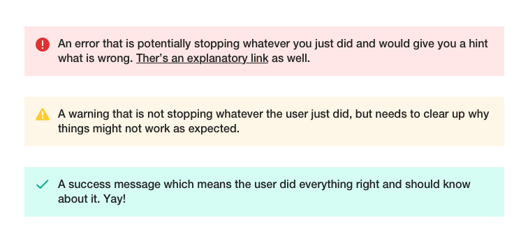
It features 4 type of messages, errors, warnings, successes and notices, in two different types:

  • boxed and
  • inline.

Original comment by @Hanna_Petruschat_WMDE:
There are three different box styles which build up on already known styles and the style elements of the new style guide.
For accessibility reasons I would insert an icon next to the color coding. There are two options to place an icon as there are two ways how text and icons are dealt with as of now.
Regarding the color I kept the familiar red, yellow, green coding and chose grey for remarks, so there is no judgement done about the users behaviour.

My recommendation:
I would rather put the text and the icon centered inside the box than having the icons differentiating in heights leaving an unclear pattern of positioning.
For a bolder statement I would chose a coloured box instead of only colored text. Colored text also avoids the coloring of icons.
As there is no (at least not for me) clear use case for borders or against them, I would probably prefer the boxes without a border. But that's really personal taste, I guess.

Event Timeline

@Hanna_Petruschat_WMDE Thanks for this proposal!
I've updated the corresponding task T127405 to make the various current applications and success criteria easier to understand. With the updated information, a few remarks:

On a general note, are the 3 variations (excluding the icon positioning) per message box type meant to be proposals to choose from or do you have different use cases in mind? If you say borders, you've also got box-shadows integrated and therefore clarification would be helpful.

  • Agree on icon addition to color coding. That is an important point.
  • We are using Base0 to indicate emphasized elements. Not only does the message box resemble a more disabled look, and not something that should draw user's attention. We should try and follow this here as well.
  • To the icon position, I'd like to throw in, that we might not only deal with two line messages, but multiline ones. And on mobile you might result in not getting the icon for a while visually.
  • On white background I'd turn the icons to be in the same color as the text, to signify the state of the message better.

There's also a few other open questions, like integration of rich text and its color contrast and styling requirements.

Hi @Volker_E! Thanks for the feedback. I'll comment in line:

On a general note, are the 3 variations (excluding the icon positioning) per message box type meant to be proposals to choose from or do you have different use cases in mind? If you say borders, you've also got box-shadows integrated and therefore clarification would be helpful.

These would be 3 different proposals. I see them being too similar to have destinct use cases.
––

We are using Base0 to indicate emphasized elements. Not only does the message box resemble a more disabled look, and not something that should draw user's attention. We should try and follow this here as well.

You mean, Base0 is drawing too much attention and should rather be Base30 or so? I was only using Base0 to stay in line with the color of the icons available now. But sure, we could change that as soon, as we have a way to change the icon color as well.
––

To the icon position, I'd like to throw in, that we might not only deal with two line messages, but multiline ones. And on mobile you might result in not getting the icon for a while visually.

Good point. Indeed I haven't thought of that.
––

There's also a few other open questions, like integration of rich text and its color contrast and styling requirements.

I would think to have a limit of characters in these fields. But that's up for discussion of course and should be filed in another ticket.
––
As of now I'm pretty packed with other projects, so I wont be able to work on that in the near future. The only transferable file format we can export from Figma is a svg which can be found here:

We are using Base0 to indicate emphasized elements. Not only does the message box resemble a more disabled look, and not something that should draw user's attention. We should try and follow this here as well.

You mean, Base0 is drawing too much attention and should rather be Base30 or so? I was only using Base0 to stay in line with the color of the icons available now. But sure, we could change that as soon, as we have a way to change the icon color as well.

What I meant was actually the opposite. I think errors, warnings and messages are the natural habitat for Base0 to emphasize their importance. The screenshots above gave me the impression that a too low-contrast base color was used, without clearly being able to name it.

The only transferable file format we can export from Figma is a svg which can be found here:

Thanks for the file and the efforts so far! Will see if anybody on the design team can take it from here.
I think the next steps would be to evaluate if we need for each three forms, resolve the points uncovered so far and apply the resulting proposals to the application examples on the main task.

Volker_E renamed this mock from WM UI: Warnings to WikimediaUI: Messages (Errors, Warnings, Successes, Notices).Mar 12 2019, 6:26 AM
Volker_E removed an image: Warnings.png.

Updated with overhaul based on work by @Hanna_Petruschat_WMDE with comments and feedback integrated.

Hi @Volker_E. Thanks a lot for building up on the earlier mocks. My two cents:
WCAG:

  • Checking Color Contrast I think we might be in muddy waters by putting red50 on red90.
  • This also applies to the yellow icon on fff background unfortunately.

Consistency

  • I wonder if it would make more sense to use the black font in the error box as well? This could help regarding the accessibility as well.

And last question:

  • Do we have another icon to differenciate between error and warning? I ran into a similar issue on wikidata dealing with the constraint icons. I put together a flash for really bad constraints, the exclamation mark for warnings and the flag for suggestions. Feedback already told us this might not be the best solution ever. Long story short: Do we want to look into the differentiation for these cases? I guess this will pop up in several places. I'll set up a new ticket for this if you agree to look further into it.

I agree with @Hanna_Petruschat_WMDE regarding putting red50 on red90 - I find the black text to be much easier to read because of the greater contrast. I also prefer consistency (black text for any kind of message).

Hanna raises a good point that the error and warning icons are the same and that is a little confusing.

Contrast/WCAG conformance:

  • When boldened and at higher font-size (18+ px) we would conform to level AA.

I do like to have the error set apart from the warning, and notice stronger, but if majority agrees with readability and identification being fine with black on red, then I'm fine too.

  • The icon is ok to be set to Yellow50 as long as the text is fulfilling contrast factor. It's not optimal, but acceptable in this combination. If you've got better ideas, pls share.
    • Icon differentiation between error and warning
  • The only possible alternative as seen in some other error message handlings of libraries is the stop sign, it's a strong emphasis:

Error_top_ALT.png (81×702 px, 13 KB)

@Volker_E definitely prefer the stop sign for the error, with the triangle for the warning.

Latest mock with stop sign inspired icon, added sizing information and error box alternative without strike-through bar.

This is a quick exploration for future consideration. It tries to keep the text readable (using Base10), and emphasize the icon with color as opposed to the border trying to drive attention to the message more than the whole box. We my want to check how this works in context if the approach looks promising:

messages-without-borders.png (359×756 px, 40 KB)

My 2 cents:
I like the borderless approach. Makes sense to keep the attraction at the content itself.
Feedback I got for the circular ! icon is it looks too similar to an info-i. I could see the stop sign icon showing the significance an error message needs.

Thanks @Volker_E and @Pginer-WMF for iterating!

The messages should catch focus on the page around. I see the borderless approach as way to approach the messages in a clean, distraction-free environment, embedded on a page I'd pledge for a design with border though. Those messages seem to be useful to resemble signs with borders.
Up for discussion is if for specific use case like CX2 a frameless variant is an acceptable modification.

Thanks @Volker_E, I like this new styling for the messages, and I've already used them in T222848!

As I already said during the last style guide update meeting, I just want to raise that the unboxed success message could potentially be not very noticeable if we set font color to green. Or at least that's my first feeling.

Also, it would be nice to see how the boxed messages would look like on mobile, and with an icon to dismiss them.

@Cntlsn The inline success message color in the mock of the time being is set to [[ https://design.wikimedia.org/style-guide/visual-style_colors.html | Green30/#14866d ]] and is conforming to level AA with a contrast of exactly 4.5:1 with background #fff. For this reason and for having a symmetrical counter point to the Red30 inline error message, I'd leave it like that for now and gather in-production experience.

Successfully closed. Part of Style Guide components now.

@Volker_E, help:) What is the size of the border on these boxes? Because here, for example, it is different: T222848.

@Iniquity border-width is 1px and therefore correct in T222848.

@Volker_E some questions about errorbox. It doesn't pass the test for color contrast. 1em != 14pt for Wikimedia projects. And I saw that the above was a proposal with black text, why was it decided to leave red? And where can I find this icon for an error, please tell me :)