Page MenuHomePhabricator

"Next" button not fully visible on narrow screens (mobile)
Closed, ResolvedPublic8 Estimated Story Points

Description

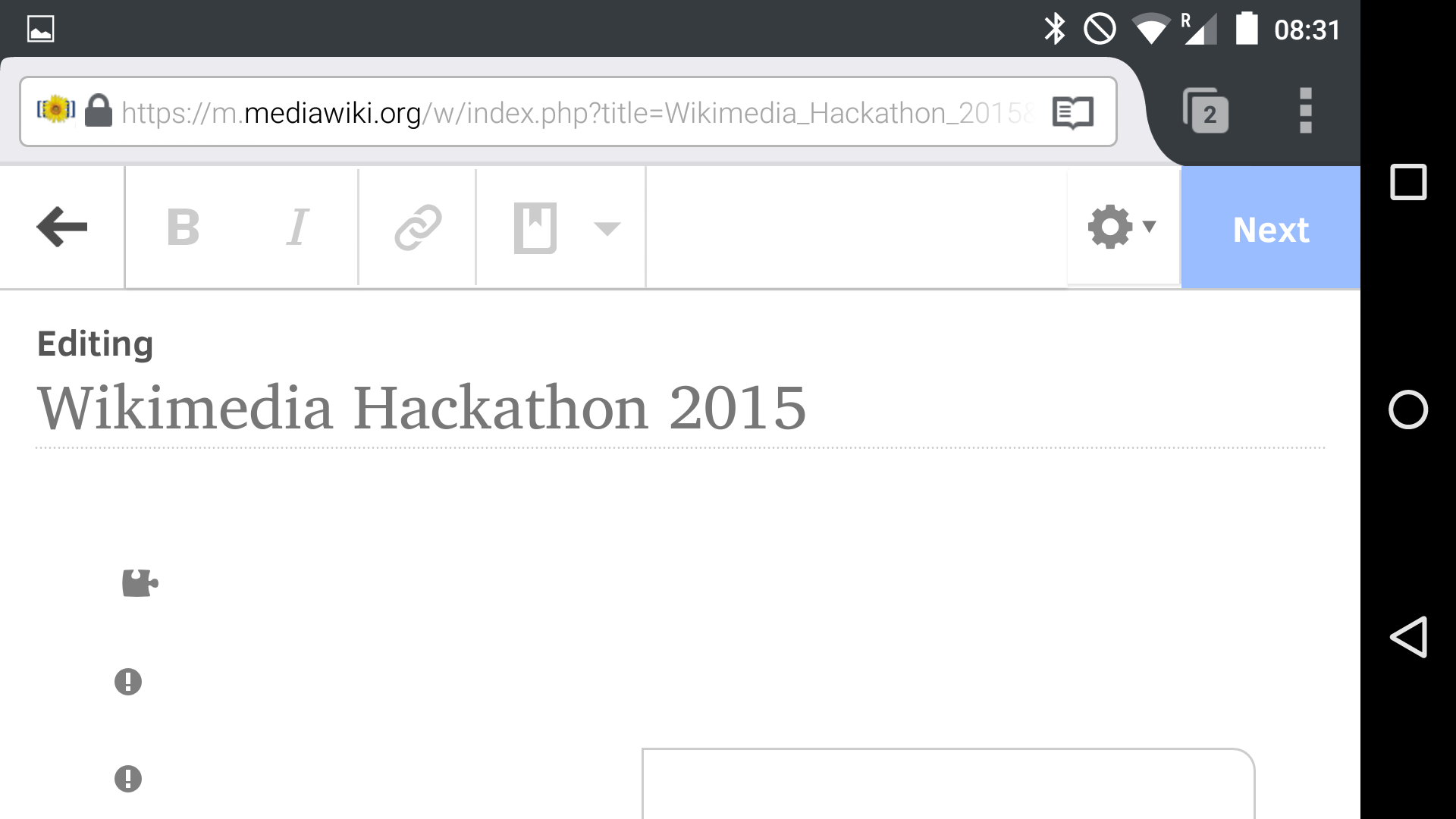
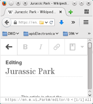
Only the left edge of the "Next" button in the mobile VE is visible in narrow screens / windows. This is noticeable e.g. on a phone held in profile format. If the phone is rotated to landscape the "Next" button is visible again.

This can also be reproduced on a desktop mobile site by pulling the window smaller. If the window is small enough, the formating buttons on the left push the "Next" button off the screen to the right.

Because moving the "Next" button onto a second line would steal valuable vertical real estate (especially annoying if the keyboard is opened on a phone), my suggestion for an easy fix would that the "Next" button pushes the other elements off to the left rather than vice versa.

Event Timeline

Erget raised the priority of this task from to Medium.
Erget updated the task description. (Show Details)
Erget added a project: VisualEditor.
Erget added subscribers: Ryasmeen, Drongou, Erget, Aklapper.

@Erget: Would be nice if you can add some screenshot too :)

@Ryasmeen: Gladly :)

Here on my phone, rotated so the "Next" button goes offscreen:

Screenshot_2015-05-25-08-31-20.png (1×1 px, 119 KB)

If you rotate the phone the screen is wide enough again!

Screenshot_2015-05-25-08-31-24.png (1×1 px, 96 KB)

And on desktop, you see the button just fine as long as it's wide enough:

mobile-desktop-wide.png (703×949 px, 185 KB)

But if you resize the window small enough the button's just not there. I expect that this problem will appear on lots of phones with lower resolutions than mine.

mobile-deskto-blocked.png (340×304 px, 28 KB)

Sorry to spam here, but I think a good way to get this to behave correctly would be to make the buttons at the top scrollable. That way they'd always be available, unscaled, no matter what resolution you're working with.

This was discussed at the weekly meeting on 2015-06-30. We decided that it wasn't a priority for this quarter, as the new design for mobile users will replace this.