In VE Cancel button has a border(also look https://tools.wmflabs.org/styleguide/desktop/section-2.html).
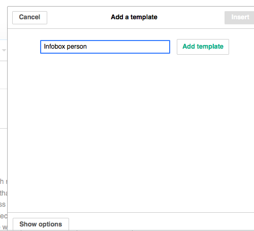
'Cancel' in Flow:
| Etonkovidova | |
| May 25 2015, 4:05 PM |
| F173732: modal-overlays.png | |
| Jun 3 2015, 1:04 PM |
| F169069: Screen Shot 2015-05-25 at 6.00.48 PM.png | |
| May 25 2015, 4:05 PM |
| F169067: Screen Shot 2015-05-25 at 5.59.53 PM.png | |
| May 25 2015, 4:05 PM |
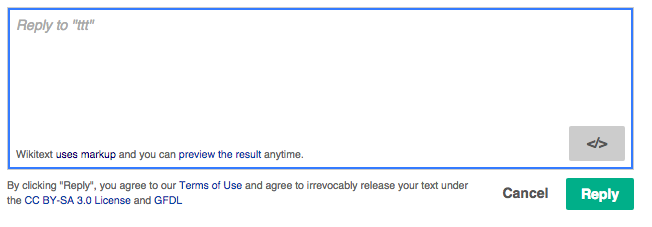
In VE Cancel button has a border(also look https://tools.wmflabs.org/styleguide/desktop/section-2.html).
'Cancel' in Flow:
The cancel button we used is a silent button. In form-like contexts, the common pattern has been to place the actions at the bottom of the form with the button right-aligned and emphasising the main action while keeping Cancel silent.
In the old Trello board for UI components this is a common pattern. and the screenshot below from the design document show it too. However it is true that it is not present on the live guide page (yet?), and placing the actions on top is also a pattern that exists (I assumed mainly for mobile). @violetto, @Volker_E, or @Prtksxna may be able to confirm which is the current status of placing form actions and provide recommendations on when to use them according to UI-Standardization recommendations.
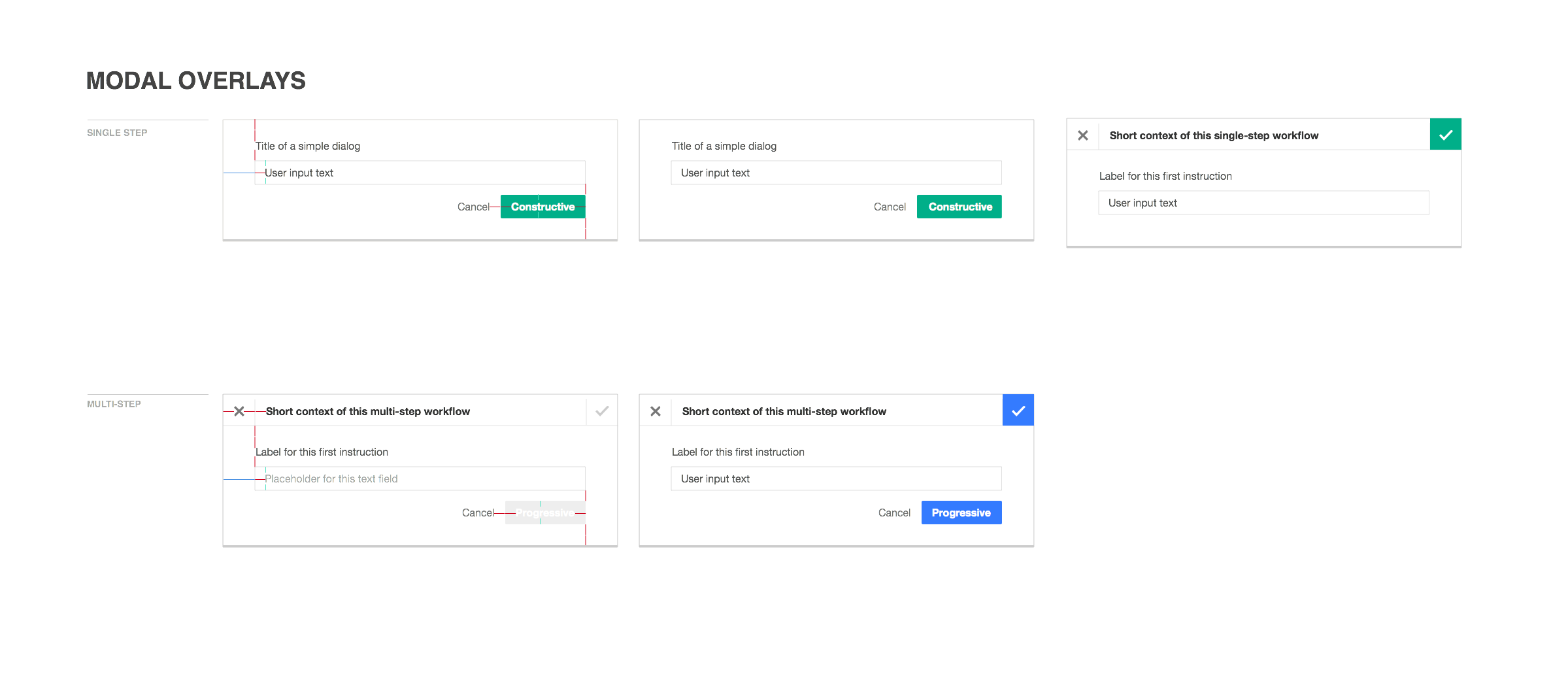
Primary (framed / bordered) buttons are reserved for actions that are most important on the page or the most obvious step forward to help users progress in a certain workflow.
In this case, "Reply" is the primary button. Quiet buttons are not framed because they are secondary actions. In order to keep an interface uncluttered and to preserve the higher hierarchy of primary buttons, we needed to a way of preserving secondary actions' importance (i.e. "Cancel") while keeping the interface easy to understand and digest.
In the case of toolbar, these actions are framed only because they are in a toolbar with a top, bottom, left and right boundaries for clarity.
Hope this helps clarify.
As mentioned above, the current separation between quiet and primary makes sense from an UX perspective. It's also learnt behaviour now. Let's put this task on 'invalid' for reasons given.