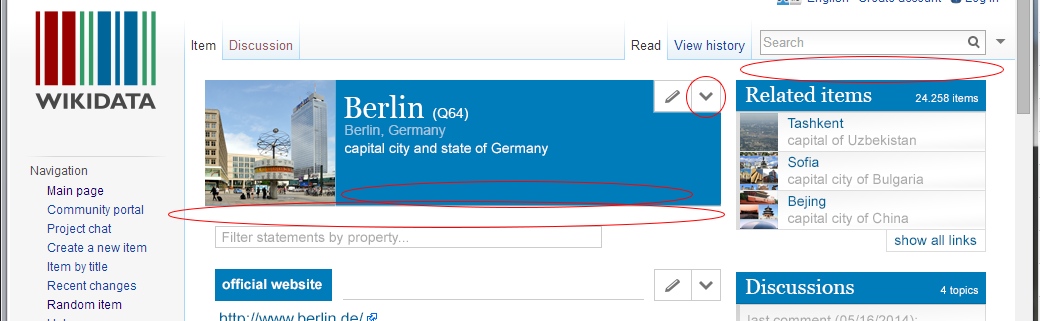
We have a link titled "concept URI" in the sidebar of each item. Clicking this link in a browser leads the user to the very same page because we are doing content negotiation. This is confusing. At the same time people don't find the RDF and JSON representation.
We need to find a way to surface them without confusing the users who don't know about RDF and JSON.
Description
Description
| Status | Subtype | Assigned | Task | ||
|---|---|---|---|---|---|
| Open | None | T44063 [Epic] Provide a plain linked data interface for accessing entities | |||
| Resolved | Lydia_Pintscher | T102155 [Task] find a way to surface rdf/json representation in item UI |
Event Timeline
Comment Actions
@Lydia we once planned a popup box with links to the various formats. It would be shown when you click on the Q-id in the title. I'm sure we had a ticket for this at some point...
Also note that this is closely related to T96298: Entity pages should link to machine readable version using <link rel="alternate"> tags in the html head. Internally, this is pretty much the same thing.
Comment Actions
we once planned a popup box with links to the various formats. It would be shown when you click on the Q-id in the title.
A pop-up box is a good solution if there are several options, but the Qid is not a good place to trigger it, since it gives no hint that it can be clicked or what one would get by doing so. There is a standard icon used for "share" that looks very similar to the RDF icon and is sometimes used in this way (google "share icon" or search for "share" on http://marcoceppi.github.io/bootstrap-glyphicons/). This could be used to indicate the popup box. One could put it somewhere in the title region (I would prefer the top-right corner).
Comment Actions
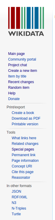
Wouldn't those export options pretty much fit into the sidebar section of "Print/export"?
In general, I do not like the sidebar that much as it is a mix-up of global navigation and page specifics. However, it seems like a sensible place to put those options for now. As for the planned layout, there are multiple options I can think of for some first evaluation:
- There could be a dedicated section in the right sidebar (likely too prominent) or
- an "icon bar" at the bottom of the header section (either in the header section itself or just below) leaving the option to put additional functionality into such an icon bar. Maybe some toc pop-up listing all the properties applied to the Item - whatever.
- In the planned layout, the top right of the header section would feature an "edit" icon with a drop-down list attached--that might be a place to put that as well instead of putting additional--probably rather specialized--content/links into the page directly.
- Another option would be to have an unobtrusive icon bar above the header / rendered Entity contents with icons aligned to the right shifting all of the rendered Entity a couple of pixels down. This might even more express the Entity (page) wide nature of the actions aggregated there. Having just one icon that makes a box pop up when clicked is a sensible solution of course.