Page MenuHomePhabricator

[AG]: UX: Design for frontpage
Closed, ResolvedPublic

Assigned To
Authored By
KasiaWMDE
Jun 26 2015, 10:47 AM
Referenced Files
F2359135: 20150825_lightbox.png
Aug 25 2015, 12:48 PM
F2358225: 20150825_imprint.png
Aug 25 2015, 11:33 AM
F2356307: 20150825_frontPage.pdf
Aug 25 2015, 9:47 AM
F2315479: 20150824_howItWorks.png
Aug 24 2015, 12:24 PM
F2314968: 20150821_frontPage3_hellgruen.png
Aug 24 2015, 12:24 PM
F2314997: 20150821_selectPicture9.png
Aug 24 2015, 12:24 PM
F2304873: 20150821_selectPicture6.png
Aug 24 2015, 9:08 AM
F2304876: 20150821_selectPicture7.png
Aug 24 2015, 9:08 AM

Description

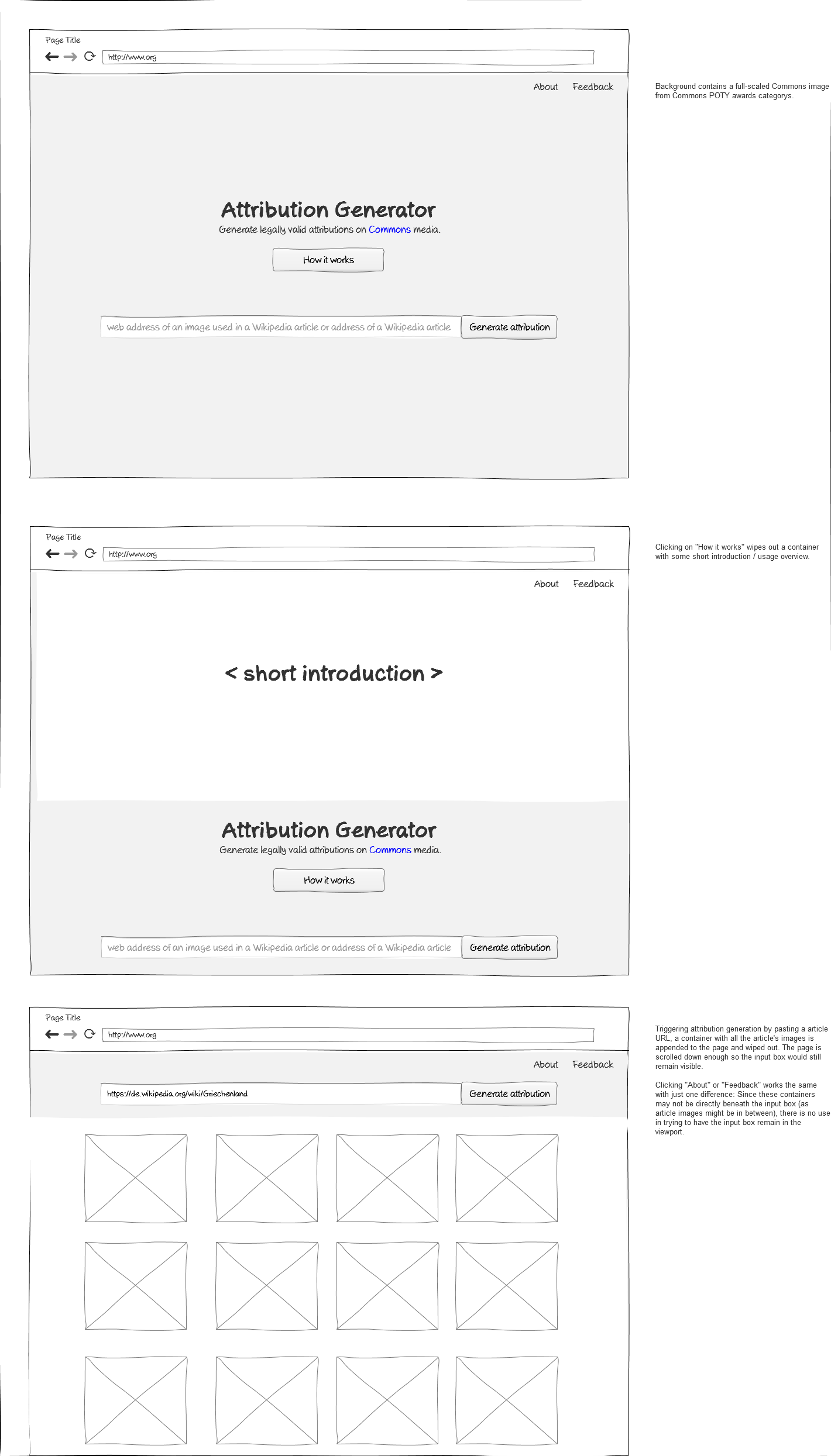
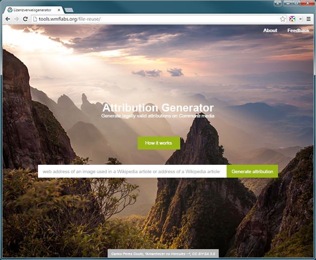
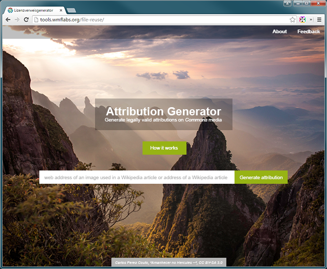
This task is about creating wireframe for the frontage of the tool. Following input should be considered:

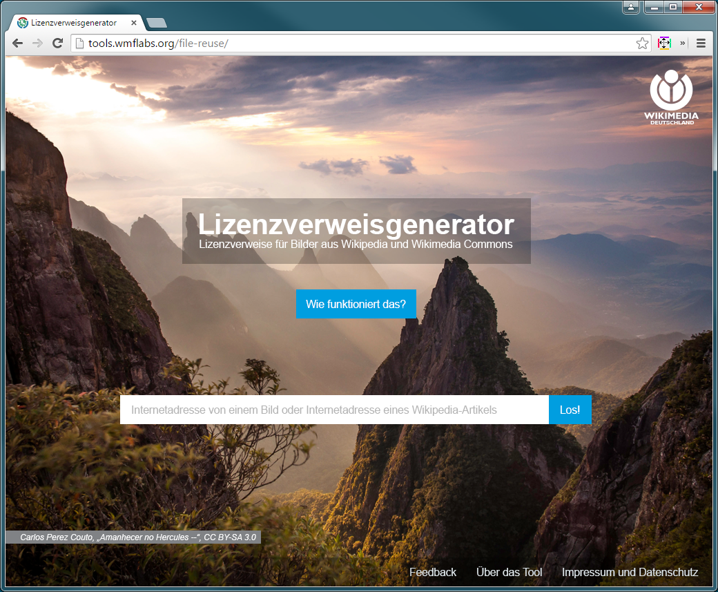
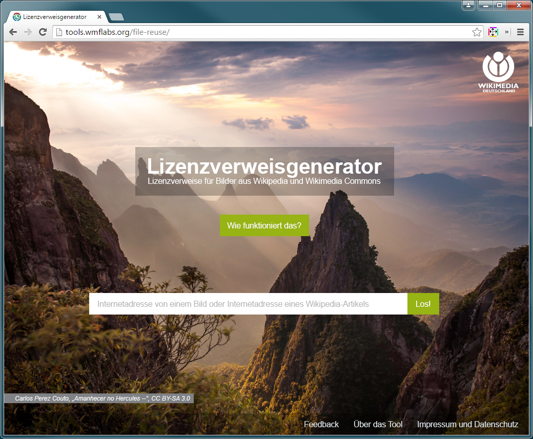
The frontage background should be a image from Wikimedia Commons (POTY). The image would change every day.
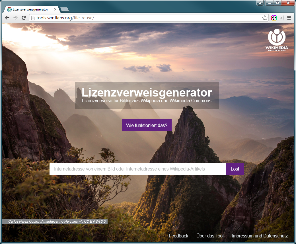
Frontpage should contain: the name of the tool, a bar for pasting the image or site url and a "how does it work" button, as well as Feedback and About us links
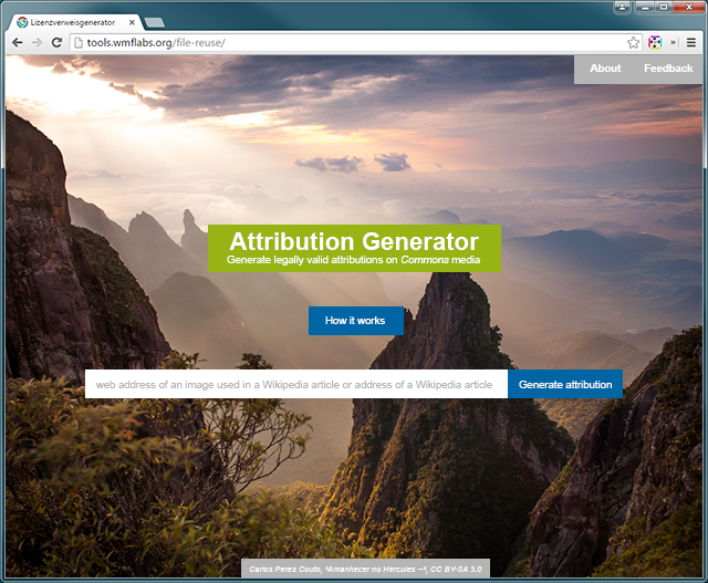
When clicking on the "how does it work" button the screen would scroll up showing a graphic instruction (the schema for the instruction will be provided)
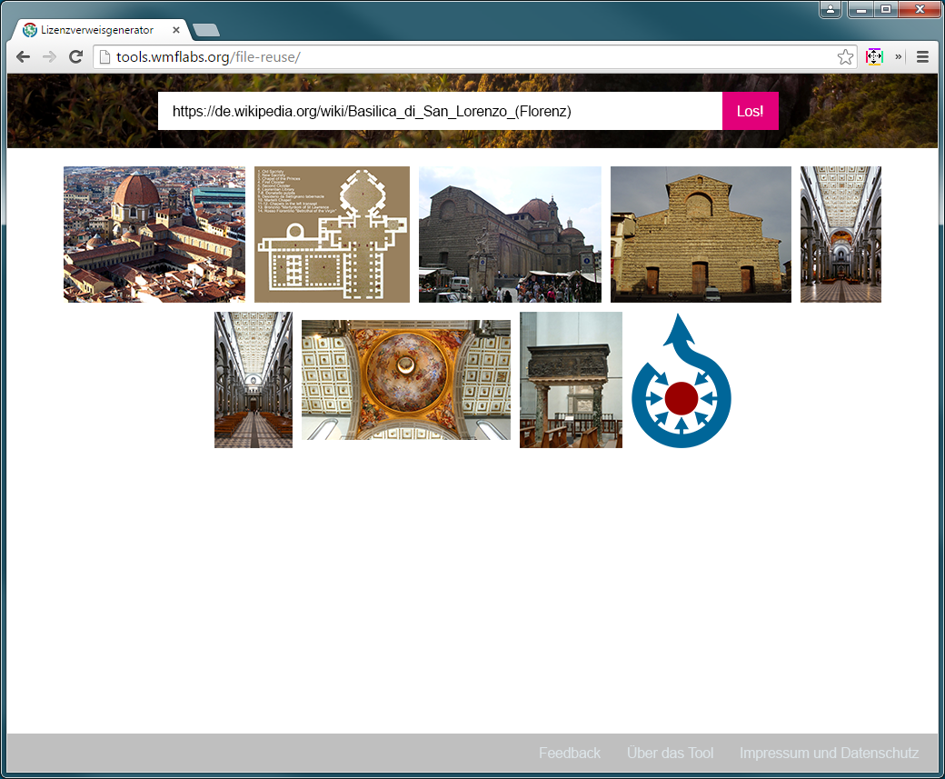
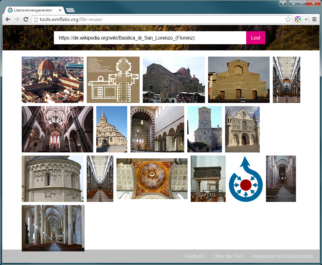
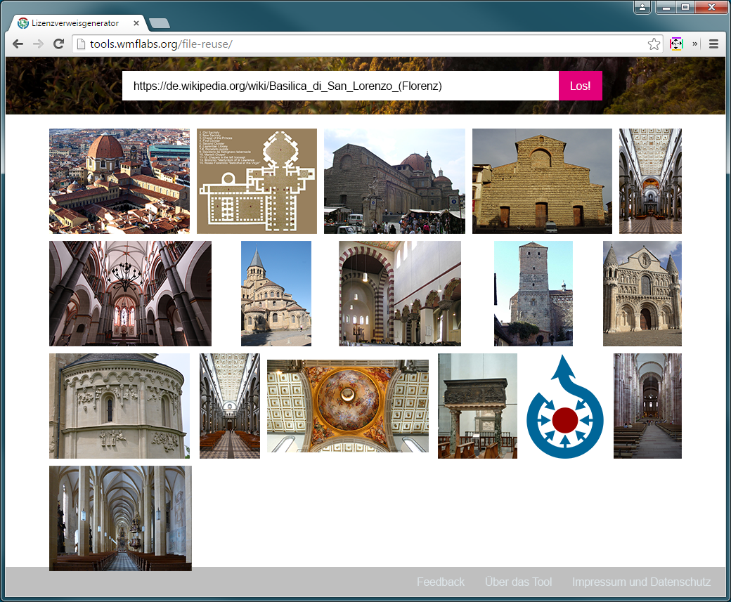
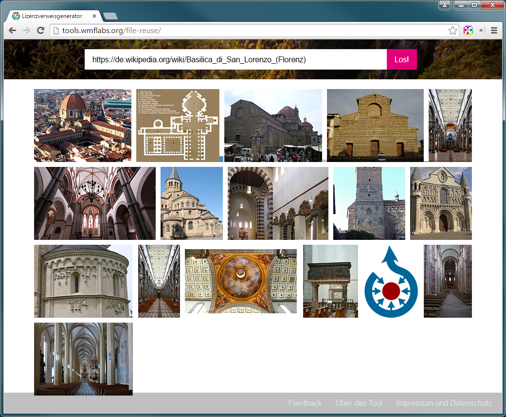
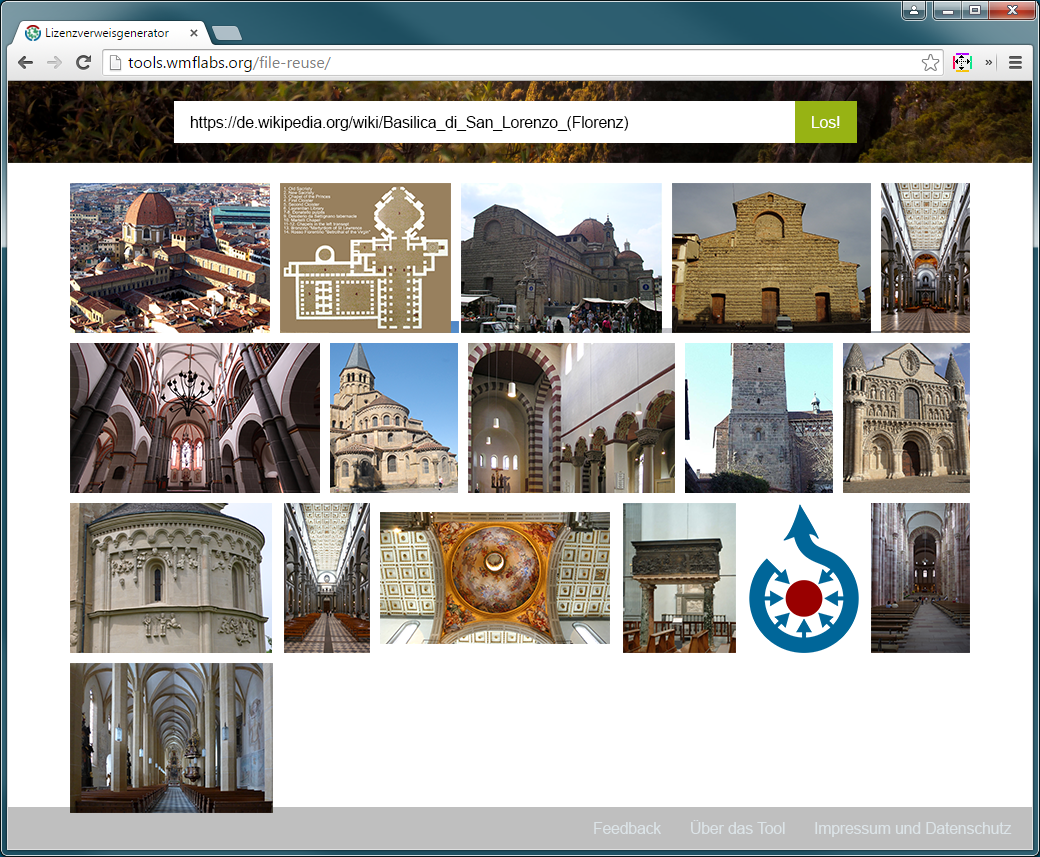
When pasting a url of a Wikipedia site the screen would scroll down and display all the images of the site

Event Timeline

KasiaWMDE assigned this task to Snaterlicious.
KasiaWMDE raised the priority of this task from to Medium.
KasiaWMDE updated the task description. (Show Details)
KasiaWMDE moved this task to UX on the Tool-Attribution-Generator board.

Some first draft. May need some more annotation, but should be sufficient for a first review:

20150630_frontpage.png (2×1 px, 141 KB)

As discussed today, a certain kind of green (for details see the style guide of the team I provided) needs to be introduced in order to ensure recognisability and consistency with other materials of the team.

Some first drafts (no pixel perfection etc.) for evaluation. Applying the WMDE colour scheme, apart from the green representing "legal matters", the software development blue could be used to make buttons stand out.

fp1.png (527×640 px, 545 KB)

Alternatively, a colour scheme based on the green could be applied.
fp2.png (527×640 px, 545 KB)

In this drafts, all texts have a fully opaque background colour because the current background image may cause that the text cannot be read. That problem could be eased if the background features a slide show of images.
fp3.png (527×640 px, 563 KB)

fp4.png (527×640 px, 559 KB)

Would be nice to have some kind of logo in the top left corner that would lead back to the front page (thinking about being in the questionnaire).

@Snaterlicious Thanks so much! Here is the feedback from the PM:

The name of the tool needs to have a green background, it may be half-transparent if it fits better (there is no strict guideline about this).
The buttons might be any fitting colour except for the "software blue". Preferably also not other kind of green to avoid confusion (however there is no strict guideline for it).
There needs to be a white stripe or half-frame (see the styleguide I provided for reference) in the frontpage side(s), the WMDE logo (see the WMDE styleguide for possible logo versions) could be placed in this stripe, preferably in the lower right or left corner. However, the guideline also permits for a white logo when on images (see p.6 of the WMDE styleguide), so we could also try this out to reduce noise in the frontpage.

In regards to the first layout draft: would it be possible to have another solution for opening of "feedback" and "about us" buttons than scrolling all the way down under the images (e.g. kind of pop-up) or would it damage the consistency? The concern is that it goes to low in case there are very many article images being displayed.

Front page with magenta colour as per request:

20150821_frontPage2.png (857×1 px, 1 MB)
But, still, there are alternatives...
20150821_frontPage2b.png (857×1 px, 1 MB)
20150821_frontPage2c.png (857×1 px, 1 MB)
20150821_frontPage2d.png (857×1 px, 1 MB)
20150821_frontPage2e.png (857×1 px, 1 MB)

As for the picture line-up. Basically, I can identify two sensible options: Reserve the same area for every image (which is currently done in the attribution generator) or line the images directly next to each other (which is what, for example, Google image search does). While the first option leads to a very clear structure it produces a lot of white space. The second option accentuates landscape format images which, probably, is the majority of images.
As for the first option:

20150821_selectPicture2.png (857×1 px, 368 KB)
20150821_selectPicture3.png (857×1 px, 369 KB)

As for the second option:
20150821_selectPicture4.png (857×1 px, 564 KB)
While the one above is kind of what Google did some time in the past, the one below is a bit more sophisticated as it dynamically "crops" the images for full justification which cannot really be seen in the example as it features two lines only. In both cases, though, a maximum width should be defined as can be seen in the second image of the second row.
20150821_selectPicture5.png (857×1 px, 564 KB)

Above examples are for visualization only. The "preview" images could very well be bigger in the end as the examples feature a small 1024x768 viewport. The examples are missing a scrollbar as well as the line-up is simply appended to the content container. The input box scrolls along until being fixed at the top of the image line-up.

I noticed that we actually moved on from wire-framing as to the ticket title. I guess this ticket is actually resolved by your mock-ups, @KasiaWMDE, at https://popapp.in/w/projects/55b5224613c497de0dc28973/mockups/55d35c5d01823bd659e259e8 and there should be a separate ticket for actual design...

KasiaWMDE renamed this task from [AG]: UX: Create wireframe for frontpage to [AG]: UX: Design for frontpage.Aug 21 2015, 12:48 PM

@Snaterlicious Next time we will make 2 separate tickets but as you have already created designs in this one, I just renamed it. Thanks for the hint!

A few more / more detailed variations of the picture selection "page":

20150821_selectPicture6.png (857×1 px, 948 KB)
20150821_selectPicture7.png (857×1 px, 948 KB)
20150821_selectPicture8.png (857×1 px, 948 KB)
20150821_selectPicture9.png (857×1 px, 988 KB)
Last one is what Google currently does. It involves dynamically cropping the images slightly.

Decision was made to go with green.

20150821_frontPage3_hellgruen.png (857×1 px, 1 MB)
And the select picture concept should preferably be:
20150821_selectPicture9.png (857×1 px, 989 KB)
"How it works" may look like this (placeholders):
20150824_howItWorks.png (857×1 px, 212 KB)

Design will be documented (colours, spacing, behaviour etc.) after final approval.

@Snaterlicious approved. However we should still keep the easier option for the "select picture" screen in the backpocket (F2067788 with a slightly darker background).

I wonder whether you can get along with that:

As for the menu items. I would not recommend opening those in a lightbox like it is done at the moment as that additional layer might contain another scrollbar. Instead, the content could just be appended to the main layout container and the viewport can be scrolled down automatically. Some exemplary screenshot:

20150825_imprint.png (857×1 px, 89 KB)

OK, as the amount of text will be not too large, we may want to use lightboxes. Since the content of the lightboxes is not finalized yet, this is only conceptual again.
Some attributes that may not change though: header bar height: 42px with 30pt font size; background overlay is #dce4e8 at .8 opacity.

20150825_lightbox.png (857×1 px, 433 KB)