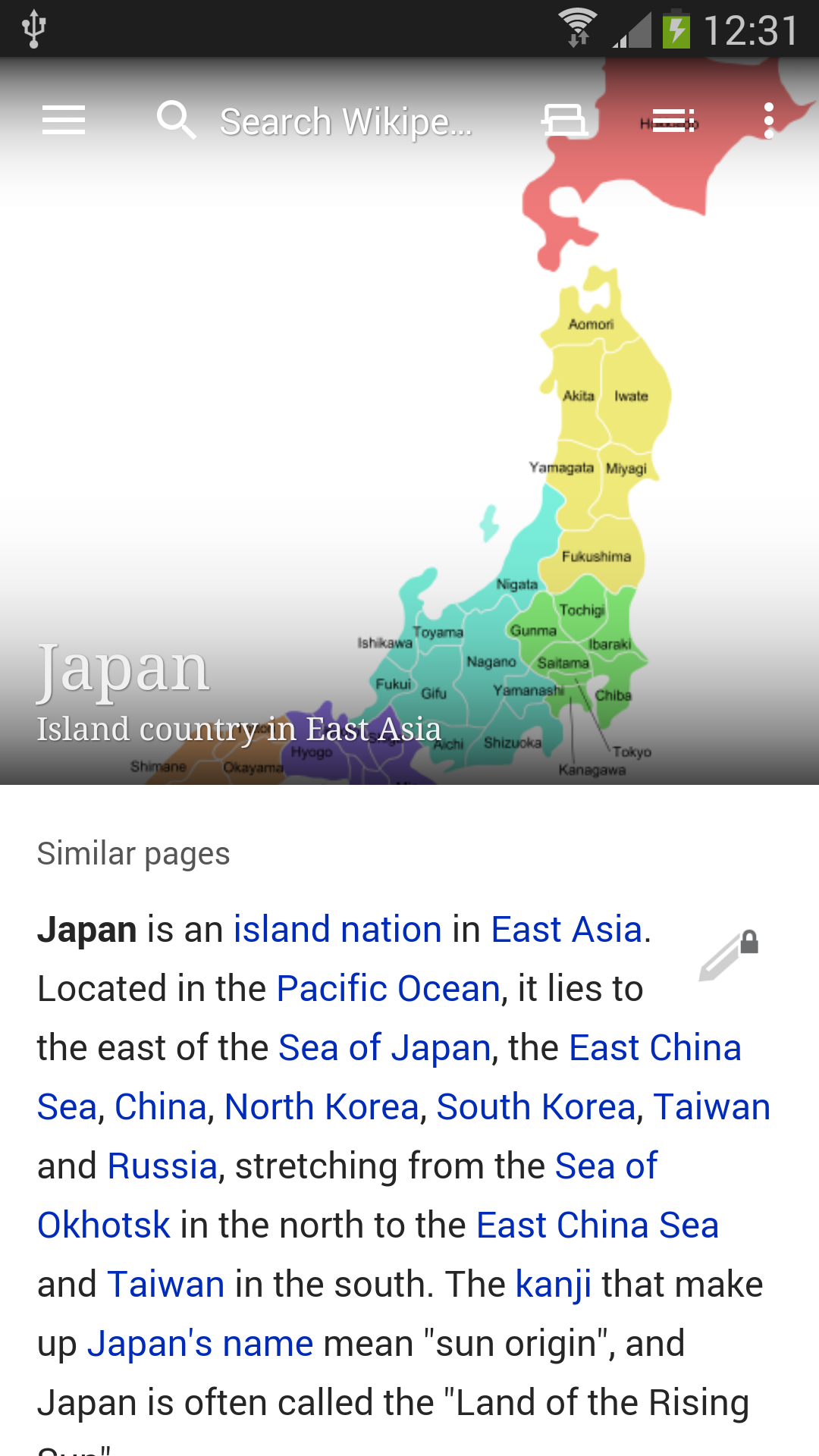
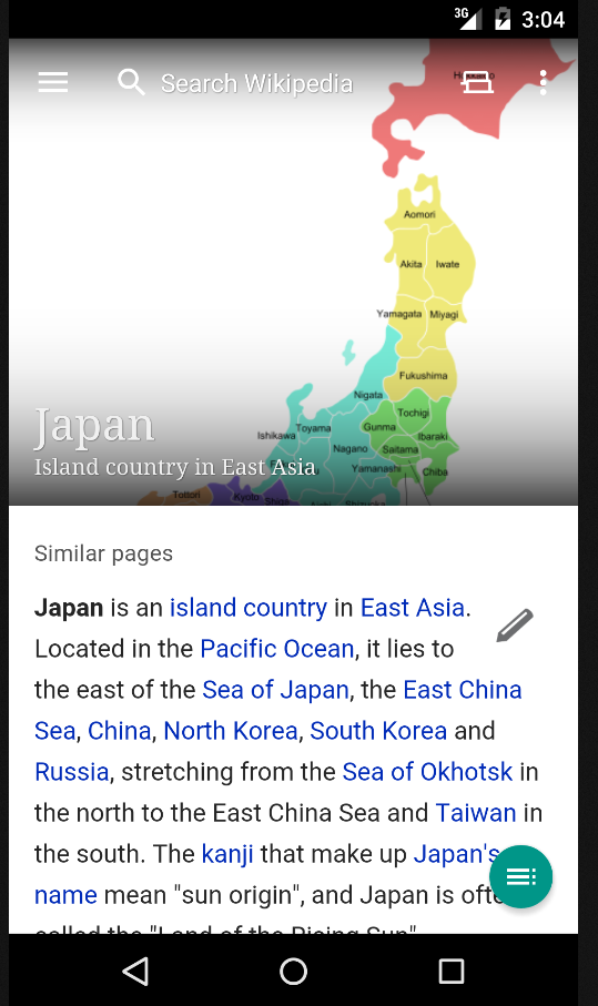
We currently display the page title, as well as the Toolbar, on top of the lead image of the current article. Since the lead image can often be a very light color, we overlay a dark gradient on top of the image, and show the text on top of it, so that the text can stand out.
The gradient that we've been using is a simple linear gradient. This means that the gradient ends with a "seam" in the middle of the image, an effect which is often noticeable in especially light images. Ideally, we need a more "asymptotic" gradient, which would trail off gradually, and blend seamlessly with the underlying image.