Page MenuHomePhabricator

Talk overlay inputs don't have borders
Closed, ResolvedPublic

Description

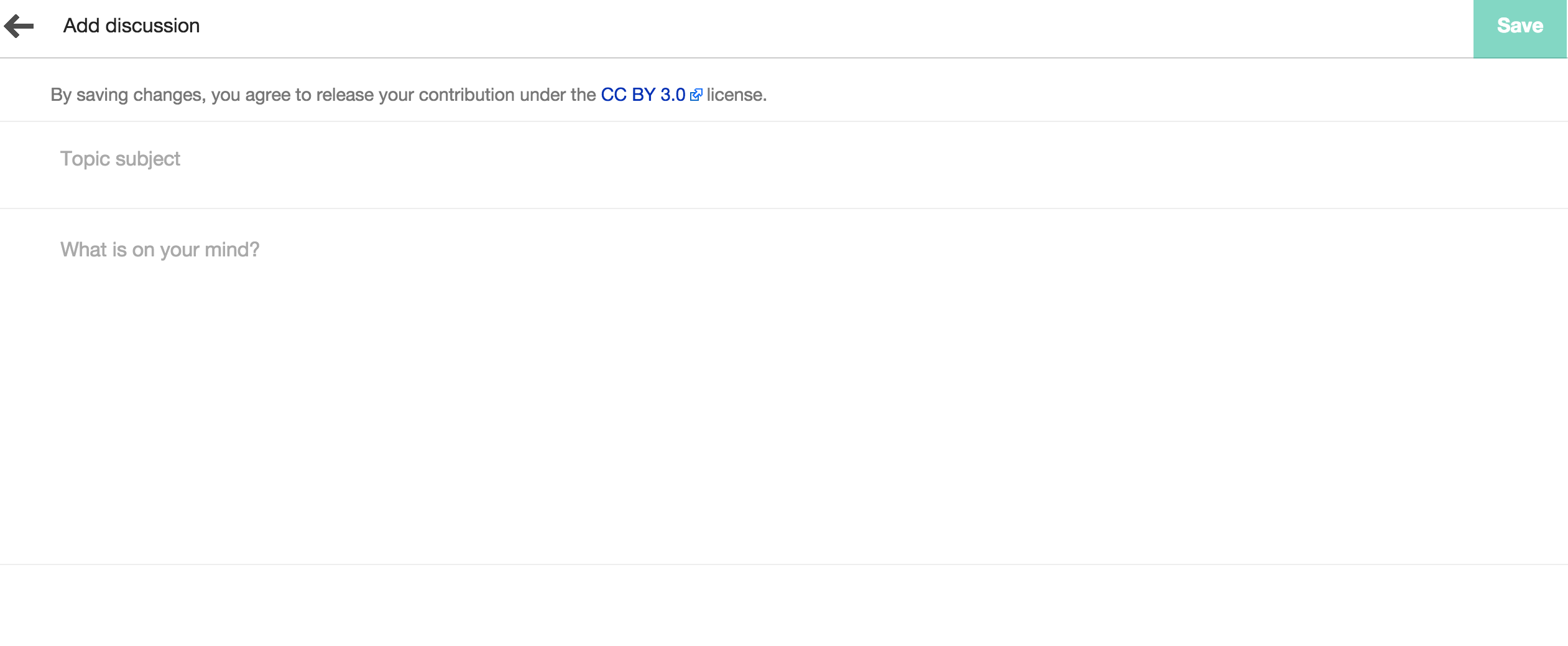
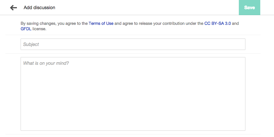
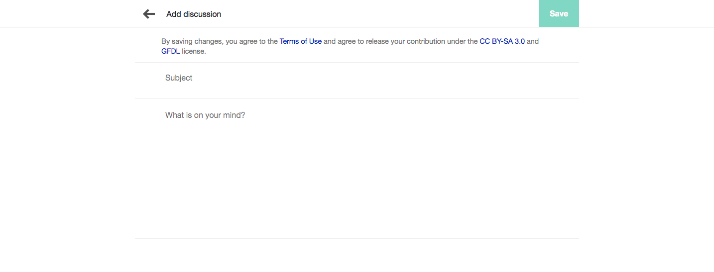
The input and textarea elements don't have a border around them. We should apply mw-ui-input classes to them and delete rules that remove border. Also the subject input field has an extra margin-bottom which is creating extra uneven extra space between fields. That margin needs to be removed too.

A picture is worth a thousand words as they say:

Screen Shot 2015-07-06 at 6.26.21 AM.png (1×2 px, 88 KB)

Event Timeline

bmansurov raised the priority of this task from to Needs Triage.
bmansurov updated the task description. (Show Details)
bmansurov subscribed.

This is not a regression and is by design and has always been this way... just as the editor has.

Jdlrobson renamed this task from Regression: Talk overlay inputs to Design: Talk overlay inputs.Jul 6 2015, 9:45 PM
Jdlrobson assigned this task to KHammerstein.
Jdlrobson set Security to None.
phuedx renamed this task from Design: Talk overlay inputs to Talk overlay inputs don't have borders.Jul 7 2015, 3:22 PM
phuedx updated the task description. (Show Details)
phuedx edited projects, added Design, MobileFrontend; removed Web-Team-Backlog.

@KHammerstein, we'd appreciate your input here. Thanks.

Jdlrobson triaged this task as Lowest priority.Sep 16 2015, 6:45 PM

@bmansurov i think whoever designed it they meant it to be similar to this interface.

Screen Shot 2015-11-30 at 11.29.41 AM.png (862×1 px, 31 KB)

I think what you are saying is it's not obvious enough that those are fields? is that right.

The things that we can fix here are fixing the hight of those two fields. , maybe focusing the subject field by default. so on mobile phones the keyboard is up.

@Nirzar, those fields don't conform to the living styleguide as you can see in [1]. I think we should be consistent here by adding borders.

[1] http://tools.wmflabs.org/styleguide/desktop/section-1.html#section-1.1

@bmansurov that is not the official styleguide though and the editor screen does not use those classes either. I'd rather not revisit these designs but it does seem something that @Volker_E and @violetto might want to think about.

All please note that this bug is lowest priority so please do not spend too much of your time here.

OK, I just wanted to clarify the work that needs to be done so that Google Code In students can work on this task.

Wondering if this would be fine to make the additions as requested. Possibly by following the style guides linked above.

@Justin-Leung, I tried to reach you back on IRC, where are you hanging out?

I needed some context. I imagine this is part of Flow on mobile, but I wasn't able to replicate this interface.

@bmansurov thanks for the link, also wasn't able to find it. @violetto Sorry, I didn't have an account for IRC yet. Should be good now.

Like said above an image is worth a thousand words. I removed the margin and added the mw-ui-input to the input and text-area. This was the final result. Would this be acceptable for the change?

Changes.png (480×958 px, 32 KB)

@Justin-Leung and I spoke to make these changes: Justin, all I did was adding mw-ui-input to input and textarea.

Screen Capture on 2015-12-22 at 17-55-04.gif (426×998 px, 369 KB)

We probably need to add new classes for the couple other changes I made:

  • Double the size of left/right padding to align with the arrow above
  • Remove margin-bottom on input so they stack

I'll let @Volker_E advise on the possibility of adding additional classes as Justin was considering earlier when we spoke.

Should I make these revisions and create a new patch.
I can create new classes following the guidelines then work from there.

@Justin-Leung @violetto So, what do you think the end result should look like?
You don't want it to be a messenger/webmail like interface with only border-bottom? You prefer to go for "boxed border" inputs?
I can provide both solutions in mediawiki.ui and I'm slightly in favor of the border-bottom solution.

Screen Capture on 2015-12-22 at 17-55-04.gif (426×998 px, 369 KB)

We probably need to add new classes for the couple other changes I made:

  • Double the size of left/right padding to align with the arrow above
  • Remove margin-bottom on input so they stack

@Volker_E ^

I would also add that when these fields are edge-to-edge on the screen, the border-radius is set to 0. I'll leave it up to you guys to decide how to achieve these technically.

So the changes we want set will be the ones listed below. Also with the additions of new classes.

Changes:

  1. Double the size of left/right padding to align with the arrow
  2. Remove margin-bottom on input so they stack
  3. Make fields full-screen or edge-to-edge on the screen
  4. Set border-radius to 0

@violetto ok I'll add the changes and submit the patch set. Have a great christmas!

Florian added a subscriber: KHammerstein.

@Justin-Leung Great to see that you want to work on this task! If you've any question, feel free to ask :)

Thanks Justin, happy holidays to you too!

mm

@Florian @violetto thank you!

I was wondering where the code base is located for this change? Or if I need to install any extensions. Thank you

Victorbarbu subscribed.

I am going to try to solve this :)

So the changes we want set will be the ones listed below. Also with the additions of new classes.

Changes:

  1. Double the size of left/right padding to align with the arrow
  2. Remove margin-bottom on input so they stack
  3. Make fields full-screen or edge-to-edge on the screen
  4. Set border-radius to 0

Is this the final requirement for this job?

Change 263143 had a related patch set uploaded (by Victorbarbu):
Refine design on New Talk overlay (MobileFrontend)

https://gerrit.wikimedia.org/r/263143

I decided not to set the panel to fit the screen's width, It seems to look better. Also, the max-width seems to only show on desktops, because on mobile, the panel has width 100%.

Here is a screenshot.

Change 263143 merged by jenkins-bot:
Refine design on New Talk overlay (MobileFrontend)

https://gerrit.wikimedia.org/r/263143

@Victorbarbu the screenshot looks good. I visited the link that Baha shared again to check out the changes. The subject line's bottom margin is large, and the focus state is missing. I remember we used to have focus states, we did right?

cc @Volker_E

Screen Shot 2016-01-11 at 5.00.22 PM.png (547×1 px, 46 KB)

@violetto, you cannot check that page because the changes have not been deployed yet, apparently, that's not my version...

I thought it could have been because the panel is no longer full width. But your version has focus states yea?

I finally saw it in action, thanks @bmansurov.

Looks good!