In English language article go to Geographical distribution section - the pie chart is not displayed correctly:
{{Pie chart
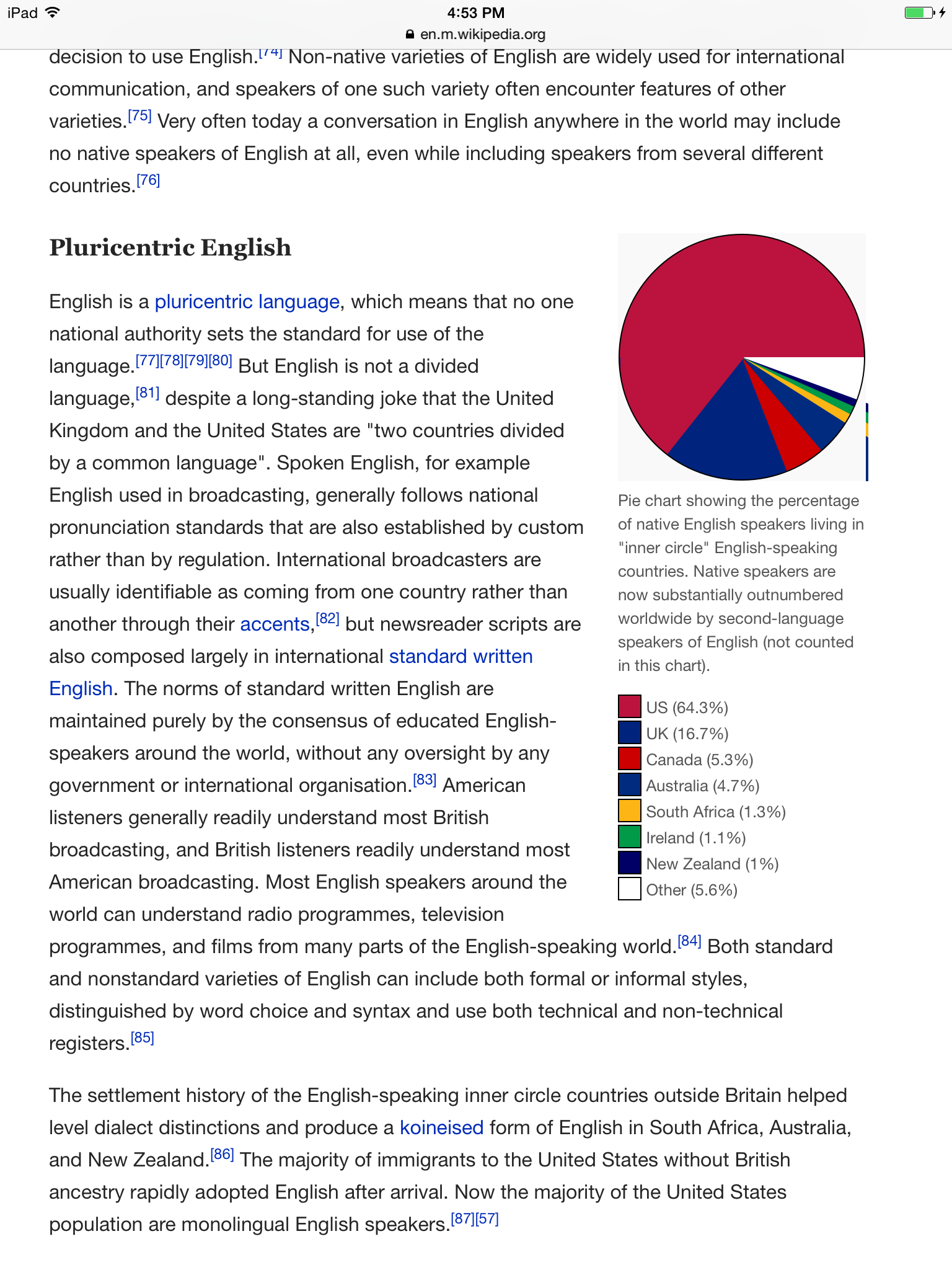
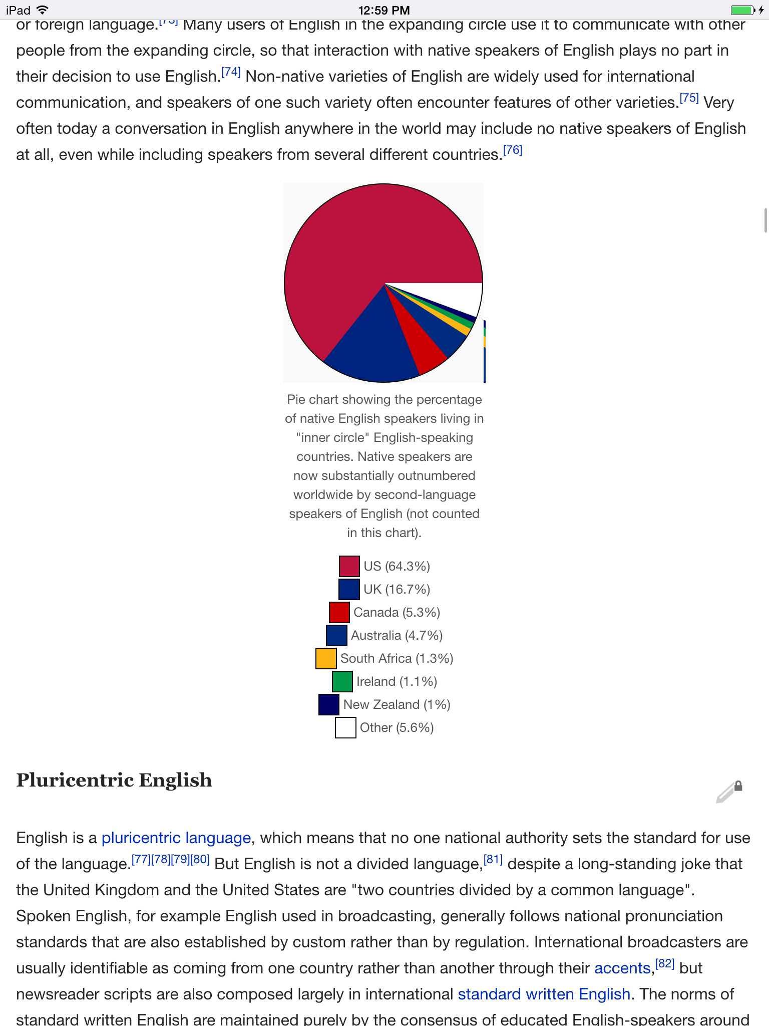
|caption=Pie chart showing the percentage of native English speakers living in "inner circle" English-speaking countries. Native speakers are now substantially outnumbered worldwide by second-language speakers of English (not counted in this chart).
|other=yes
|value1={{#expr:231/359*100 round 1}}
|label1=US
|color1=#BB133E
|value2={{#expr:60/359*100 round 1}}
|label2=UK
|color2=#00247D
|value3={{#expr:19/359*100 round 1}}
|label3=Canada
|color3=#CC0000
|value4={{#expr:17/359*100 round 1}}
|label4=Australia
|color4=#002B7F
|value5={{#expr:4.8/359*100 round 1}}
|label5=South Africa
|color5=#FCB514
|value6={{#expr:3.8/359*100 round 1}}
|label6=Ireland
|color6=#009A49
|value7={{#expr:3.7/359*100 round 1}}
|label7=New Zealand
|color7=#000066
}}Note:
- other pie charts, e.g. in Pie chart article, look ok.
- Mobile Web displays the pie chart correctly: