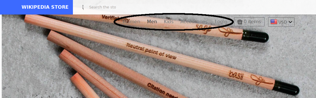
The menus for the different categories in the shop are very hard to see.
- They not stand out, such that various users have failed to notice they were there in the first place and thought the shop only contained the three featured items further down. The menu needs some sort of highlighting in order to separate it from the relatively busy background image, as well as catch the eyes of the users in general, which for a primary thingy they'd be wanting to use is important.
- They are hard to read due to the lack of colour contrast. In particularly, many of the images use grey backgrounds. Grey text on grey backgrounds is not good.
Menus are circled: