Page MenuHomePhabricator

Add responsive design to window sizes between 895px and 1165px
Open, MediumPublic

Description

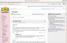
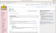
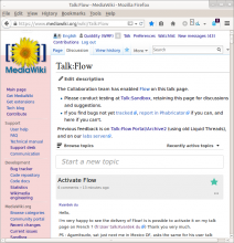
When resizing my window, there is a 'deadzone' of unresponsive-ness between 895px and 1165px.
The width should keep expanding for those last 270px

Screenshot from 2015-07-28 17:19:59.png (775×749 px, 159 KB)

Screenshot from 2015-07-28 17:20:05.png (775×848 px, 164 KB)

Screenshot from 2015-07-28 17:20:12.png (775×908 px, 164 KB)

Screenshot from 2015-07-28 17:20:15.png (775×983 px, 166 KB)

Screenshot from 2015-07-28 17:20:22.png (775×1 px, 168 KB)

Screenshot from 2015-07-28 17:20:28.png (775×1 px, 205 KB)

Screenshot from 2015-07-28 17:20:36.png (775×1 px, 206 KB)


reported at https://www.mediawiki.org/wiki/Topic:Sktnu6pt2re51u8y


See also T93675: Should be a standard way to access tablet browser width threshold
Event Timeline

Quiddity raised the priority of this task from to Low.
Quiddity updated the task description. (Show Details)
Quiddity subscribed.
Restricted Application added a subscriber: Aklapper. · View Herald Transcript
Quiddity set Security to None.
Quiddity raised the priority of this task from Low to Needs Triage.Aug 5 2015, 11:18 PM
Catrope triaged this task as Medium priority.
Catrope subscribed.

I recall that numbers were calculated for the sizes to be the same before and after each breakpoint. It may be a good idea to find the original ticket where the sidebar was discussed to check the values, or do the calculations again.