Currently there are several different types of buttons (examples based on mw theme):
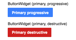
- Primary buttons (solid coloured buttons, updated 2016-03-16 to reflect resolved T110555)
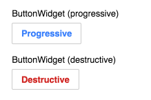
- Non-primary buttons (framed white buttons, updated to reflect resolved T110555)
- Frameless buttons (they look like links with extra padding)

- Frameless buttons styled like tabs (message dialogs)

The distinction between when to use primary vs non-primary buttons is vague and seemingly arbitrary. As different versions for primary/non-primary buttons only exist for progressive, constructive, and destructive styles, and having multiple progressive, constructive, and destructive buttons on the same form is generally a sign that the form is a horrible mess and needs to be redone (not necessarily an issue with anything ooui I've seen yet, but there are extensions that would have this problem if converted, and the thing they share in common tends to be that they really are just a mess), this should be reconsidered.
Frameless buttons by themselves are, essentially, simply not buttons. If having buttons somewhere is out of the question, a link should be used. However, it appears that a primary purpose for frameless buttons is also to allow for other styles of buttons to be specified (such as in message dialogs). This should be avoided, as it adds unnecessary complexity for users to parse, designers to design around, and developers to implement and maintain. If the existing buttons do not work or look good in a particular setting, the reasons why should be determined and addressed within the overall theme/form/whatever.
These different button types should be standardised into a single style that adequately supports all use cases.