Description
Description
Details
Details
| Subject | Repo | Branch | Lines +/- | |
|---|---|---|---|---|
| [DEPRECATING CHANGE] Create single icon for language/translation | oojs/ui | master | +49 -38 |
| Status | Subtype | Assigned | Task | ||
|---|---|---|---|---|---|
| Open | None | T55733 Use the same icons to represent the same things (tracking) | |||
| Resolved | Esanders | T121976 Don't use 大 ("big") character for translation icons | |||
| Resolved | Esanders | T111040 Duplicate icons: 'Translation' and 'TextLanguage' |
Event Timeline
Comment Actions
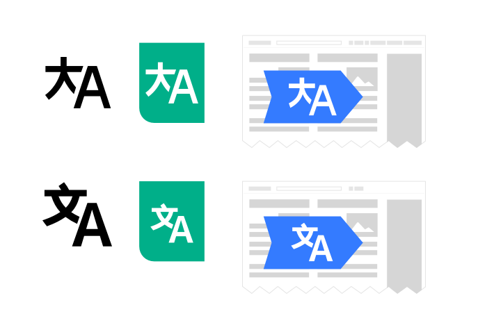
The Chinese character used in 'Translation' is confusing because it means 'big'.
We should either use the VE icons which uses the 'a' vowel from Japanese Hiragana 'あ', or if Chinese, the 文 character which means 'langauge' (and is used by Google translate)
Comment Actions
Change 263410 had a related patch set uploaded (by Esanders):
[DEPRECATING CHANGE] Create single icon for language/translation
Comment Actions
Change 263410 merged by jenkins-bot:
[DEPRECATING CHANGE] Create single icon for language/translation
Comment Actions
I went with @violetto through the before/after comparison:
The used icons work well, but the space between characters and character size may benefit from some small adjustments.
@violetto created an adjusted version taking consistency and the above considerations into account that we should probably be using:
Comment Actions
@violetto created an adjusted version taking consistency and the above considerations into account that we should probably be using:
Can you share all 3 svgs?
Comment Actions
@violetto created an adjusted version taking consistency and the above considerations
"Consistency" - It's more important to be consistent with the icon set, than consistent with previous versions of the icon. This icon is going to appear close alongside other icons in various contexts (e.g. the VE toolbar). The 'A' used is the same as other icons in the set, as is the spacing and size.
The icon could be enlarged within the green a blue fields, as I don't think we have anything to compare those to yet.
"Above considerations" - what are you referring to here?
Comment Actions
I'm referring to the icons from the designers icon repository.
Those have been created mainly by @violetto and they follow a common style (i.e., similar line thickness, spacing, rounded corners, etc.) and are user in different products too.
If I need to create a new icon I normally upload them to the "not final" folder for @violetto to review and adjust if needed, in order to avoid the style to differ too much. Then it is incorporated into the project (or updated if we had to include an earlier version due to time constraints).
With icons, as with other aspects of user interaction, I expect them to move from design assets into production assets. I'm not aware of the path the VE icons followed, but I agree with you that their style is different (e.g., the trash can is not like the one in the design repo). So I think it would be good to get more clarity on the process from UI-Standardization to make sure we avoid inconsistencies (i.e., all icons defined following the same style and coming from the same place).
The icon could be enlarged within the green a blue fields, as I don't think we have anything to compare those to yet.
"Above considerations" - what are you referring to here?
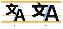
I'm talking about the following:
- The separation between characters seems too small compared to the width of the strokes.
- Adjusting the vertical alignment to make each character not to be much above the other leaves room to be used by the characters.
Below I added some quick visual comparison at large and small sizes:
@violetto may add more details since she was the one reviewing the icon in detail, I just pinged her as a standard practice.
Comment Actions
All OOUI icons are in the OOUI repository and can be viewed on one page in the demo:
https://doc.wikimedia.org/oojs-ui/master/demos/#icons-mediawiki-mixed-ltr
That is the canonical source of SVGs, the place when ResourceLoader pulls them from when serving them, and the place when people can contribute new ones and those changes can be reviewed.
The spacing and alignment tweaks seem fine, but I think the proposed version looks a little too large compared to others on the 24px grid.
Comment Actions
Thanks for the link @Esanders. The page is useful to get an overview of the current icons (e.g., it helped me to notice that the trash icon is no longer out of sync as I recalled).
However there are some processes that are not as fluent as they should (e.g., compared to the material design icon page): it is not clear how to get the SVG files to (a) use them in mockups, and (b) submit new icons or changes to the current ones.
@Catrope helped me to clone the right repo recently, but having clear steps documented would be helpful as part of the design guidelines (that's why I was pinging UI-Standardization).
The spacing and alignment tweaks seem fine, but I think the proposed version looks a little too large compared to others on the 24px grid.
@violetto may want to check this.
Comment Actions
@Pginer-WMF your desc here is accurate. It's worth mentioning again that OOjs UI icons used to have its own set of icons that differ from Wikifont icons. Although OOjs UI has adopted Wikifont icons, there are still remaining pieces of OOjs UI icons that VE uses but not available on Wikifont.
With that, there will definitely be an inconsistency because those two icon libraries look different.
Re: processes
This we hope to get more answers in Q3. :)