| Type | Before | After |
| Anonymous editing | ||
| User editing |
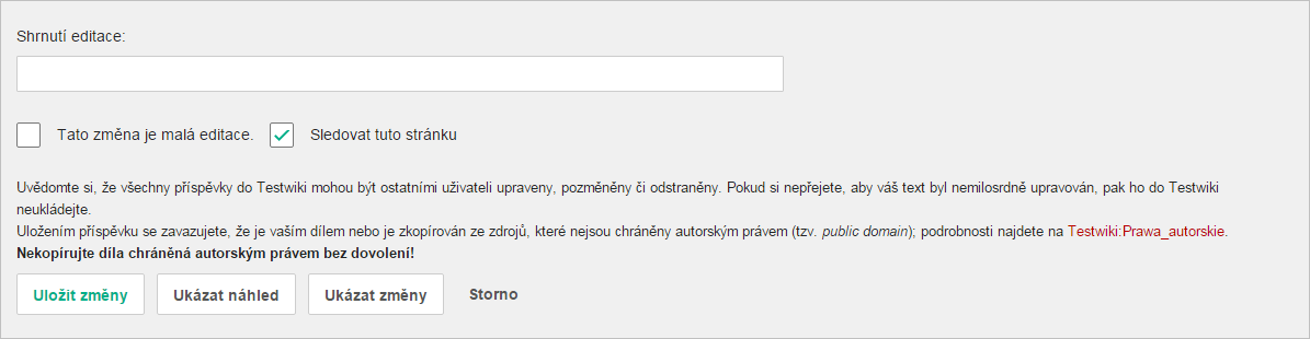
Description
Description
Details
Details
| Subject | Repo | Branch | Lines +/- | |
|---|---|---|---|---|
| Convert EditPage buttons, checkboxes and summary input to OOUI | mediawiki/core | master | +297 -64 |
| Status | Subtype | Assigned | Task | |
|---|---|---|---|---|
| · · · | ||||
| Open | None | T101471 Convert core forms that use MW UI with wgUseMediaWikiUIEverywhere false to OOUI FormSpecialPage or explicit OOUI PHP | ||
| Open | None | T100270 Replace use of jQuery UI and MW UI with OOUI across all Wikimedia-deployed extensions and core | ||
| Resolved | • Whatamidoing-WMF | T162849 Support WMF communities in run-up to switching EditPage over to OOUI | ||
| Resolved | Jdforrester-WMF | T64316 Update CSS of input#wpSummary from "width: 80%" to "width: 100%" | ||
| Resolved | matmarex | T111088 Convert EditPage.php to use OOUI rather than MW UI | ||
| Resolved | matmarex | T120419 HorizontalLayout broken in Apex | ||
| · · · |
Event Timeline
There are a very large number of changes, so older changes are hidden. Show Older Changes
Comment Actions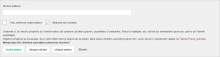
and now? What color (button class) of Save button will be there in order to make it different from remaining two if green is not supported anymore?
Isn't a change in T110555 colision with this? On testwiki this was a preview three months ago:
and now? What color (button class) of Save button will be there in order to make it different from remaining two if green is not supported anymore?
Comment Actions
One important (missing) thing from a user experience perspective would be to use frameless ButtonWidgets for the “Cancel”/“Editing help“ links.
When dealing with mobile viewports it's easier to make them adapt and they also shouldn't be in text color.
Comment Actions
Looking at the screenshots only – the "Editing help" link is a link, not a button. It just links to the page with help about editing – it does not perform any action, like buttons do. It should remain a regular, blue link. (Slightly related: T156885)
Comment Actions
Yes, @matmarex thanks for pointing this out. My shared concern was mostly about sudden change to text color and Cancel. Agreed, “Editing help” should be a link.
Comment Actions
+1 to "Editing help" being normal linked blue text.
"Cancel" should either be a quiet-destructive button (per https://doc.wikimedia.org/oojs-ui/master/demos/#widgets-mediawiki-ltr-desktop ) or just normal linked blue text. Black-text should almost never be a link - that just makes all black-text into potential links, which confuses everyone.
I'd encourage making "Preview" into a quiet-progressive button, as "preview before saving" is a really good habit (a best-practice) for all editors.
Comment Actions
Screenshot of @Quiddity's changes:
| Now | 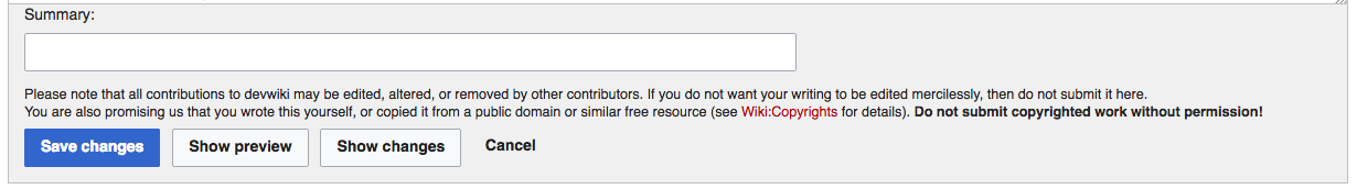 |
| After | 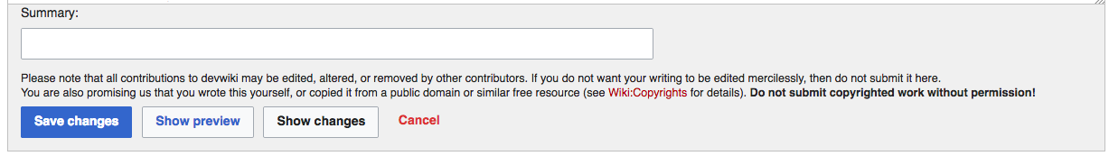 |
We'd still have a black button, but it clearly looks like a button.
Comment Actions
but several similar-weighted actions instead.
Mixing the primary progressive button with the quiet-progressive button is not a good idea from a pattern perspective.
@Ladsgroup I'd not recommend to make “Cancel” a framed button, there's already too much going on.
Two options are somewhat seen critical at the end of a form as general UX approach, here we would end up with four buttons side-by-side.
I'm also strongly against turning “Show preview” into a quiet-progressive button. If that element is so important, we have to think about other ways to emphasize this. From a UX guideline standpoint, there should be at max one primary button per view to guide user focus, here “Save changes”.
The quiet-progressive buttons have been invented for places, where there is not one primary action, like in the edit dialog
but several similar-weighted actions instead.
Mixing the primary progressive button with the quiet-progressive button is not a good idea from a pattern perspective.
Comment Actions
As you can see, the effect of primary action is marked by a striking green button, the opposite action to primary is marked by a striking red cancel button and the other two buttons between are marked by less striking blue button and both the same, in order not to stand out among primary ones. Yes, the whole look is a little bit over-coloured, but the concept is clear, simple and user-friendly. I would suggest something like this:
It could be quiet-proggressive or normal, but both the same, not one quiet-proggressive and second one normal.
In my opinion if you turn "Show preview" button into a quiet-progressive form, the aggrieved one would be the "Show changes" button, because it becomes less distinct and noticeable.
Similar problem I see in the cancel link/button, because without frame, it is just insignificant and users just don't even notice there is some fourth button/link for cancelling. I'd like to share gadget on cswiki:
As you can see, the effect of primary action is marked by a striking green button, the opposite action to primary is marked by a striking red cancel button and the other two buttons between are marked by less striking blue button and both the same, in order not to stand out among primary ones. Yes, the whole look is a little bit over-coloured, but the concept is clear, simple and user-friendly. I would suggest something like this:
It could be quiet-proggressive or normal, but both the same, not one quiet-proggressive and second one normal.
PS: Sorry for Czech labels, I just used that gadget on cswiki and changed colours in Chrome devtools...
Comment Actions
@Dvorapa Where do you get that from:
users just don't even notice there is some fourth button/link for cancelling
Comment Actions
@Volker_E I haven't got any statistics, but I can say my experience. I edit Wikipedia pages since cca 2009 (as registered since 2011), and I noticed there is a cancel link in November 2015 (when I discovered OOJS UI and created the gadget shown above). I think the button must be there since current wikitext editor (when was it deployed to Wikipedias?). Maybe some event logging/longage statistics/user testing would say, if I'm the only one exception or if it is more general problem (e.g. in comparison to watch checkbox, which is I think the second rarely used element there, yet still important).
Maybe some event logging/longage statistics/user testing for some possibilities of an appearance of these four links/buttons would help to decide, which possiblities to consider most.
Comment Actions
I use the Cancel link/button, with some regularity. It's the fastest way to reload the page, into view-mode - the main alternative is scrolling to the top of the window, and clicking the page-tab.
In most circumstances, users can also hypothetically click the browser back-button, but that's less intuitive to non-technical folks who just want to 'cancel' their edit (whether it's an article edit or a new comment they've reconsidered).
[edit: It also doesn't work if I used the preview button at all, which makes the back-button work differently]
It also doesn't work if we used a non-generic method to access the edit page, e.g. via Navigationpopups, or an E:Inputbox link.
I would suggest that having the 2 buttons in different colors would inspire some new-user-curiosity, versus having them be a matching pair.
Similar problem I see in the cancel link/button, because without frame, it is just insignificant and users just don't even notice there is some fourth button/link for cancelling. I'd like to share gadget on cswiki:
It currently has just plain blue text, which does make it blend in. I think the red text will help make it noticeable to the few people who want that function.
I think making it a full button would emphasize it too much. Especially since colors still have different meanings in different cultures (despite the negative effects of globalization, and standardizing effects of traffic lights!).
Ok. I do encourage that thinking, then. :-)
I use the Preview button an average of a bit over once per edit, and encourage everyone I mentor to do the same. The preview button is your friend!
Comment Actions
What do you want people to use? Back button or closing the tab? Be aware that users get confused by these.
Comment Actions
The Chinese Wikipedia uses a different way to emphasize the "Show preview" button: The "Save" button is grayed-out and inoperable until you've previewed your changes. Given their dual-script situation, forcing users to preview the page probably saves them a lot of grief.
Comment Actions
Compared to this old screenshot:
The buttons now have the same background color as the surrounding area, and they don't stand out much. This is probably caused by rMW3e84bc55f62b: Align editOptions section with WikimediaUI color palette.
Comment Actions
@Ladsgroup Several minor nitpicks:
- The “Watch this page” checkbox is too close on the “This is a minor edit“ label. I'd recommend a margin-right on latter
- The containing box should have a border-radius: 0 0 2px 2px as well
- With cancel becoming a quiet destructive button the padding of Cancel to the pipe should be the same on Editing help's left side
- Editing help is vertically off due to the different font-weight and line-height in comparison to Cancel
I'm not the biggest fan of using Base80 (#eaecf0) for the edit options background, but I understand the issue with the normal buttons contrast and I think it's good to go with for now. (I'll post this on the patch as well)
Comment Actions
I am requesting that this change not happen until https://meta.wikimedia.org/wiki/Tech/Server_switch_2017 is over (regular deployment train should resume on Tuesday, 9 May 2017).
Comment Actions
Since now it's using a config variable, I think we won't enable it until the switchover is done but I hope this gets merged really soon. I'm tired of constant rebasing.
Comment Actions
Before we enable this on Wikimedia wikis, we should also update WMF-deployed extensions that add fields to that form. For example, FlaggedRevs adds an extra checkbox (only shown to reviewers), and TemplateStyles adds an extra text field (only for templates).
Comment Actions
Change 231600 merged by jenkins-bot:
[mediawiki/core@master] Convert EditPage buttons, checkboxes and summary input to OOUI
Comment Actions
This is done now.
Note that Wikimedia wikis have this still disabled for now. I'm not sure when we want to enable it (someone should file a task about that). At the very least, T161809 needs to be resolved before that happens.
Users can already test gadgets/scripts/etc. to see if they are compatible with the new interface by adding '&ooui=1' to the URL, for example https://en.wikipedia.beta.wmflabs.org/w/index.php?title=Albert_Einstein&action=edit&ooui=1.
Comment Actions
It's great. I will work on T161809: Update extensions not to use deprecated EditPageBeforeEditChecks hook subtasks but first, the cancel button has a weird small white border. Is it a oojs-ui bug?
Comment Actions
Users can already test gadgets/scripts/etc. to see if they are compatible with the new interface by adding '&ooui=1' to the URL, for example https://en.wikipedia.beta.wmflabs.org/w/index.php?title=Albert_Einstein&action=edit&ooui=1.
But only on the beta cluster? This will work on the other wikis once wmf.21 has been deployed?
Comment Actions
OK. My inclination would be to wait with announcing the upcoming change in Tech News until wmf.21 has been deployed, so that it's easy for users to test gadgets and scripts, but that assumes there's still enough time to do so before it's enabled. Does that make sense?
Comment Actions
That makes sense to me.
(I only linked to the beta site since the change isn't live yet and I wanted to have an actual example of a working link.)
Comment Actions
No; the code's already written, and I was going to get it merged in a month or so after the last Wikimedia wiki is switched over to use it and we're confident.