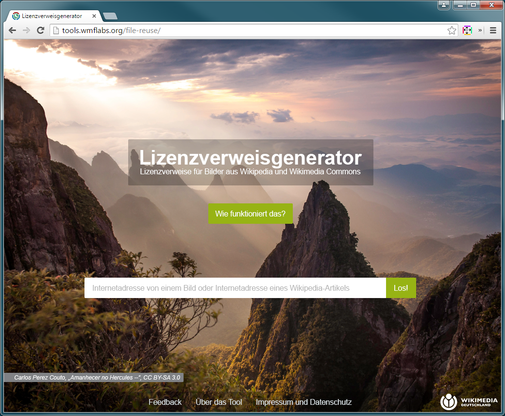
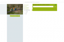
Create the screen design for the dialogue.
Description
Description
| Status | Subtype | Assigned | Task | ||
|---|---|---|---|---|---|
| Resolved | Snaterlicious | T113584 [AG] Create dialogue design | |||
| Resolved | • KasiaWMDE | T103979 [AG] UX: Create wireframes for Questionnaire |
Event Timeline
Comment Actions 11
11
 17
17
 20
20
 22
22
 23
23
 24
24
 26
26
 27
27
 32
32
 37
37
 39
39
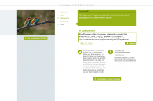
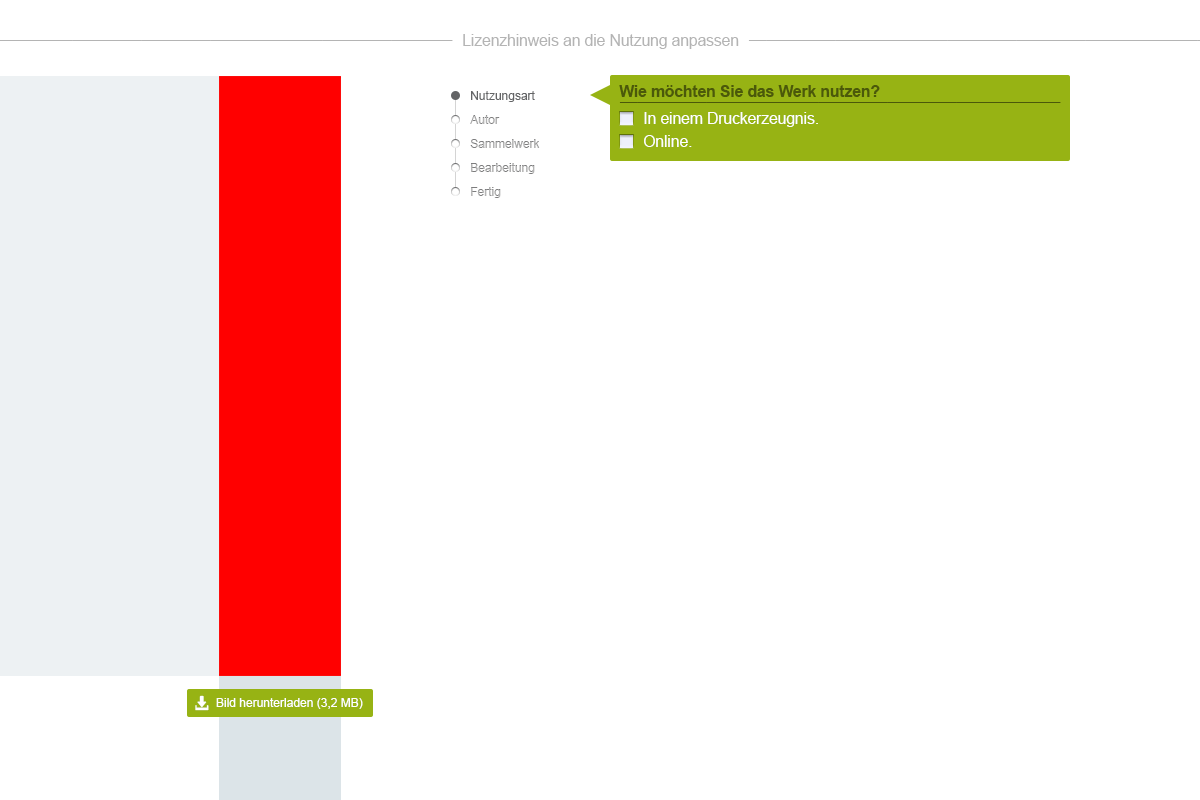
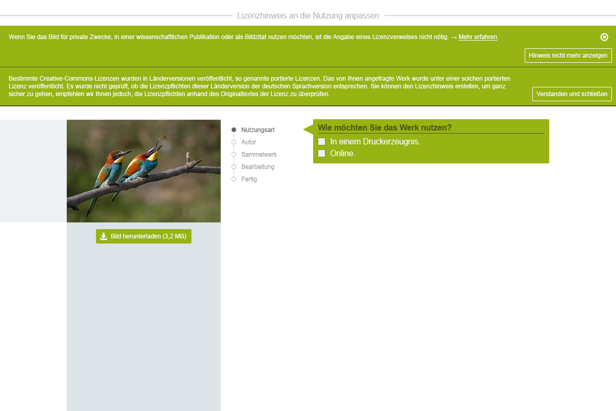
The following designs are for consideration.
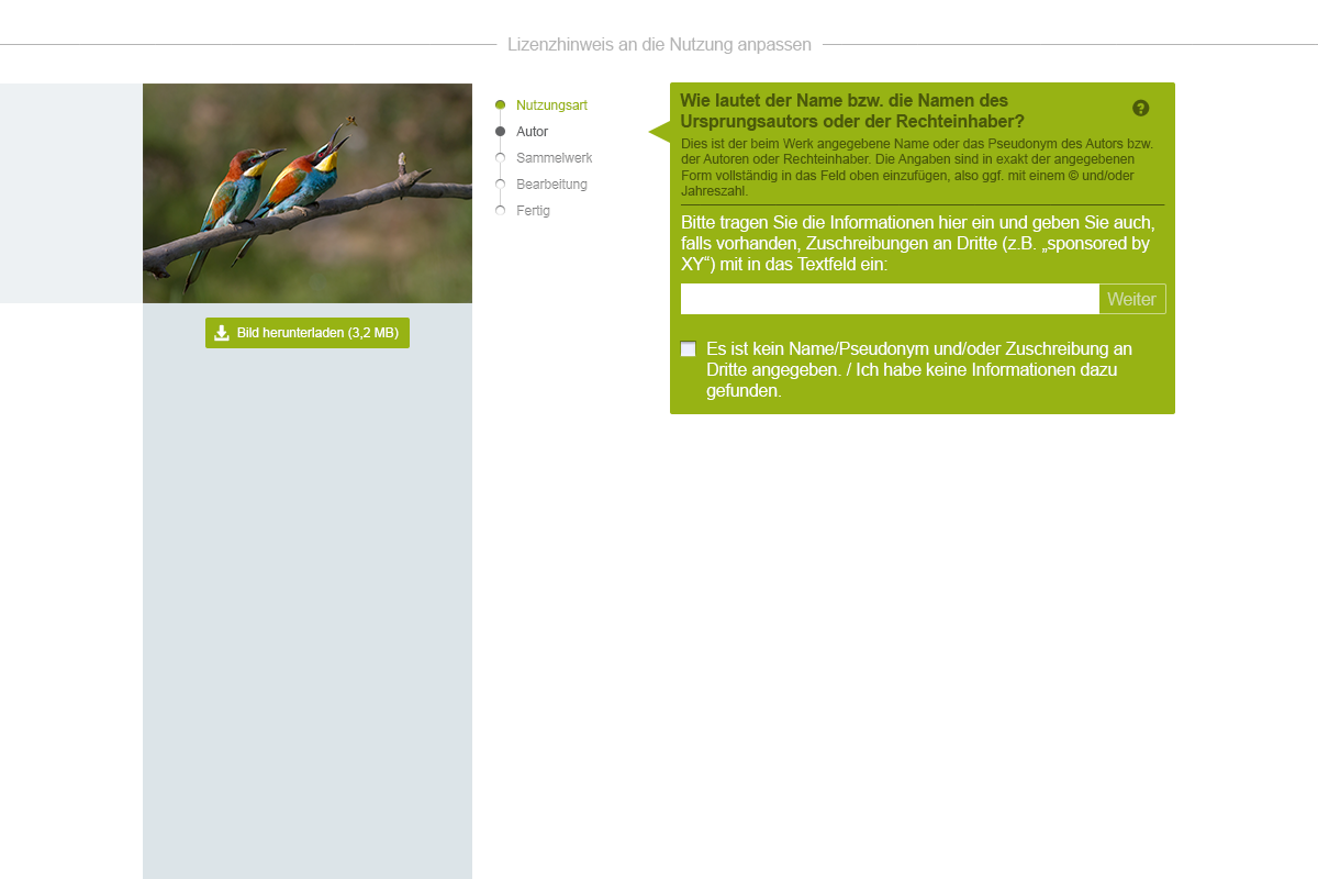
Since Bootstrap is used, these were made with a template for MD size. Numbers correspond to pages in the wire frame document of T103979. Menu bar left out by intention.


Comment Actions 10 (as the logo was requested to always be visible, this would be a general alternative)
 11
11
 17
17
 20
20
 22
22
 23
23
 24
24
 26
26
 27
27
 32
32
 32 (alternative)
 37
37
 39
39
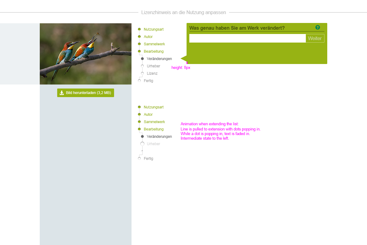
2nd iteration:


Comment Actions

Larger main navigation bar:
Navigation on questionnaire screen:

... or without vertical background bar:
Comment Actions 10
10
 10
10
 11
11
 11 (doc)
 11 (doc, with navigation)
 17
17
 17 (doc)
 20
20
 22
22
 22 (doc)
 23
23
 23 (doc)
 24
24
 24 (doc)
 26
26
 26 (doc)
 27
27
 32
32
 32 (doc)
 37
37
 39
39
 39 (doc)
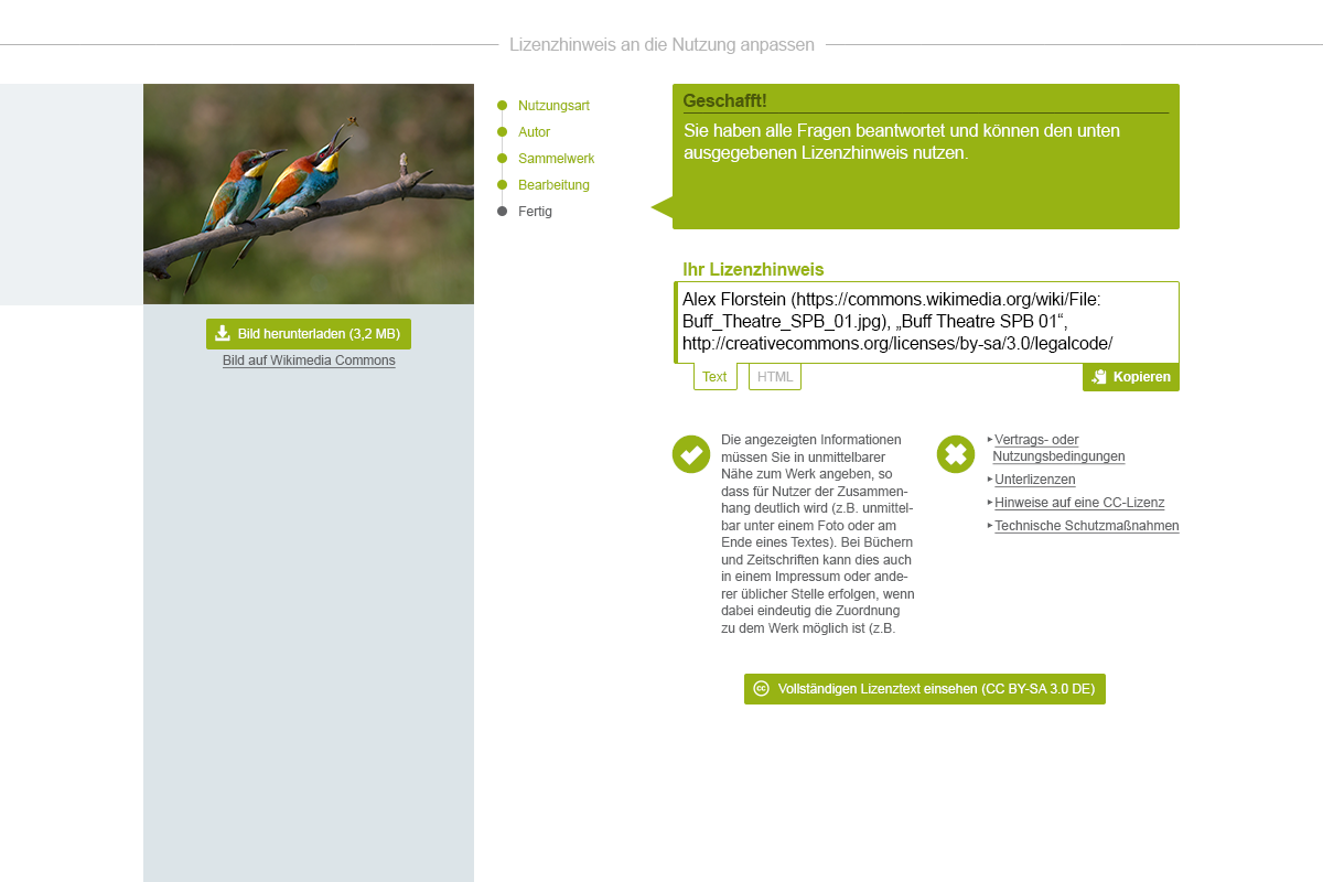
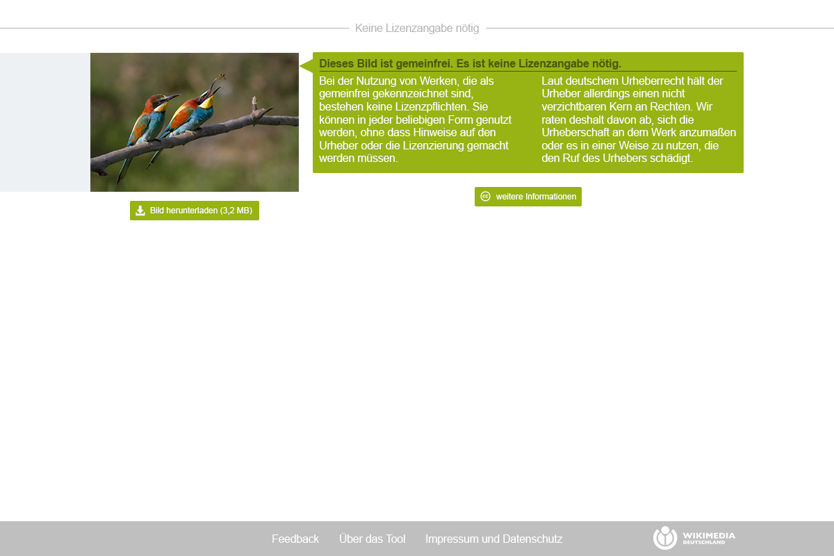
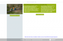
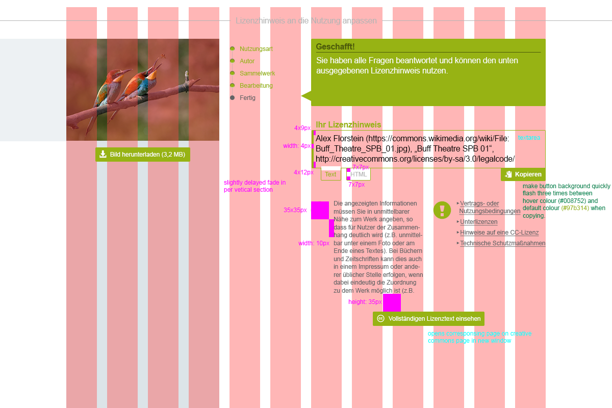
"current final result"
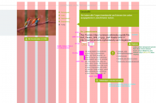
(Numbers as to pages of the mock-up document in T103979.)
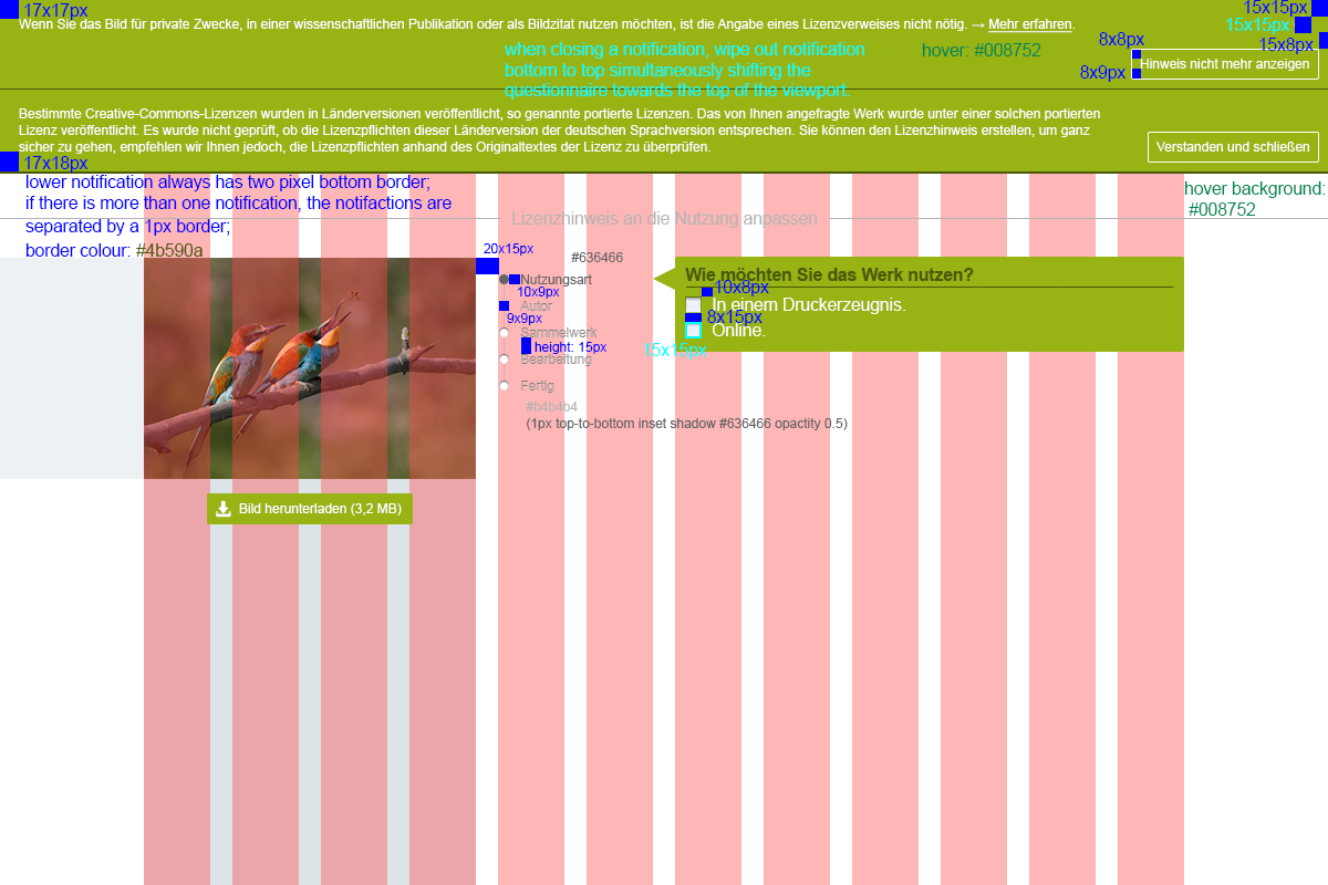
Font sizes: Base font-size 13pt, smaller font-size: 10.5pt (or 17px / 14px) - might be nice to use em though.
Colours used: #97b314 (light green*), #4b590a (dark green), #008752 (green*), #dce4e8 (bluish light grey*), #b4b4b4 (neutral light grey), #636466 (dark grey*), #ffffff (white), #000000 (black) [* colours from the WMDE style guide]
All icons are part of Glyphicons bundled with Bootstrap, except for the cc icon which is available on the Creative Commons web site.
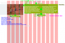
The striped background on some of the doc pages mark the Bootstrap "md" size grid. Some sizes are specific to the md size grid - you will notice.
Altered front-page:


Questionnaire pages:


Comment Actions Portrait image
 Narrow image (width < 300px when scaled to maximum height of 600px).
Handling of other image formats:
For the maximum height, we could probably also use ( viewport height minus height of the heading). Not sure if that would be feasible as the image would also need to rescale automatically when adjusting the viewport height.
Comment Actions
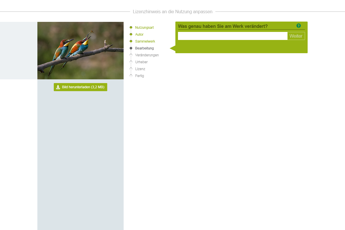
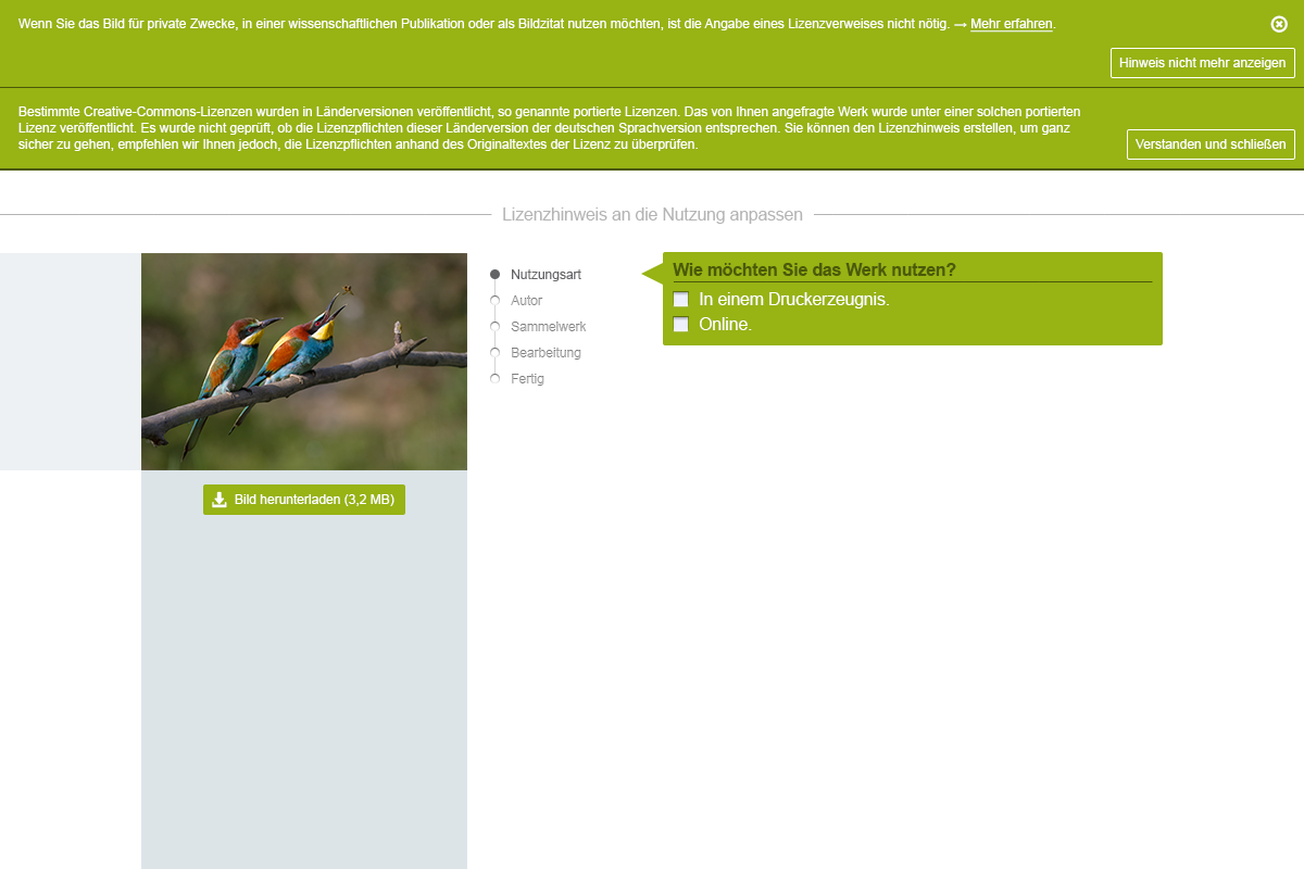
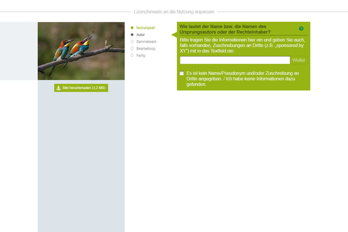
@Snaterlicious Feedback after the storytime-meeting:
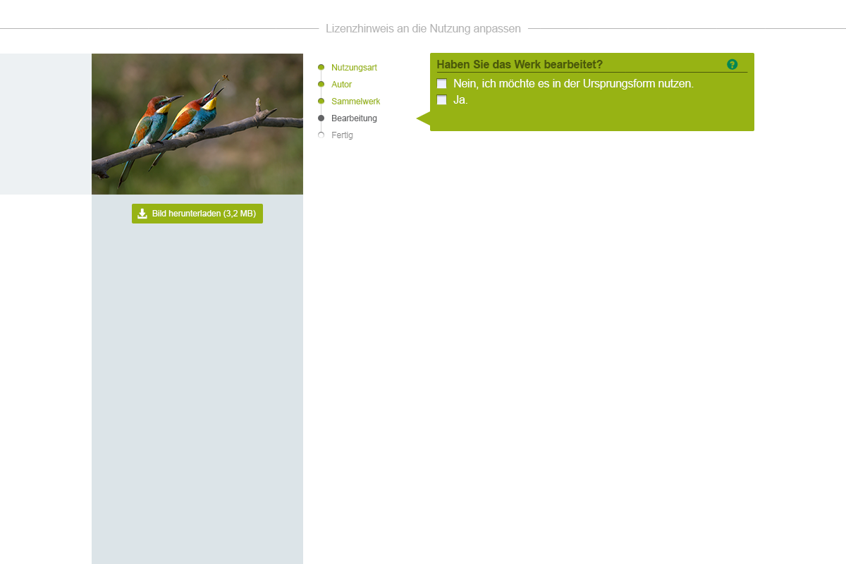
- Progressbar looks like radio-buttons, this might be misleading. Please make an alternative screen without inner shadow.
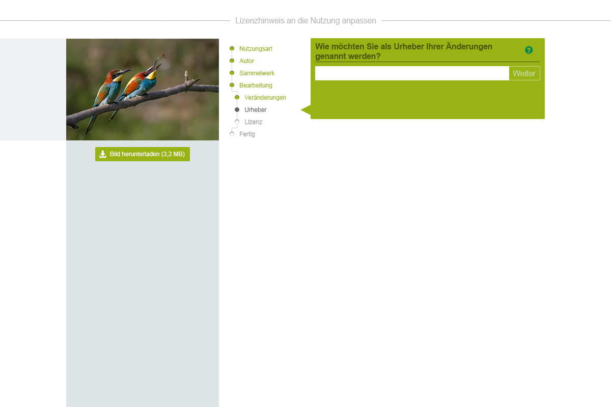
- One should be able to choose the answer by clicking on the text of the answer (not only by marking the check-box). This might collide with the linked licences in the question "Unter welche Lizenz soll das veränderte Werk gestellt werden". It has been suggested to add small licence-icons (analogous to the small question marks) for better separation of these two functions. Please make a screen for that. (https://phabricator.wikimedia.org/F2630750)
- It has been suggested that the exclamation mark icon for "Don'ts" might be misleading. Please exchange it against a cross and make a screen for that (https://phabricator.wikimedia.org/F2665880)
- On the screen with two hint boxes (https://phabricator.wikimedia.org/F2665847) the line saiyng - Lizenzhinweis an die Nutzung anpassen- might fit better over the two boxes (indicating that the boxes are part of the dialogue) instead of below. Let's see how this would look like, please make a screen.
Thank you!
Comment Actions 17 (notifications below heading)
 37: I would recommend making the link to the licence text even more explicit than an icon which does not necessarily express that clicking it leads to the licence text. Hence, I applied a text link. The contrast of the licence name in bold and the additional text link in smaller font size should be great enough to reduce the text links' obtrusiveness.
I also removed the inner shadow from the checkboxes to receive a more flat look in general as the shadows from the progress indicators are to be removed as well. 39 (exchanged "x" with exclamation mark).
Here are the updated screens (progress indicator inner shadows are removed in all screens):

I also removed the inner shadow from the checkboxes to receive a more flat look in general as the shadows from the progress indicators are to be removed as well.

Comment Actions
Thanks @Snaterlicious
- We decided to keep the previous version
- OK for the licence links but let's stay with the inner shadow (even though it might look like a radio button -> it will not be possible to click it anyway)
- OK for the "X" instead of "!"
Comment Actions
OK, no problem. But do not feel urged to not combine progress bullet points not having shadows with checkboxes having shadows. I was just thinking that an overall "flat" look might be the one which is more desired/applicable as the input boxes do not have shadows as well (could, of course, apply some). And, all in all, the bullet points do not look that bad without shadows. Sorry, for making it complicated. ;) We can briefly talk about it on Monday.
Comment Actions
@Snaterlicious can we see a mixed version (bullet points flat, checkboxes with shadows)? I think the mixed version might be the one I want to go for. If it doesn't look good, we can come back to the earlier "shadow" version (both bullet points and checkboxes.) Thanks!
Comment Actions

Here is a screen with input box and checkbox:

I think the the bullet points look quite nice without shadows as well. The problem of graphical consistency may arise more regarding input box and checkbox.
Comment Actions
@Snaterlicious OK, let's go with 23b (bullet points flat, checkbox and inout box with shadows). I will update it accordingly in the tasks. Thanks!
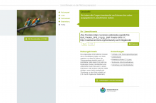
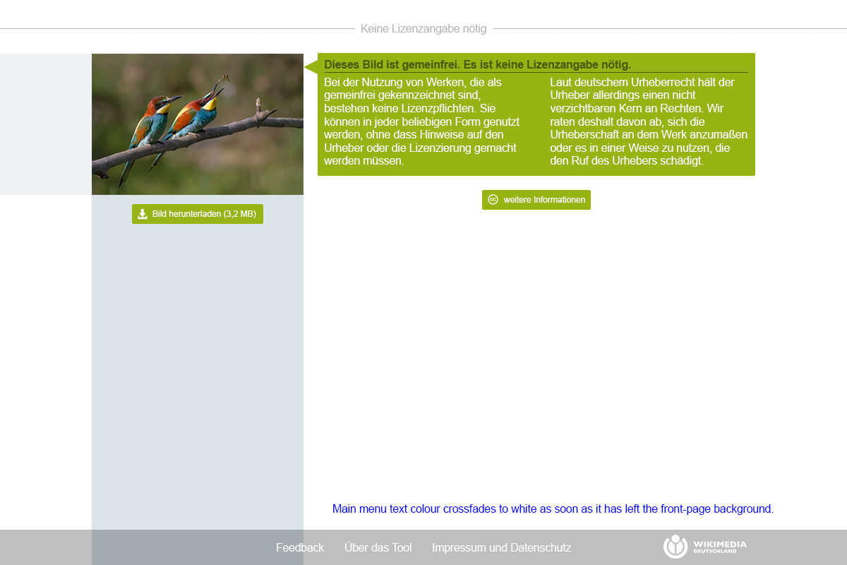
Comment Actions Button to Commons page.
 Link to Commons page. I would prefer that one as the link does not have any action. One might argue that the link to the licence texts has no particular action as well. The intention is to make the link to the licence text simply stand out more.
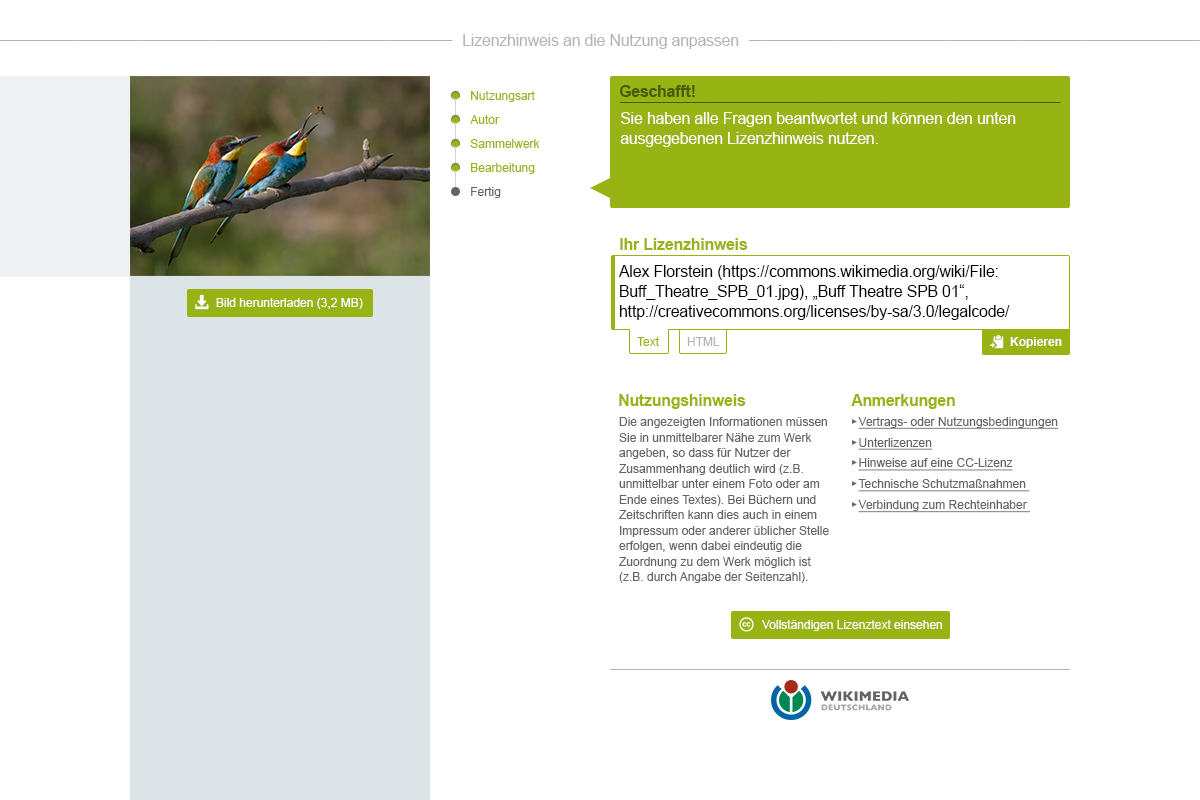
Two screens for the updated final stage. In both screens, the licence name is included in the heading "Ihr Lizenztext" and below the button "Vollständigen Lizenztext einsehen". However, I think mentioning it once is sufficient and I would prefer to have it placed below the button as the one in the heading will most likely just be skimmed over.


Linking the image itself may be done, although I would link it to the full-size image and not to the Commons page, nor should it trigger the download action.
Comment Actions
@Snaterlicious Thanks, after consultation with the Project Manager could you add another version:
*without the licence name in the heading "Ihr Lizenztext"
*With a button leading to the picture on Common or Wikipedia but just saying "Bild ansehen" (opening in a new tab) instead of "Bild auf Wikimedia Commons"
*Including the name of the licence in the button "Vollständigen Lizenttext einsehen"
Thank you!
Comment Actions
"Bild ansehen" is quite unspecific, although there is an icon in the button giving little hint. The licence name may appear quite cryptic and in my opinion the meaning of the characters become more obvious when dedicatedly stating that these represent the name of the licence.
No problem.
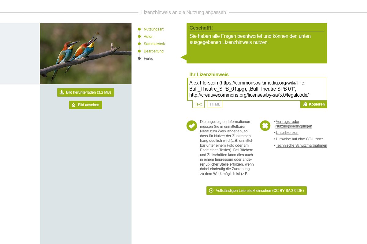
"Bild ansehen" is quite unspecific, although there is an icon in the button giving little hint. The licence name may appear quite cryptic and in my opinion the meaning of the characters become more obvious when dedicatedly stating that these represent the name of the licence.