Use search results list style for initial design
- Thumbnail
- Title
- Wikidata description
- Watch icon
Increase spacing around elements - included in mock
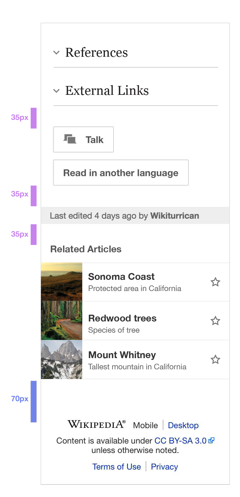
Desktop
| • KHammerstein | |
| Sep 25 2015, 5:15 PM |
| F2757904: desktop-17-17.png | |
| Oct 22 2015, 9:11 PM |
| F2660830: related-article-list-tablet-13.png | |
| Oct 5 2015, 11:26 PM |
| F2660820: related-article-list-spec-14.png | |
| Oct 5 2015, 11:23 PM |
| F2660821: related-article-list-tablet-13.png | |
| Oct 5 2015, 11:23 PM |
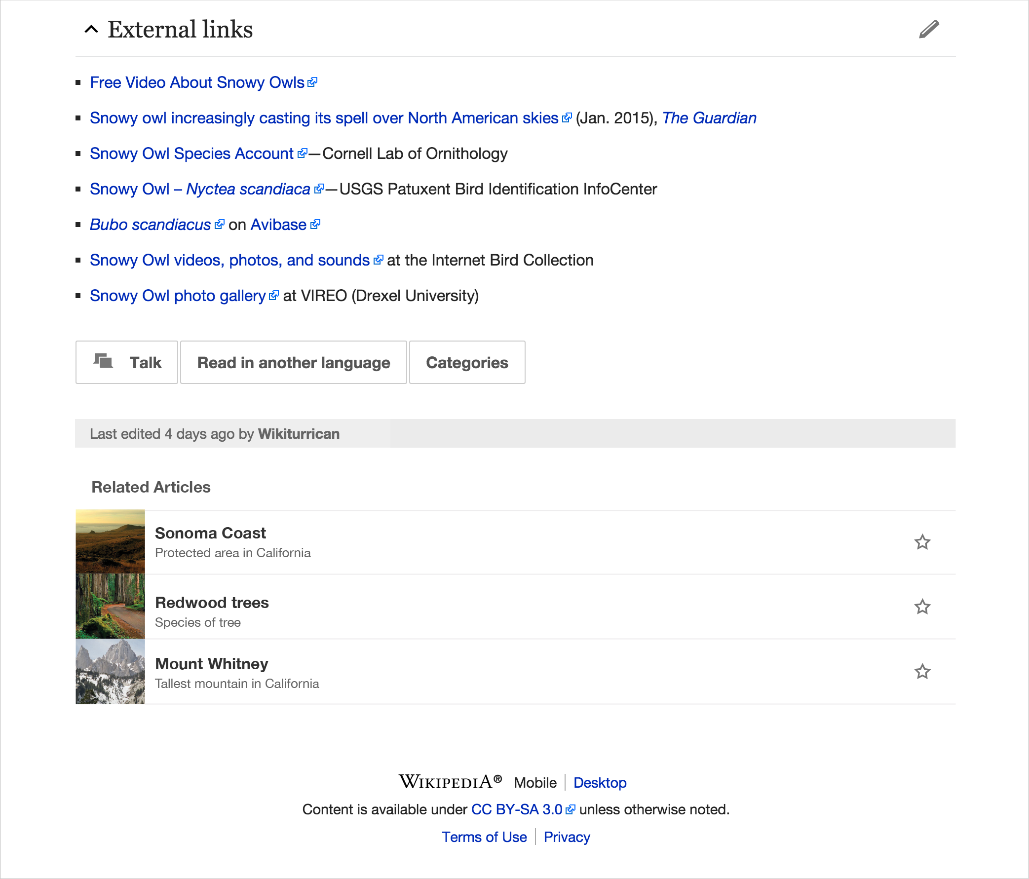
Use search results list style for initial design
Increase spacing around elements - included in mock
Desktop
| Status | Subtype | Assigned | Task | ||
|---|---|---|---|---|---|
| Resolved | Jdlrobson | T94906 [EPIC] Read more related articles after end of current article | |||
| Resolved | • bmansurov | T114303 Add EventLogging to read more | |||
| Resolved | phuedx | T113635 Implement first version of read more | |||
| Duplicate | None | T113768 Finalise RelatedArticles design |
@KHammerstein @Jdlrobson The feedback we got from user testing on gather was that each story took up too much vertical space--with this in mind, let's not increase the line length. I edited the desc. to reflect this.
^ here is the line I removed from the description: Change amount of text to first 5 lines
@KHammerstein, looks like we're moving forward with this for next sprint. Can you talk to @JKatzWMF about specifics?
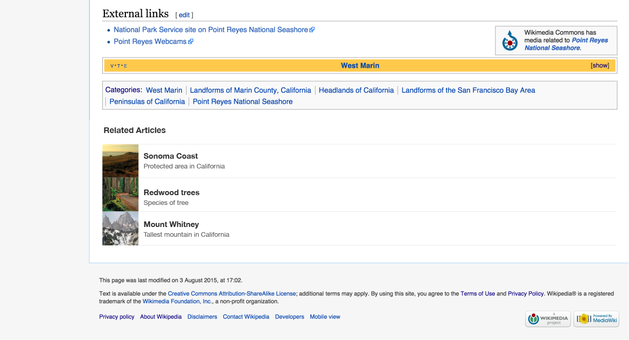
@KHammerstein i do not think we should include the watchlist icon for now. It is not used by our readers as is (in-article) and we just removed it from search results.
We haven't removed it from search results... We still have it in watchlist, search and nearby.
@Jdlrobson oh, I see it now. It's only when logged in. We should remove
them or only show them for logged in users. I am leaning towards
consistency, particularly since it could potentially be a vehicle for the
most amazing project in the world: Gather
Funny enough...
http://permalink.gmane.org/gmane.org.wikimedia.mobile/4051
"As can be seen traffic to watchstars outside the current page is low. I would suggest we therefore stop showing the watch star in search, nearby results and Special:EditWatchlist and just focus on the funnel from the page itself."
I think I pinged you about this but we never actually did anything.
You may want to analyse the data a bit more, now that we have more data collected to assess impact. How many users will this potentially annoy? Are the numbers important?
Change 244149 had a related patch set uploaded (by Phuedx):
[WIP] Add Related Articles section to MobileFrontend
@JKatzWMF @Jdlrobson
I agree, we should remove from search results. I'm not sure we should remove from here and nearby, even though the numbers are low its something we want to encourage.