Page MenuHomePhabricator

In the new interface of Special:MovePage, the "Move page" button often appears below the fold
Closed, ResolvedPublic

Description

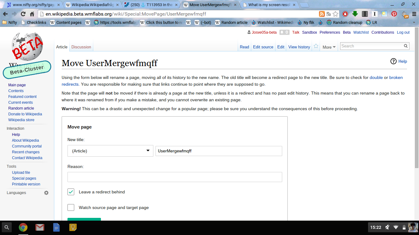
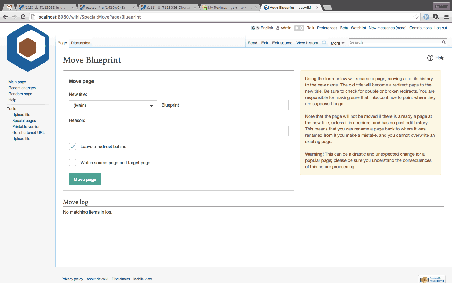
After the changes made in T86865, which made the form a bit taller, the "Move page" button on Special:MovePage often appears below the fold (you have to scroll to see it).

At 1920x1080px (probably the most common desktop resolution), it usually just barely fits (the screenshot below has 3 checkboxes, but up to 6 can be displayed). At 1366x768px (very common low-end laptop resolution) you have to scroll.

2015-09-28 15_25_56-Greenshot.png (1×1 px, 165 KB)

Event Timeline

matmarex raised the priority of this task from to Needs Triage.
matmarex updated the task description. (Show Details)
matmarex added subscribers: matmarex, Jenks24.

I think the form hits a fairly reasonable balance between density and prettiness, but there is just a lot of text above it.

Two things I see that we could do:

  • The "Move page:" fake field in the form could probably be removed entirely.
  • The "This page has a talk page, which will be automatically moved along with it unless…" warning could be displayed next to the checkbox it affects, hidden behind a clickable "i" icon.

Something like this? (Screenshot from my local testing wiki.)

pasted_file (948×1 px, 170 KB)

Change 241654 had a related patch set uploaded (by Bartosz Dziewoński):
Improve brevity of Special:MovePage form and its description

https://gerrit.wikimedia.org/r/241654

There is likely a reason for it, but perhaps that one column of checkboxes could be two columns to save some vertical space?

Change 241654 merged by jenkins-bot:
Improve brevity of Special:MovePage form and its description

https://gerrit.wikimedia.org/r/241654

The change has been made and you can see it on http://en.wikipedia.beta.wmflabs.org/. It will be deployed to Wikimedia wikis Tuesday-Thursday next week, with 1.27.0-wmf.2, according to https://www.mediawiki.org/wiki/MediaWiki_1.27/Roadmap.

There is likely a reason for it, but perhaps that one column of checkboxes could be two columns to save some vertical space?

It's an interesting idea… I wonder how many languages other than English would benefit (we couldn't really do it if the labels were even a bit longer, since it'd end up even worse with the label wrapping over two lines, and English tends to be a very terse language).

I'm not comfortable putting it into our code at the moment, but if you want to experiment yourself, the following user CSS seems to work to give you columns for checkboxes in that form.

body.mw-special-Movepage .oo-ui-fieldLayout-align-inline {
    display: inline-block;
    min-width: 50%;
    height: 2.25em;
}

pasted_file (413×757 px, 22 KB)

matmarex added subscribers: Glaisher, Matanya, Josve05a.

The namespace dropdown field is also a bit oversized, I am fixing that as T113492.

Change 242535 had a related patch set uploaded (by Bartosz Dziewoński):
Improve brevity of Special:MovePage form and its description

https://gerrit.wikimedia.org/r/242535

Change 242536 had a related patch set uploaded (by Bartosz Dziewoński):
Improve brevity of Special:MovePage form and its description

https://gerrit.wikimedia.org/r/242536

Change 242535 merged by jenkins-bot:
Improve brevity of Special:MovePage form and its description

https://gerrit.wikimedia.org/r/242535

Change 242536 merged by jenkins-bot:
Improve brevity of Special:MovePage form and its description

https://gerrit.wikimedia.org/r/242536

I've had the change backported and deployed everywhere. @Josve05a, what do you think about the current state of the page?

I'm using a 1366 x 768 screen (my schools computer, which is a Lenovo 11e Chromebook) and the move-button still is below the field of the screen. (If I have the browser at 100%, I nomrally have it on 90%, and then it looks ok!)

Screenshot 2015-10-01 at 15.22.37.png (768×1 px, 213 KB)

One sulotion to this could be to move the button to the top right corner, or implement this below as default, which would move the move button appear inside my screen again. (Or split-screen, warning text on one side, and the fields etc. on the other...

body.mw-special-Movepage .oo-ui-fieldLayout-align-inline {
    display: inline-block;
    min-width: 50%;
    height: 2.25em;
}

pasted_file (413×757 px, 22 KB)

It might also help to use two columns for the help/warning text and the form.

movepage.gif (900×1 px, 57 KB)

We might need to use heading text and some iconography to get more attention to the text on the side. I can make some options if this idea is feasible and considered.

Per T117762, the spacing has been tightened a bit more:

BeforeAfter
pasted_file (948×1 px, 170 KB)
pasted_file (946×1 px, 177 KB)