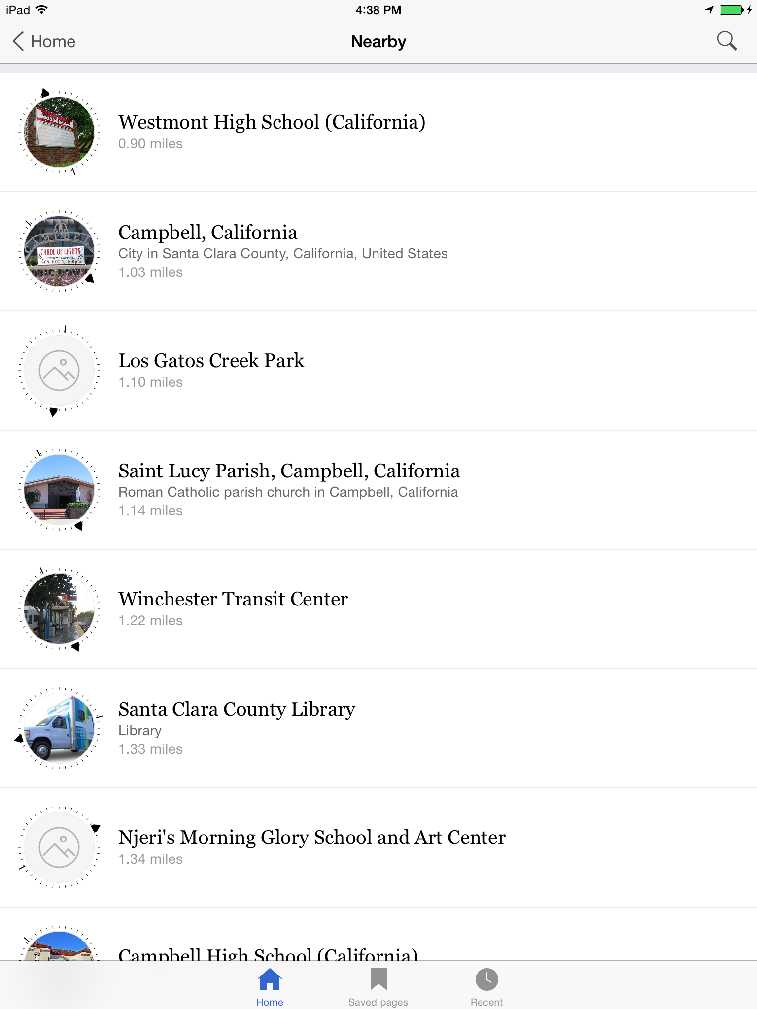
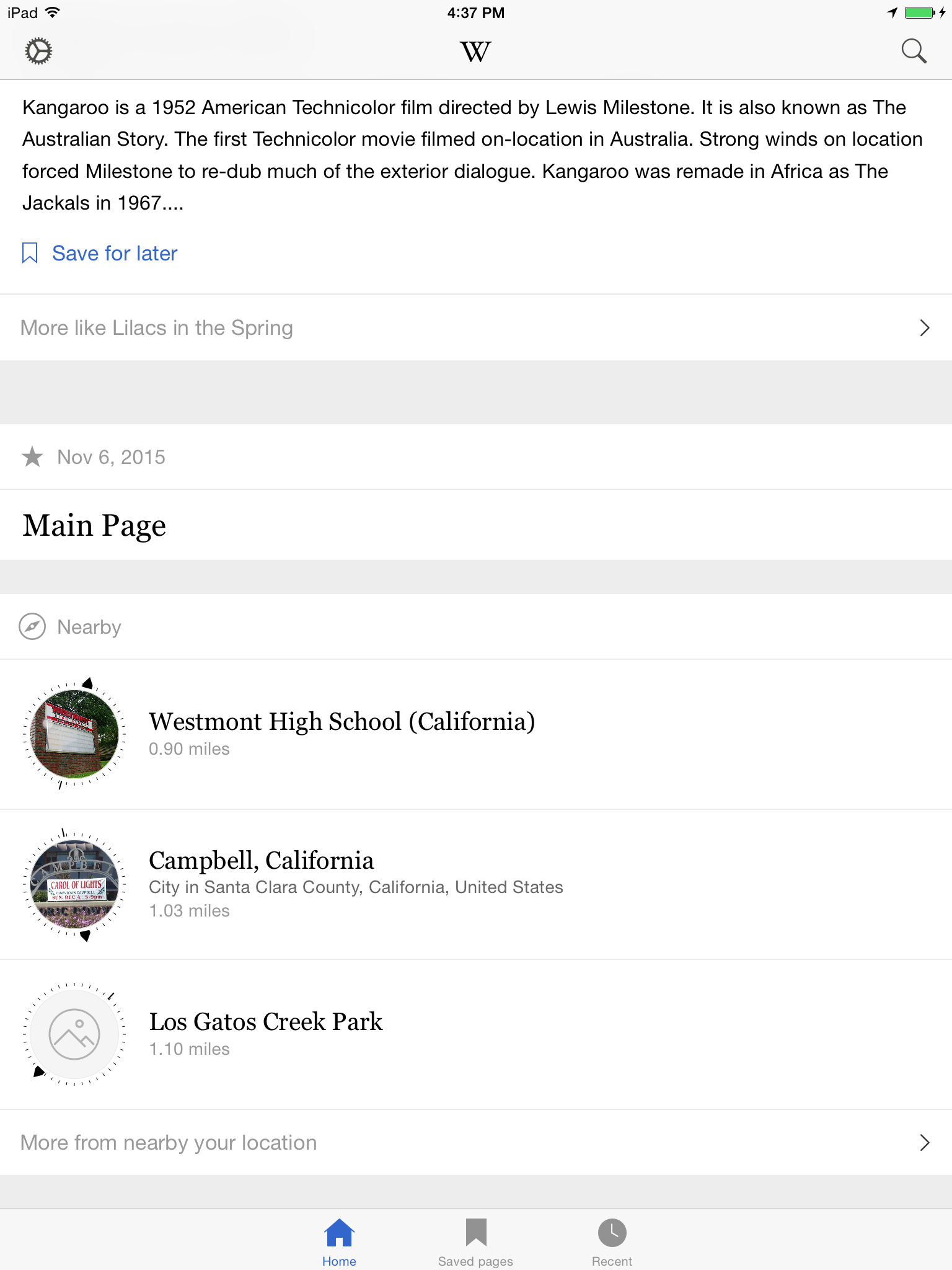
Title font should be Georgia. Accent and highlight colors should also match app palette.
Changes
- Compass colors black.
- Title 20pt Georgia regular
- Wikidata description 14 pt #666666
- Distance 14 pt #999999, no background color
| • JMinor | |
| Oct 28 2015, 5:49 PM |
| F2924382: IMG_0353.PNG | |
| Nov 7 2015, 12:53 AM |
| F2924384: IMG_0352.PNG | |
| Nov 7 2015, 12:53 AM |
Title font should be Georgia. Accent and highlight colors should also match app palette.
@KHammerstein @JMinor Quick thing to consider - by no longer having the direction arrow and the distance of the same color (was green) we lose something subtle - a hint that the two, the directionality and the distance are related and "active" - i.e. they both update as you move about.
If a user is looking at the arrow to get direction the matching color ties the distance to the direction. It "pops" better than more black text.
I'm implementing this to spec, but would ask we consider keeping this splash of color :)
@Mhurd
Good point. I thought at first of making them blue, but that would indicate they are actionable.
Looking forward to improve nearby in the future with maps! Then they will be actionable.
Checked with Dev 5.0.0 (475)on iPad mini 8.2
@Mhurd @KHammerstein - what if the pointing end of a compass(the arrow part) will be red like on real compasses?
@KHammerstein I like to think "actionable" in this context is "walking toward" the item, rather than tapping something. That's the call-to-action the color association between the arrow and the distance voiced, if I remember long ago conversations with Vibha correctly :) Green = GO!
I'm gonna resolve this, but I agree we should use an accent color on the compass point. Either our "on brand" blue or red (per @Etonkovidova skeumorphic suggestion). Will file separately.