Page MenuHomePhabricator

[Design] Language button on footer
Closed, DeclinedPublic

Assigned To
Authored By
KLans_WMF
Nov 25 2015, 8:44 PM
Referenced Files
F3114871: different_base_script.jpg
Dec 18 2015, 12:11 AM
F3021878: Screen Shot 2015-11-28 at 12.43.27 PM.png
Nov 28 2015, 9:04 PM
F3021875: end-to-end.png
Nov 28 2015, 9:02 PM
F3021854: Screen Shot 2015-11-28 at 12.42.05 PM.png
Nov 28 2015, 8:59 PM
F3021871: end-to-end.png
Nov 28 2015, 8:59 PM
F3021859: P66nL.png
Nov 28 2015, 8:59 PM
F3021855: Screen Shot 2015-11-28 at 12.41.52 PM.png
Nov 28 2015, 8:59 PM
F3021865: language-select.png
Nov 28 2015, 8:59 PM

Description

Problem statement

  • Changing article language is a prominent usecase based on the data that we have.
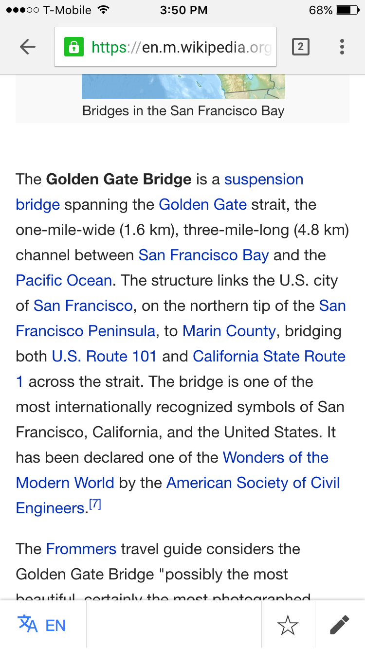
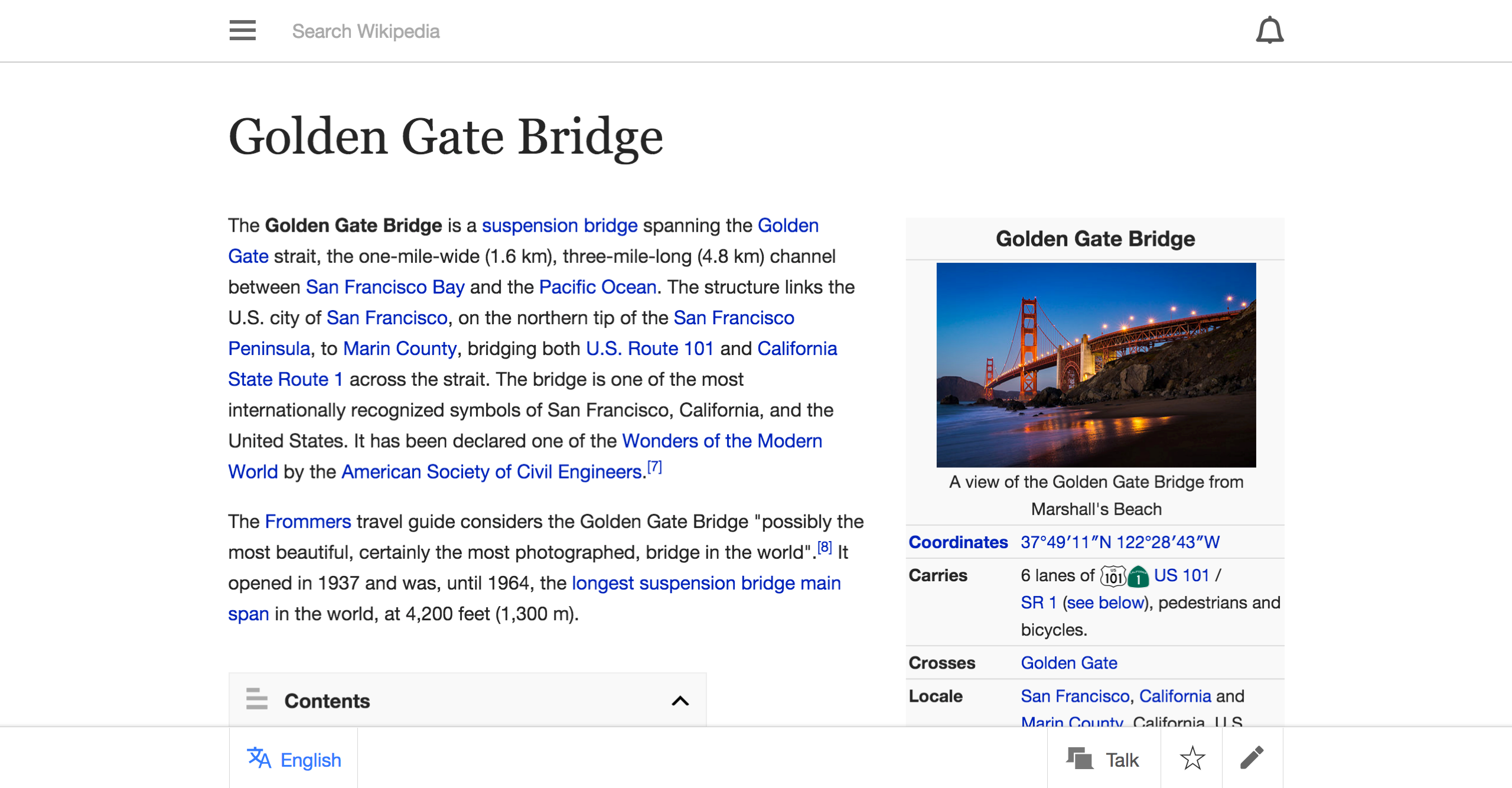
  • Current way of changing the article language is to scroll down to the bottom of article and look for the buttont o change the language

Proposed solution

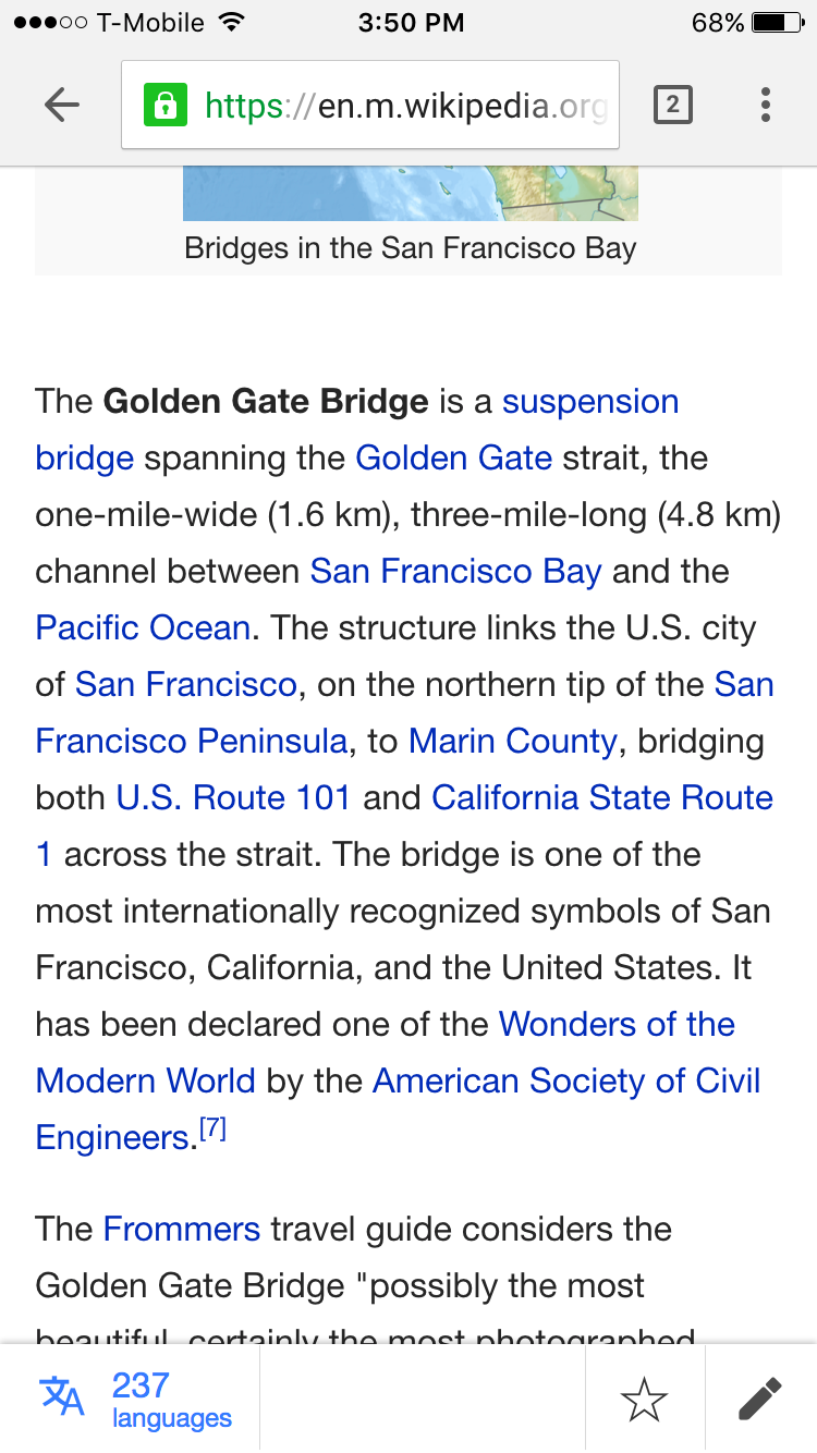
  • Create a sticky footer for articles
  • the footer will have a "change language" button on it which will make it easy to change language and also surface this functionality
  • the metadata may include either
    1. current language
    2. number of languages the article is available in
    3. just the language icon

Rational
We already have a sticky footer on iOS app which shows promise and easy of use when it comes to changing language of an article
It also gives us a place to have useful and important article actions, like add to watchlist, or edit the article etc. in the future

Open questions

  • Which design we are going with?
  • Is there any scroll behaviour?
  • What is the fallback for users who do not support position fixed or where position fixed is not performant?
  • How big should tap areas be?

Event Timeline

KLans_WMF assigned this task to Nirzar.
KLans_WMF raised the priority of this task from to Needs Triage.
KLans_WMF updated the task description. (Show Details)
KLans_WMF moved this task to Design on the Reading-Web-Planning board.
KLans_WMF subscribed.
Nirzar set Security to None.
Nirzar updated the task description. (Show Details)
Nirzar added subscribers: JKatzWMF, Jdlrobson.

@JKatzWMF

So here are some ideas around exposing the change language feature.

  • Sticky footer will be at least 44pt high
  • We can use the same space for watch list and edit (needs a discussion)
  • Because of edit and watchlist not being in the first paragraph, the reading experience for first paragraph improves drastically
  • on bigger screens, the sticky footer can have talk page links too.

Option 1 - show language icon and language code

language-code.png (1×750 px, 274 KB)

Option 1a - if the language code is longer

long-language-code.png (1×750 px, 352 KB)

Option 1b - RTL for the same

RTL.png (1×750 px, 220 KB)

Option 2 - show number of languages the article is available in

no-of-languages.png (1×750 px, 277 KB)

Desktop layout

mobile-on-desktop.png (1×2 px, 892 KB)

hey @Nirzar these look great. A few comments, but I think I'd like to here our resident multi-language expert @Amire80's opinion as well.

  1. I am not sure that notifying the user of the language they are currently is helpful enough to have featured so prominently. If I can understand the language, I know what language it is, right? If not, then it kind of doesn't matter. Regardless, if someone is really curious about what language they are reading in, they could presumably hit the language switcher and see which is selected. Same is true of number of languages--not important enough that it should always be present. One exception: if there are 0 other languages, it should be noticeably disabled. Just my opinion.
  1. Actions:
    • What does it look like when I hit the language button?
    • does the footer every disappear? Does it only appear on scroll? Can you show what it looks like with the safari or chrome chrome underneath?
  1. I like moving the edit pencil, but if we allow editing in-sections, then this could be problematic...
  1. Super minor and very subjective, but there is something strange about the side-shading of the toolbar on desktop/tablet. The rest of the page bleeds into the blank gutters on either side, so this additional dimensionality seems kind of strange. To me, it visually implies that the gutters are part of the page, when, in reality I think we are trying to emphasize that they are ignorable. I think the footer behavior should be consistent with the header. What does it look like when it extends the entire width, but the actions are kept to article width?

I am not sure that notifying the user of the language they are currently is helpful enough to have featured so prominently. If I can understand the language, I know what language it is, right? If not, then it kind of doesn't matter. Regardless, if someone is really curious about what language they are reading in, they could presumably hit the language switcher and see which is selected. Same is true of number of languages--not important enough that it should always be present. One exception: if there are 0 other languages, it should be noticeably disabled. Just my opinion

Good question!
Here, the language code is not to notify the"current language" but to notify that "you can change language here"

This decision was informed from various things

  • We did some user testing on iOS and we used only "EN" the language code without any icon as a way to change language and almost all the participants understood that it was the way to change the language
  • This same pattern is used by all operating systems.

Mac -

Screen Shot 2015-11-28 at 12.42.05 PM.png (168×574 px, 54 KB)

Screen Shot 2015-11-28 at 12.41.52 PM.png (118×392 px, 24 KB)

Windows

P66nL.png (534×435 px, 46 KB)

Other websites where language is important

Screen Shot 2015-11-28 at 12.43.27 PM.png (502×1 px, 163 KB)


What does it look like when I hit the language button?

language-select.png (1×750 px, 119 KB)

forgot to add this, but it will be the same language selection modal we have right now, but i have added the language codes here too for familiarity


does the footer every disappear? Does it only appear on scroll? Can you show what it looks like with the safari or chrome chrome underneath?

the footer will be sticky all the time. except for when the keyboard is up it will go over the footer.
i am working on this http://nirzar.github.io/prototypes/mobile-web/index.html html prototype . ignore the ABC on the footer but you can open that in chrome and safari and see how the stickiness works in action and with the browser chrome.


I like moving the edit pencil, but if we allow editing in-sections, then this could be problematic...

we can still persist the edit actions on section levels. the top level edit in the first paragraph will be gone and it will be more prominent as a persistent action


Super minor and very subjective, but there is something strange about the side-shading of the toolbar on desktop/tablet. The rest of the page bleeds into the blank gutters on either side, so this additional dimensionality seems kind of strange. To me, it visually implies that the gutters are part of the page, when, in reality I think we are trying to emphasize that they are ignorable. I think the footer behavior should be consistent with the header. What does it look like when it extends the entire width, but the actions are kept to article width?

yes that could be a possible. the stickiness itself introduces "layering" in the interfaces. the shadows imply that something is above and something is below. i think you are finding it odd that the footer isn't end to end with shadow perhaps. as i said that could be a possible treatment. here i mocked it up

end-to-end.png (1×2 px, 901 KB)

@Nirzar thanks, this addresses my concerns.

but to notify that "you can change language here"

I am surprised the button isn't enough, but trust user research!

I am surprised the button isn't enough, but trust user research!

yeah it might be. but icon + language = zero ambiguity

A few questions:

Option 1: Does use of a Latin language code make sense for users who don't know Latin scripts or are unfamiliar with Latin language codes? If I understood the earlier comments, the assertion may be yes. However, I wasn't sure how to reason about this if the base script is something else, like this:

different_base_script.jpg (2×3 px, 3 MB)

Option 2 small form factor: I gather that will be done in a translated fashion. In other words, "languages" would get the usual i18n treatment, right? This seems to have a pretty clear implicit CTA.

Option 2 desktop form factor: Is this the current language in the current language's script? Or is it the current language as spelled out in the user's Wikimedia profile UI language preferences? Or is it some clever hybrid like user's Wikimedia profile UI language preference, falling back to current wikilang script if no UI language preference set? Would an arrow help to indicate this is going to do something? Or does the research suggest that this is sufficiently clear as initiating a language change given it's placed in the sticky footer?

I was wondering - if section editing will still be supported with this approach, would it make sense to apply the text label "Edit" on a section-by-section basis to make it distinct from the page-level edit pencil and to avoid clashing pencils?

Couple questions from today's meeting:

  1. Where do users normally scroll on their devices? Will they accidentally tap the buttons on the bottom bar while trying to scroll down the article?
  2. Do we want to ever hide the bar when scrolling one direction vs. another (similar to how some sites hide their fixed header when scrolling up)? I am personally not a fan of this whatsoever as I have noticed buggy behavior several times for sites that do this with fixed headers, but it's still a question that should be answered with solid reasoning/evidence.
jhobs renamed this task from Language button on footer to [Design] Language button on footer .Jan 12 2016, 6:09 PM

@aripstra, @pizzzacat: This is the task that outlines the design problem and the mocks for the Language Switcher feature.

@phuedx @Jhernandez I guess many of you are aware of the issues with position: fixed in older mobile browsers. To recap – position:fixed has (not only, but also from my own painful experience) had serious quirks on all kinds of mobile browsers. Everything below Android 3, Opera Mini and early iOS is affected with partly bad user experience issues. Further read: http://www.quirksmode.org/blog/archives/2010/12/the_fifth_posit.html and http://bradfrost.com/blog/mobile/fixed-position/

bd808 triaged this task as Medium priority.Feb 16 2016, 5:17 PM
bd808 subscribed.
Nirzar renamed this task from [Design] Language button on footer to [Design] Language button on footer.Feb 20 2016, 9:06 PM
Nirzar changed the task status from Open to Stalled.
Nirzar subscribed.

One thing to consider is to have the sticky footer hidden when the user is reading and scrolling downwards.

I believe sticky footers of any kind are considering highly annoying on mobile due to limited screen space. Less distraction is always better. Discovery is good, but I think the footer being sticky at all times would be too much in one's face.

One relatively approach is to have it appear on scroll-up and automatically slide away on scroll-down. See https://medium.com/@cramforce/why-amp-is-fast-7d2ff1f48597 for example. I think it could be improved (ideally it's visible on initial page load since having to scroll -back- up is not very intuitive imho). They do the same with the header as well, which might be a better location for these tools as that is naturally visible on page-load (highly discoverable), it naturally slides away and non-distracting when scrolling down. And it can come back in when the user scrolls up (but without having to scroll up all the way, see Medium's header as example).

Just an idea :)

@Krinkle yeah I was trying that out in the prototype that I have. medium is also A/B testing it because of the distraction the scroll up and scroll down it creates. It creates an abrupt experience on iOS safari because the toolbar of safari also hides when scrolled down and shows when scrolled up.

the desktop medium is really distracting, it keeps coming up and down rapidly if i am scrolling because it goes away *only* when you are scrolling. i guess they have 3 versions out there.

it's not coming up automatically now.

but it's something that we could try.

@Jdlrobson This is stalled for long term because we are going with T128350