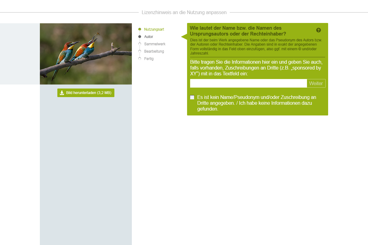
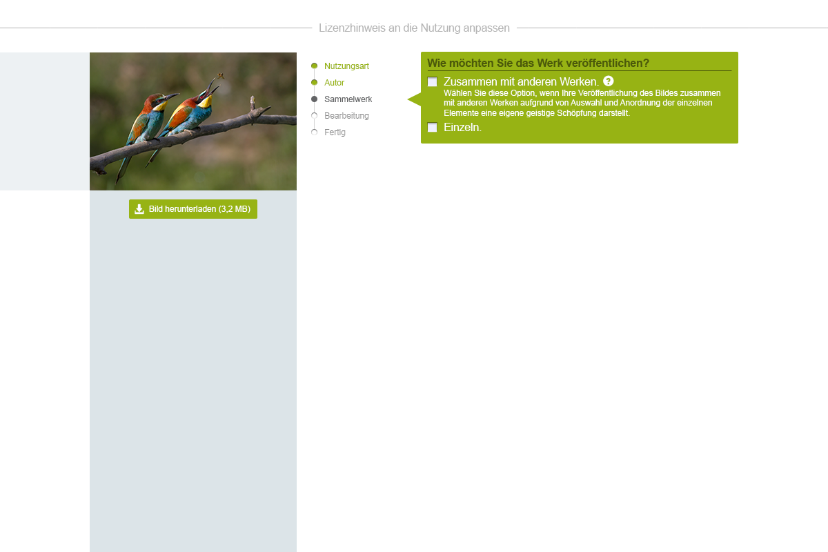
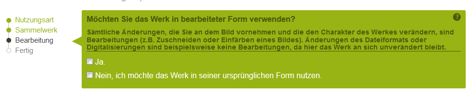
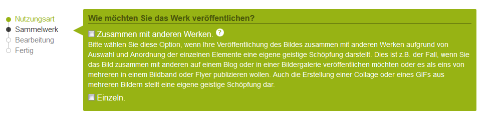
Help texts look different in different places:
| • Katja_Ullrich_WMDE | |
| Dec 17 2015, 8:35 AM |
| F3112540: 24.png | |
| Dec 17 2015, 3:01 PM |
| F3112541: 27.png | |
| Dec 17 2015, 3:01 PM |
| F3111773: help 2.PNG | |
| Dec 17 2015, 8:35 AM |
| F3111772: help 1.PNG | |
| Dec 17 2015, 8:35 AM |
Help texts look different in different places:
If it is for the different colours, that is okay with me and complies to the mock-ups. The text is in the colour of the corresponding section (header section dark green, answer section white). The question mark icons are in different colours as well. In my opinion, that additionally underlines that the help text corresponds to either the question as a whole or a individual answer.
Now I get it! Maybe it's not completely intuitive but it's fine as long as it complies with the mockups. Thanks.
Still, the formatting (apart from the colour) diverges a bit from the mock-ups and we could track that in this ticket.
Text format (font size, line height) should actually be the same (see mock-ups below).