Page MenuHomePhabricator

The focus state on full width text field feels to tight to the edge of the mobile screen.
Closed, InvalidPublic

Description

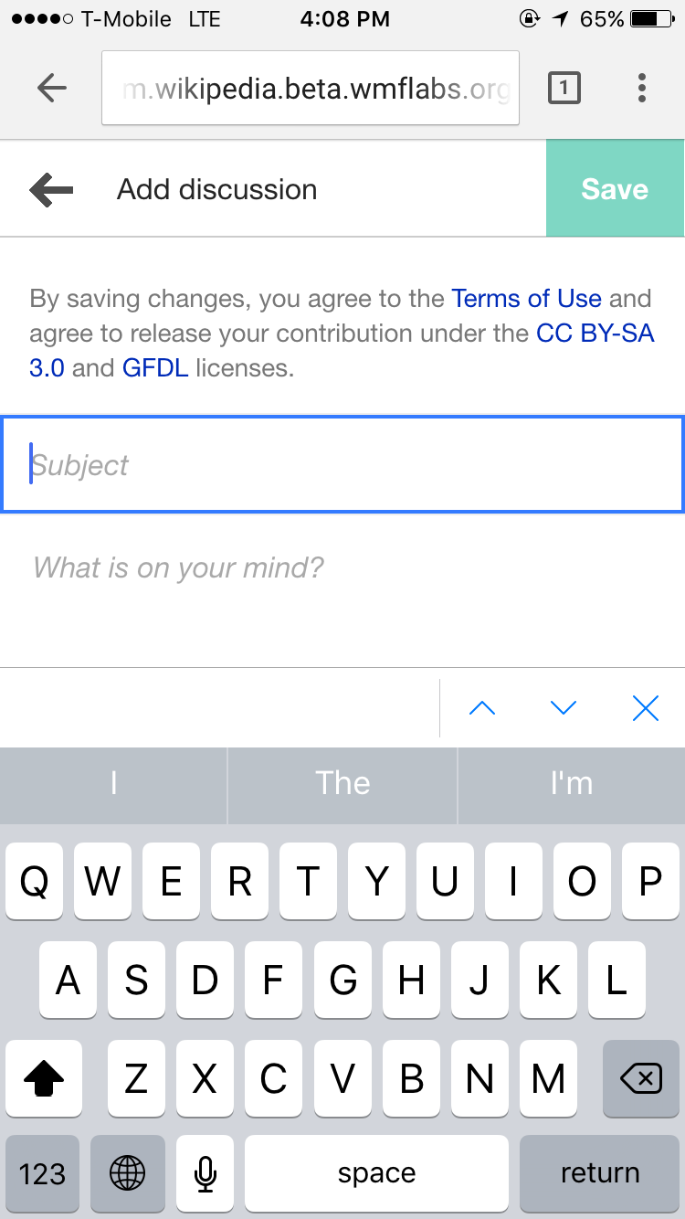
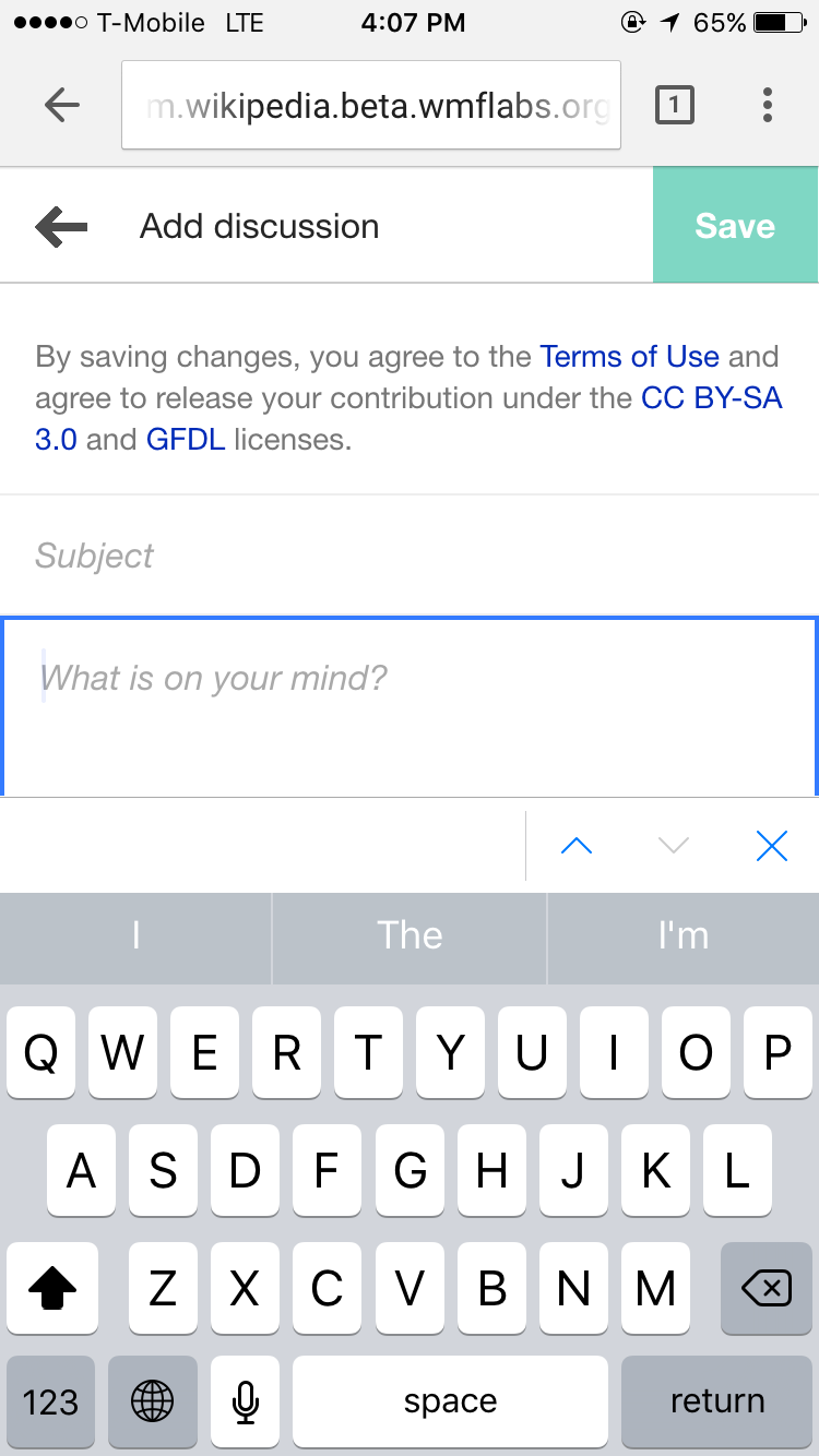
Is it worth considering a slight different approach for mobile?
Or shall we consider changing the interface? I appreciate the full-width text fields and I notice other apps/os typically get away with just blinking cursor as their focus state. But what does others think?

Photo Jan 21, 4 08 02 PM.png (1×750 px, 112 KB)
Photo Jan 21, 4 07 58 PM.png (1×750 px, 111 KB)

Event Timeline

violetto raised the priority of this task from to Needs Triage.
violetto updated the task description. (Show Details)
violetto added subscribers: violetto, Volker_E.

The input should vertically be aligned with the content text. If there's an issue with it being to close to phone screen edge it's an issue of the body margin not of the input.

image.png (720×644 px, 46 KB)

shows current https://en.m.wikipedia.org/wiki/Special:Redirect and looks good. Might have been a different issue at time of writing the task.