Page MenuHomePhabricator

Adjust contrast for notification text and content excerpts
Closed, ResolvedPublic

Description

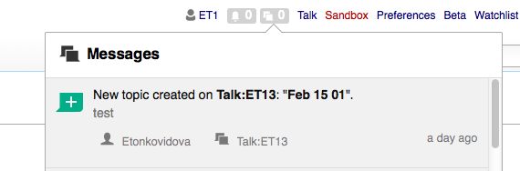
Currently, the notification text and content excerpts use a grey level for text which does not provide enough contrast. That makes it hard to identifying the main text as a much more prominent piece of information compared to other elements such as secondary actions.
I propose to increase the contrast to make items easier to scan in a list.

Current status:

  • Main text color: #666
  • Content excerpt color: #888
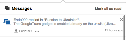
notif-contrast-current.png (162×502 px, 21 KB)

Proposed:

  • Main text color: #111
  • Content excerpt color: #777

notif-contrast-proposed.png (162×502 px, 21 KB)

Event Timeline

Pginer-WMF raised the priority of this task from to Needs Triage.
Pginer-WMF updated the task description. (Show Details)
Pginer-WMF added a subscriber: Mooeypoo.

Change 270850 had a related patch set uploaded (by Sbisson):
Increase contrast between header and body text in notifications

https://gerrit.wikimedia.org/r/270850

Change 270850 merged by jenkins-bot:
Increase contrast between header and body text in notifications

https://gerrit.wikimedia.org/r/270850

Etonkovidova renamed this task from Adjust contrast for notification text and content excepts to Adjust contrast for notification text and content excerpts.Feb 16 2016, 10:04 PM

Checked in betalabs - much better contrast, especially for seen notifications (with grey background).

Screen Shot 2016-02-16 at 2.13.49 PM.png (188×570 px, 23 KB)

.mw-echo-ui-notificationItemWidget-content-message-header

color: #111;

.mw-echo-ui-notificationItemWidget-content-message-body

white-space: nowrap;
overflow: hidden;
text-overflow: ellipsis;
color: #777;

And for secondary links:
.mw-echo-ui-menuItemWidget-content

display: inline-block;
margin-left: 2em;
font-weight: normal !important;
color: #000 !important;