Page MenuHomePhabricator

Dynamic text size control for articles in iOS app
Closed, ResolvedPublic5 Estimated Story Points

Assigned To
Authored By
hhanke
Feb 11 2016, 10:54 PM
Referenced Files
F3850689: Line-height iOS vs web
Apr 8 2016, 7:43 PM
F3850694: resize-icon.pdf
Apr 8 2016, 7:43 PM
F3850696: T-large.pdf
Apr 8 2016, 7:43 PM
F3850663: T icons to align with track end points
Apr 8 2016, 7:43 PM
F3850695: T-small.pdf
Apr 8 2016, 7:43 PM
F3850578: IMG_9912.PNG
Apr 8 2016, 7:08 PM
F3850577: IMG_9911.PNG
Apr 8 2016, 7:08 PM
F3842979: T-large.pdf
Apr 7 2016, 12:06 PM

Description

Problem:
Users with vision impairment are unable to easily read articles in the Wikipedia iOS app, since they lack a method to increase the font-size of text from within the app.

User story
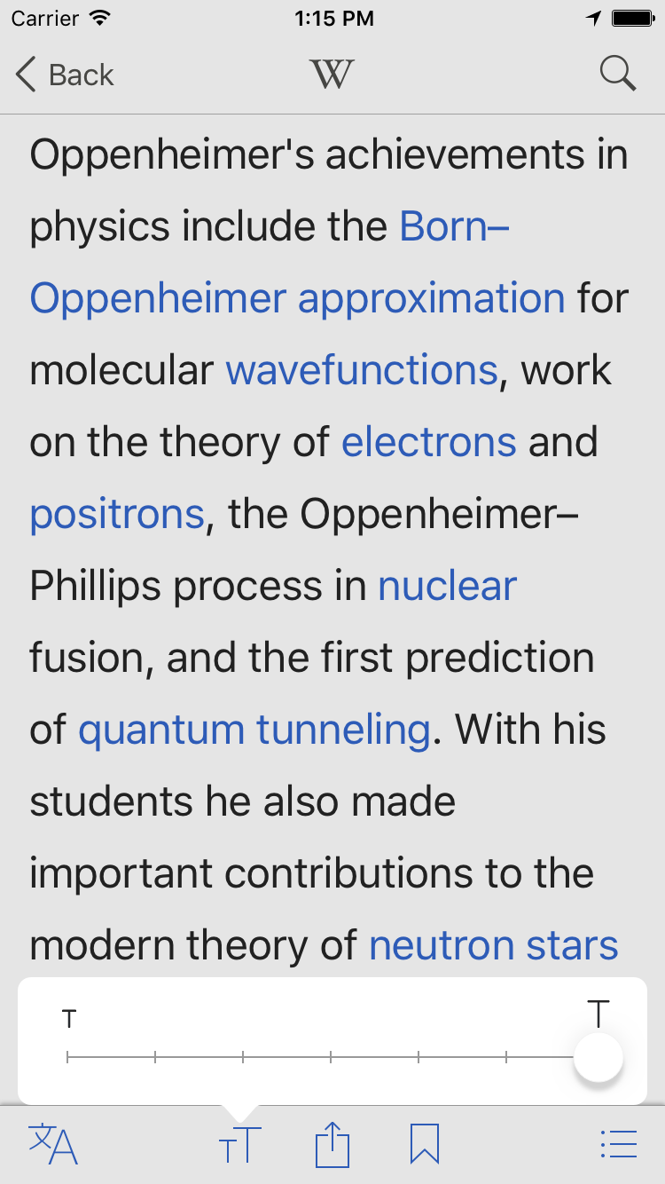
As a reader with some vision impairment, I want to be able to optimise the font-size of article text so I can more easily read this article and subsequent articles without having to leave the app or require constant use of zoom and scroll.

Community feedback
Ability to adjust text-size was one of the top 3 missing features users requested (via OTRS feedback) since 5.0 release.

Acceptance criteria:

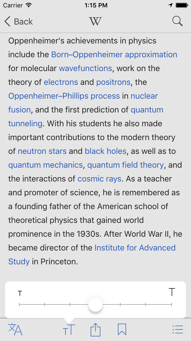
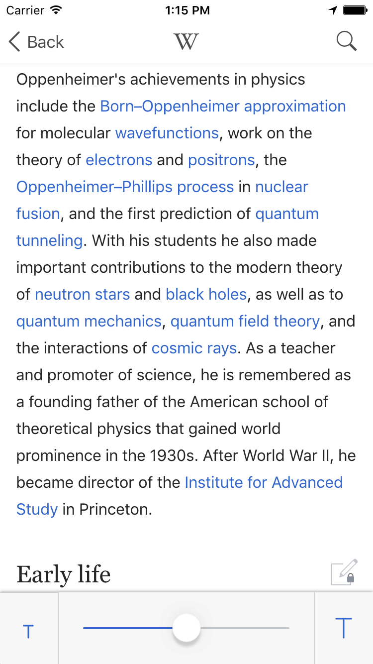
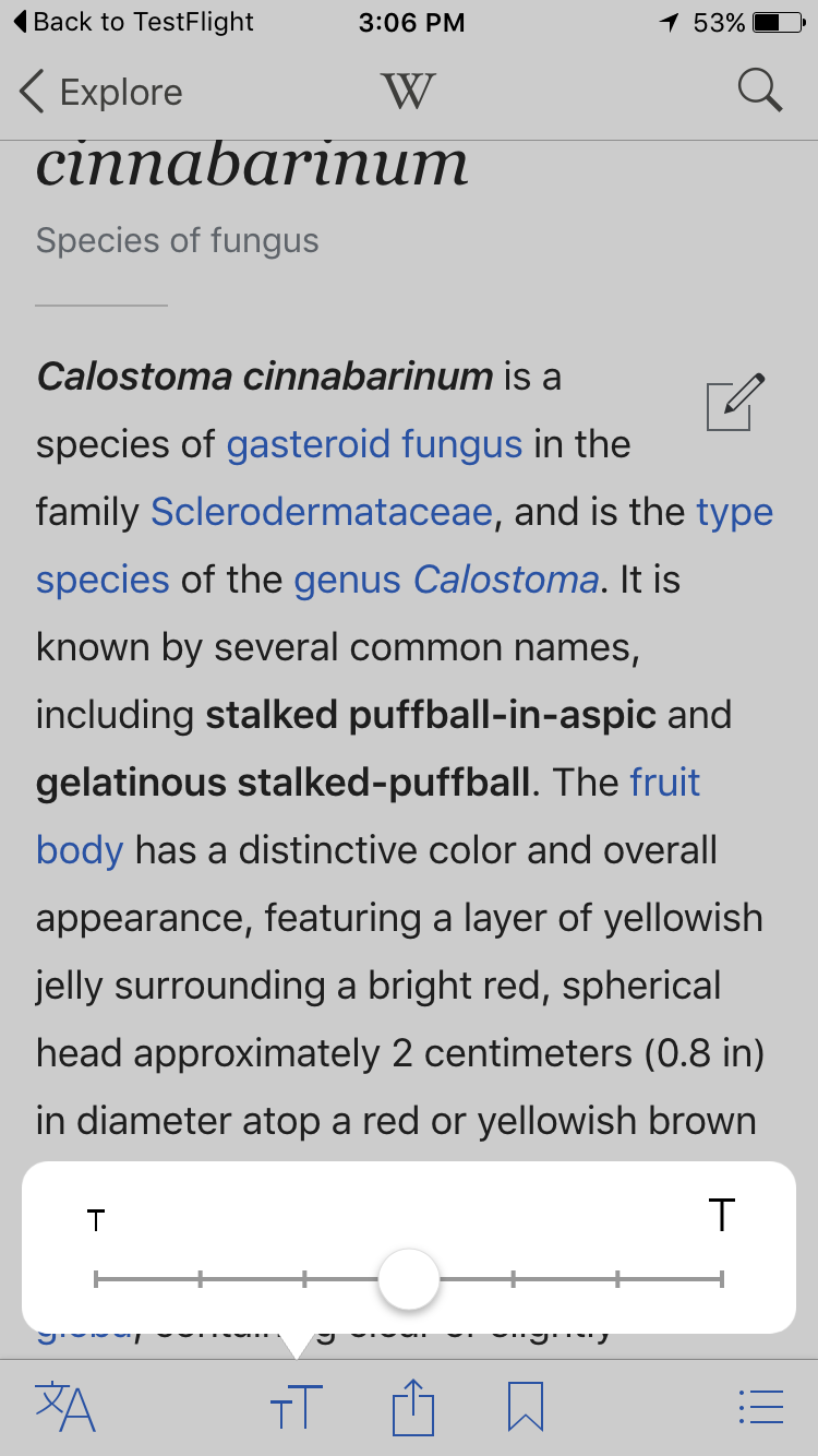
  • Text resize button should be placed to be easily accessible from the article pages
  • Font-size selected is maintained across text in all subsequent articles (regardless of whether I navigate to another article or go back to the feed and select another article)
  • Text resize button is easily distinguishable from the language selection icon
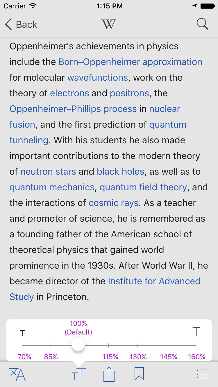
  • Clearly indicate min. and max. thresholds for text size

Other considerations

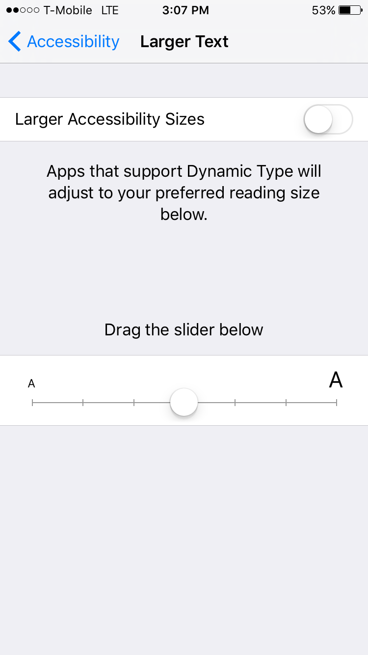
  • Review existing examples of this feature in iOS applications (e.g., iBooks, Kindle, Safari Reader, Pocket, The Guardian) when determining apt iconography (most apps utilise ‘Aa’), placement and behaviour
  • Design takes into consideration further reading preferences that can be potentially be accessed from the same button, notably:
    • Changing the background and text colour to ‘night’ mode
    • Adjusting brightness directly from app (rather than needing to access settings)
    • Leading (line-height)
    • Changing article font (either toggling between sans-serif and serif font, or allowing choice between a selection of fonts)

Mocks
0. Addition of icon on toolbar

size 0 - initial.png (1×750 px, 213 KB)
with TT icon (preferred)

v1. Popover

size v1a with popover.png (1×750 px, 216 KB)
popover triggered
size v1b text size increased.png (1×750 px, 146 KB)
max. text size

Mock showing discrete values:

V1-with text size estimates.png (1×750 px, 225 KB)

Event Timeline

hhanke raised the priority of this task from to High.
hhanke updated the task description. (Show Details)

This is also related to T126689.

I would also like to add – while I describe this as a problem here, I must not forget to say how great it actually is for people with visual impairments that there exists something as Wikipedia in the first place. It is a great source of knowledge in reflow format and with (in principle) adjustable background and all! This is not something that is solvable with printed books and sadly not even with many electronic books or webpages. Similar for blind people – it is a treasure that so many information is described in Wikipedia in textual form and in a consistent format with consistent navigation. This is not at all something that would be easily reachable elsewhere for people with disabilities. Wikipedia is a great help for such people, there is no question about that. So it is also why I think it is very worthwhile to spend effort on Wikipedia accessibility :-)

@hhanke tanks for the positive comments. The iOS team really aspires to make our app an even better resource for those with disabilities. Although we might not be able to get all features in the upcoming version, we are committed to continuing to improve access.

This is one of our most requested features, so it is high on the list for features in our next release.

Danny_B moved this task from Colors to Font size on the Accessibility board.
hhanke renamed this task from Impossibility to enlarge content of articles to Impossibility to enlarge content of articles in iOS app.Feb 15 2016, 9:23 AM

FYI, WKWebview, also supports Dynamic Type for HTML content.

http://www.interactiveaccessibility.com/blog/text-resizing-web-pages-ios-using-dynamic-type#.VsWKi8fdjTU

This might be interesting to explore, though as @hhanke notes, for longer text, a dedicated application specific control might be more suitable.

@TheDJ Yes, thank you for the suggestions, it is very useful to consider them, but I think there are significant drawbacks in using just Dynamic Type for the size of articles:

  • The size of Dynamic Type cannot be changed by the reader easily according to circumstances when he interacts with the app (it can only be changed from iOS Settings app, which is cumbersome and therefore not really suitable for this type of situation where reading of text is the central activity).
  • For severely visually impaired users needing significantly bigger letters, Dynamic Type text size settings are a compromise between the actual users needs and the unwanted trimming of larger texts that do not fit on the screen with the larger type and more difficult orientation in the UI. Sadly, trimming seems to be there by design (see that the info message in Settings->General->Accessibility->Larger text is also indicates it when you move the slider to larger text). On the other hand, there is very little danger of trimming in article content or loss of orientation due to bigger letters, so a severely visually impaired users would often actually prefer a larger text for Wikipedia articles than what they will have set in the accessibility settings for the whole system.
  • The current max size of Dynamic Type setting is too low for what could otherwise be achieved on an iPad screen (at least in landscape). I think this limitation might be intentional as Dynamic Type is also used in the UI as such, not just in content.
  • A general setting for iOS UI and the main content of a reading app just generally feel to be two separate things. (Setting larger text for Dynamic Type to a certain value will affect all other apps as well.)
  • There is currently no setting on iOS to handle foreground/background modes (see the related T126689

But I think the main guidance here is that Apple itself seems to prefer a separate control inside the app for this type of adjustments for longer reading content, this is so at least in iBooks and Safari Reader. It is possible that this will change in the future, access to the iOS setting will be made easier from the control center, foreground/background modes will be provided, it will be possible to influence Dynamic Type setting in a more granular way etc., but we need to make the app accessible now. (A good test is a comparison with how we treat "healthy" users: it would seem to be unacceptable saying that some core functionality does not work now as expected, but we will wait if that possibly resolves itself with future versions of iOS).

This said, I think it would be great if the default parameters of the dedicated control were set to the current accessibility settings for Dynamic Type. This way, when a new user launches the app, he/she will automatically have it preset to what he expects and he/she can adjust it as needed later on. Rather than using Dynamic Type styles in content directly, this can be done by observing the current Dynamic Type settings.

The approach that @TheDJ mentions might also be useful for Wikipedia Mobile, where we do not have so much control about the Safari interface.

JMinor renamed this task from Impossibility to enlarge content of articles in iOS app to Dynamic text size control for articles in iOS app.Mar 22 2016, 9:35 PM

@RHo just for context, @Fjalapeno has a working prototype which does basic font size adjustment in the article. Right now he's triggering that with a simple button, but I'd like to give teh user a bit more feedback and info. See also the Dynamic Text Size setting in iOS Settings and @Nirzar had some initial sketches along these lines.

@RHo looks good. Slider looks like it will work well.

I agree that the A icon version can be confused with the languages icon. But IMO the T icon doesn't look as good as the A one. What do you think?

Also,Do we have a text size adjust icon anywhere else in the Wikipedia properties? Wondering if we have prior art.

Anybody else have thoughts on the icon? I might just be overthinking it.

@Fjalapeno the A of language icon conflicts with A for textsize

Looking good to me.

I like the drawer for extensibility (it will be easier to add more reader controls), but the popover looks better with just the one control. Not a strong preference, though.

How would the drawer look on iPad? Would it become a popover?

We're in a tough spot for icons, since we already have a letter-form icon. I'm fine with the T, but might be worth running past a couple testers to see if they can distinguish the two?

@JMinor @Fjalapeno
FWIW, Gmail and Adobe both use the TT icon for adjusting text-size:

Gmail text-resize icon (117×542 px, 14 KB)

Adobe text-resize icon (69×371 px, 12 KB)

However, general display/reading settings are generally denoted by the 'AA' icon, or some variation using the letter A... so my thoughts are we go with the 'TT' icon initially and perhaps we can revisit once we have more than just text resize, and if people do struggling to recognise it.

FWIW#2: In terms of prior art I haven't found anything elsewhere. Wiki Android doesn't have an icon to denote these settings at all but is an overflow item called "Font and theme":

Android text-resize overflow menu (203×368 px, 35 KB)

which opens a drawer with text resize and light/dark theme controls:
Android 'font and theme' (text-resize) options (638×370 px, 83 KB)

@JMinor - My preference is v2 for the drawer for greater extensibility in future, and also since the popover dims the content behind it slightly so it is harder for the user to see the change in text size than the drawer.
And yes, the drawer in the iPad version would become a popover.

@Fjalapeno just an extra detail on the interaction. Are we able to include tap to increase and decrease text-size on the "T" icons as well as the discrete slider? See mock below.

tap and slider text resize.gif (1×750 px, 1 MB)

@RHo we can do that is possible for sure.

Is this for v1 or v2?

However, general display/reading settings are generally denoted by the 'AA' icon, or some variation using the letter A... so my thoughts are we go with the 'TT' icon initially and perhaps we can revisit once we have more than just text resize, and if people do struggling to recognise it.

Sounds good to me. Lets move forward.

@Fjalapeno ahh based on the meeting, let's stick with v1 popover for this text resize.

@Fjalapeno
Sure. LMK which format suits best moving forward.


resize-icon3@.png (60×72 px, 246 B)

resize-icon2@.png (40×48 px, 194 B)

@RHo thanks!

Svgs rendered in Pdf is the preferred format for all assets on iOS (except the home screen icon which must still be in pngs)

Fjalapeno set the point value for this task to 5.Apr 6 2016, 9:00 PM

@RHo hey forgot - I also need the big and little T for inside the popover.

@Fjalapeno
nw, here you go.

To test:

Text size change:

  1. Open any article
  2. Tap the new "tT" button in the bottom toolbar
  3. Slide the slider to select the largest text size
  4. The text size should change
  5. Tap away from the popup to close it

Text size persists:

  1. Force quit the app
  2. Re-ope the same article from above, the text size should be the largest
  3. Tap the "tT", make sure the slider is in the largest position
  4. Open any other article, the text size should be the largest
  5. Tap the "tT", make sure the slider is in the largest position

Rotation closes the popup:

  1. Tap the "tT" button
  2. Observe the popup
  3. Rotate the device
  4. The popup should close

This looks great, thank you! This will really help many people!

Based on the screenshots here and on GitHub I can contribute 2 ideas:

  1. Please lets make sure that the maximum value is chosen so that the size of the text is the very maximum feasible on the given display. There will always be people for whom even that will be too small, but in that case then there is nothing that can be done. But we do not want to limit the maximum size artificially (without any good reasons). Severely visually handicapped users are willing to read text where there is only between 1 to 3 words on a given line and that is what we should aim for if it is feasible. Reading and understanding text broken into so many lines is hard, but is still much easier than to have to use Zoom and therefore to have to go through the additional burden of having to scroll Zoom left and right.
  1. Lets make sure that we have a way for VoiceOver users to close this dialog. I did not try the PR, so I do not know if there is one, but if you think it is the correct time now and would like me to check it, I will do so.

In any case, this will be a good improvement!

Testing on iPhone with iOS 9.3.1 and Wikipedia 5.0.3 (817). The dynamic text size adjustment works so I'm considering this fixed. I have no way to test voiceover capability.

@RHo the top cross bar for T's is fatter than the vertical pipes of T. also the tracker line inside the slider is too thick.

can we fix that?

here's a reference of the tracker line

IMG_9911.PNG (1×750 px, 151 KB)

IMG_9912.PNG (1×750 px, 71 KB)

thanks @Nicholas.tsg - just popping this into design review for finishing touches

hi @Fjalapeno, recapping design review items here:

  1. Update text-resize icons to stop funky rendering of the horizontal and vertical bars on the T (assets resupplied here)


  1. The vertical bar of the small and large t icons should align with the min and max tick marks respectively. Can we fix this by extending the track's length by 12px (6px on either side?)

T icons to align with track end points (231×747 px, 33 KB)

  1. Tracker and tick marks are twice as thick as they should be (per Nirzar's previous comment)
    • Expected: tracker height and tick mark width should be 1px
      IMG_9912.PNG (1×750 px, 71 KB)
    • Actual: tracker height and tick mark width are 2px
      IMG_9911.PNG (1×750 px, 151 KB)
  1. Disable the TT icon on the toolbar until all content loads so that it fades from grey (disabled) to blue (active) once the article finishes loading
  1. Reducing line-height on section headings to be tighter (like the web view which is 1.3)

Line-height iOS vs web (543×620 px, 145 KB)

s/w Nirzar, I have create a new ticket T132572: Line-height for section headings too sparse for updating css here

Adding another element to the bar can become cluttery at some point. I recently encountered another nice way to do this. They had the settings panel, pretty much as we have here. But additionally to that, in the 'browse' mode of their app, you could do a pinch-zoom and it would pop up the size indicator mid screen and simply resize live, as you pinch zoomed. Let go, and it was set and the indicator disappeared on it's own.

That is slightly less discoverable (you could place an explanation hint under the settings control to hint people at it), but it was surprisingly intuitive. Performance of might also a problem, because we have huge content areas. Just leaving that out there, in case we ever need to revisit due "zomg, we have way too many icons, how will we ever fix this."

JMinor added a subscriber: pizzzacat.

@TheDJ Yes, this is the last button we have room for. If we need any more article tools (which we probably will) we will have to consider some other mechanisms for this.

Although we're still waiting for final research results from @pizzzacat the feedback so far on the beta is positive and I'm gonna consider this resolved, and we can file other tickets if further iteration is needed.