Page MenuHomePhabricator

investigate when wikipedia.org site responsively switches from desktop to mobile view
Closed, DeclinedPublic2 Estimated Story Points

Description

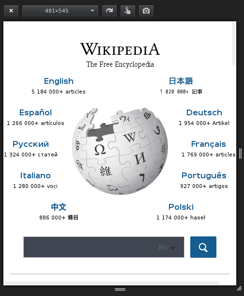
It appears on some browsers, that the sweet spot of responsive switching from desktop to mobile view might have some issues with text overlapping the browser page.

Here's a screenshot and comments from @abian:

With my configuration, contents slightly overflow the page when using a window of between 481 and 560 px wide. I would increase the border between mobile and desktop view from 480 px to ~550 px (or would modifycontents so that we didn't need to modify that limit).

Event Timeline

debt triaged this task as Low priority.Mar 12 2016, 3:19 PM

The media query is kicking at max-width: 480px.

The top10 container width is set as 546px.

It makes sense to switch to mobile view as soon as the top10 doesn't fit.
Or to make the top10 fit within 480px.

Hi @MSyed - can you take a look and let us know how you'd like the design to be in this instance?

debt set the point value for this task to 2.Apr 12 2016, 6:46 PM

moving to backlog for now, until we have more time to look at this.

I don't think this is an issue anymore. The .central-featured class has the following rule - max-width: 100% which prevents it from overflowing. Also, the removal of the slogan from non-latin Wikipedias reduces the amount of space needed by the text.

Screenshot from 2016-07-01 14-44-48.png (611×504 px, 70 KB)

Yay, thanks for checking it out, I'll close this ticket as declined then. :)