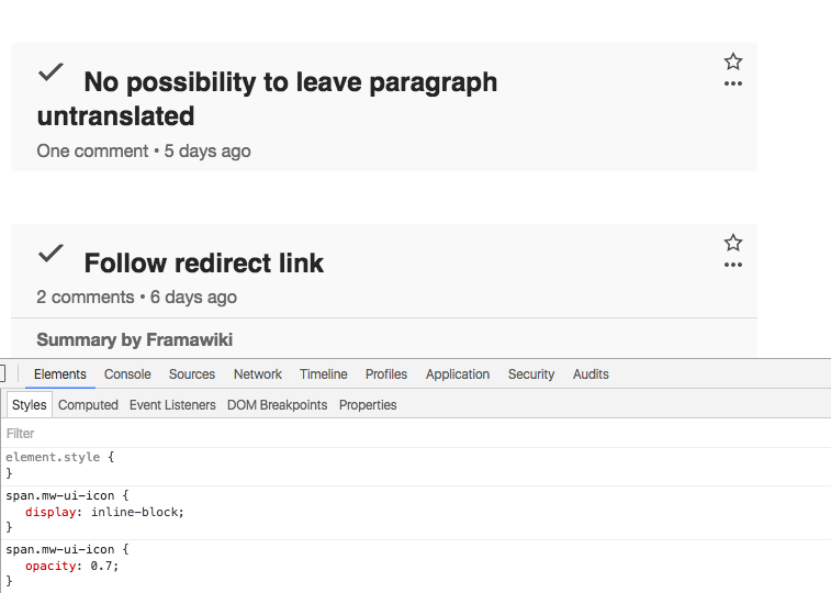
Mark a topic as resolved. The check mark will be displayed lower than a topic title.
| Etonkovidova | |
| Apr 8 2016, 5:50 PM |
| F4419915: Screen Shot 2016-08-31 at 16.05.11.png | |
| Aug 31 2016, 2:08 PM |
| F4419917: Screen Shot 2016-08-31 at 16.06.11.png | |
| Aug 31 2016, 2:08 PM |
| F4336851: IMG_1591.PNG | |
| Aug 4 2016, 5:42 PM |
| F3850281: Screen Shot 2016-04-08 at 10.34.53 AM.png | |
| Apr 8 2016, 5:50 PM |
| F3850284: Screen Shot 2016-04-07 at 4.54.07 PM.png | |
| Apr 8 2016, 5:50 PM |
Mark a topic as resolved. The check mark will be displayed lower than a topic title.
Checked in betalabs - I see the same positioning for the check mark. I am moving the ticket to Product/Design work for input from @Pginer-WMF.
Also, the mobile view for resolved topics (iPhone 6s, iOS 9.3.2).
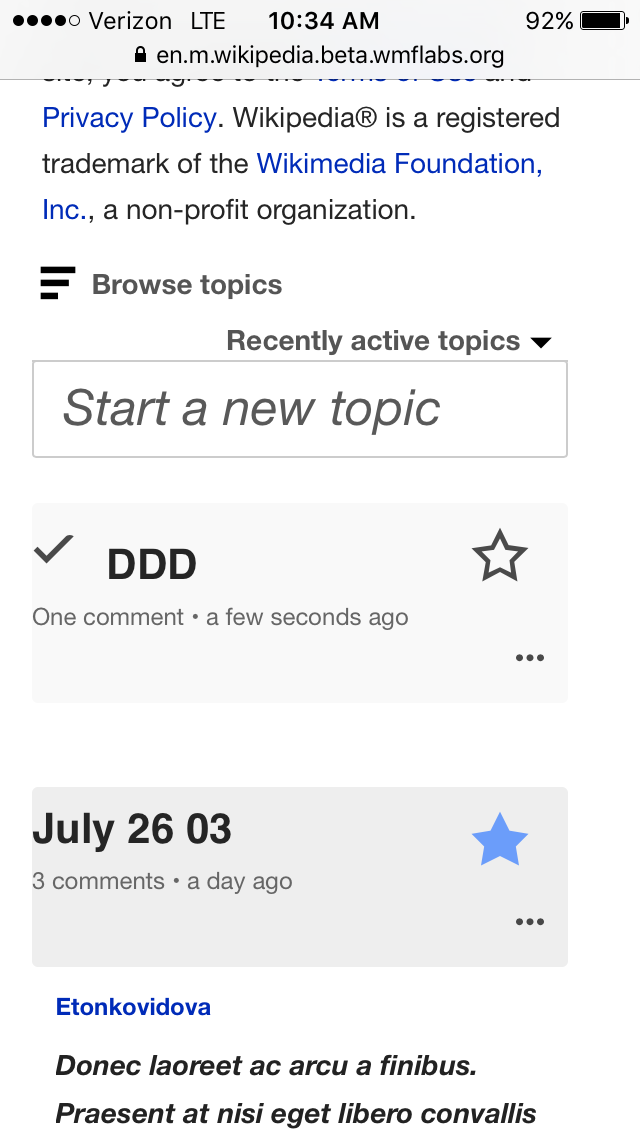
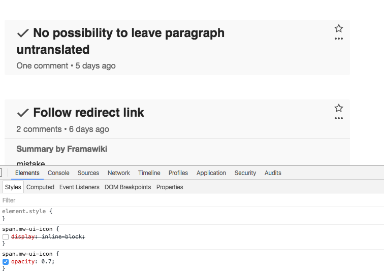
The mark on mobile seems misplaced. One interesting thing I noticed is that it seems that on mobile the tick mark is placed as an inline-block (unlike in desktop), and removing that CSS rule seems to improve the alignment: