Page MenuHomePhabricator

Icon process within WMF Design: Adding to and maintaining our own icon set or use an external one?
Closed, ResolvedPublic

Description

@Nirzar brought up the following question recently in connection to our conversations about general icon process:

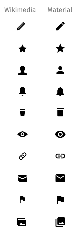
Should we create everything from scratch or use something like for example Material Icon set? It's well

  • maintained
  • open source
  • neutral

How are we dealing with apps' icons, as apps are very strongly aligned to native guidelines?
When we are talking about web (desktop and mobile), do we (designers) have the resources to care process-wise as in invent and maintain?

With this task, I want to make sure that designers across teams are on the same page when facing above questions.

Outcome of discussion (summarized):

  • We're continuing to maintain and extend our icon set, currently located at Wikimedia/WikiFont
  • We might take other open-source icon sets as (inspirational) fork base, mentioned here Material Icons.
  • We gonna collect our icon addition guidelines

Further discussion will be taking place at T135081: Icon process within Wikimedia Foundation Design and its sub-tasks.

Event Timeline

From my position, it makes sense to continue and built on top of already taken work on WMF's own icon set for use in web, because:

  • Lots of work and broad agreement was involved to come up with current icons, so let's not throw that overboard
  • It's (at least in parts) already used in several products like
    • VE
    • Echo
    • Mobile web skin Minerva
    • Flow
    • Maps
    • …?
  • We ensure brand recognition/addressing user's mental models when switching between mobile web and desktop.

I'm also convinced, that apps are doing well using a slightly different set to meet app platform specific UI guidelines.

Volker_E renamed this task from Icon process within WMF Design: Creating and maintaining our own icon set or using external one? to Icon process within WMF Design: Adding to and maintaining our own icon set or use an external one?.May 12 2016, 2:40 AM
Volker_E updated the task description. (Show Details)

I like the idea of avoiding the "Not invented Here" syndrome. If there is a good resource we can reuse, is worth looking at it independently on whether it was contributed by an antonymous volunteer or a big corporation.

However, we need to make clear which level of adoption we aim for:

  • Adopting material icons as our only reference: replacing existing icons by material design equivalents, follow their guidelines when creating new icons, and keep everything in sync as material design evolves.
  • Declaring material design icons compatible with the Wikimedia style, so that it is possible (and encouraged) to reuse them when creating new icons (or as alternatives we can decide to adopt when there are overlaps).

Regarding the branding concerns, Wikimedia and Material design share many stylistic aspects regarding to icons. I created a quick comparison of random icons and I'm not sure I could declare any of the material design icons to break our icon guidelines:

wikimedia-material.png (1×326 px, 24 KB)

We need also to check the license implications. Their CC-BY license requires attribution, although they note the following: We'd love attribution in your app's "about" screen, but it's not required. The only thing we ask is that you not re-sell the icons.

I'm not averse to adopting the Material icons set for use on web, but here are some of my reservations/questions if we are to do so:

  • What happens if Google 'refresh' the look and feel of their icons in future? Are we fine with this risk and ok to update additional WMF-specific icons we've created to match this potential (but likely to happen at some point) change in visual style?
  • Despite similarity of many icons in WMF and Material, I think there is value in maintaining an independent set of Wikipedia icons that differentiates us as a separate brand, however minute/subtle icon usage may be.
  • Per Volker's comments, it seems a shame to throw away the work that has been done on the current set of Wikipedia icons, esp. after what must have been a long process to reach agreement to use these icons by multiple teams and the community.
  • Even though from Pau's sampling many icons are indeed quite similar, we would still have to update the WMF-specific icons (eg. the TextDirRTL icon) to respect the Material system icon guidelines. Is this something we are resourced to undertake?

Though on the flip side, do we currently have an equivalent guideline with grids etc we have to help create new Wiki-style icons? If this is fuzzy it may be just as much work to define guidelines properly and audit the current set to ensure consistency of the entire set.

End brain dump

  • Despite similarity of many icons in WMF and Material, I think there is value in maintaining an independent set of Wikipedia icons that differentiates us as a separate brand, however minute/subtle icon usage may be.

I think this is an important point, and one we should talk about at the meeting in June.

@Heather I was actually targeting at collecting inputs from current designers in the WMF as main users (and main contributors if we continue or own) of an icon library. And would like to get to an accorded agreement on the questions above within a week from our group.
A decision here for sure doesn't have influence of making it part of a bigger conversation the meeting in June again.

Even though I proposed this for reasons mentioned. I see value in our own style.
There is one more compramise we can do. We can fork material design icons and work on it. it solves most of the concerns @RHo has mentioned.

We don't have to rely on upstreaming them and we can add our own icons to the set and even modify the current ones with a wikimedia character. if we don't work on a particular icon, it will fallback to the default material design. I think we can use the groundwork they have done. things like groups of intentions to use icons, tagging, list of icons needed etc.

But this means more work :)

+1 for this suggestion.
While it does mean more work, in the long run this seems worth it as it is
a good way to leverage the existing Material icons without losing the
previous work on our "Wiki-style" icons.

In my opinion the big advantage of Material design is the guidelines used to create the icons. Having guidelines like these would certainly lead to consistency and give a solid foundation for creating new icons.

Even If we did replace our icons with those of material design, it would only be a matter of time before we would have to create new icons for our own specific needs. Having guidelines in this scenario, such as a grid (as @RHo mentions) would provide consistency over the long-run.

@Pginer-WMF you mention 'our' icon guidelines, is there any documentation on that?

@Pginer-WMF you mention 'our' icon guidelines, is there any documentation on that?

I don't think icon guidelines have been documented in detail beyond emails, conversations and maybe brief descriptions in outdated wiki pages.

I think that stylistically they can defined as: simple shapes monochrome, rounded corners, filled areas (as opposed to outlines to define shapes) and medium-thick strokes.

One of the options I described in T135080#2288887, was to declare the current Material Design icons as compatible with the above, which basically means that if a Material design icon exist for a concept we may choose to use it, but we don't have to; and we can benefit from other resources such as templates or padding rules when it's convenient.

From what I read I think there is not opposition to that level of adoption (while there are some concerns about a deeper integration).

I don't think icon guidelines have been documented in detail beyond emails, conversations and maybe brief descriptions in outdated wiki pages.

Sounds like an action point ;)
Especially considering how many people have been leaving the WMF, I think it is important to recognize that we should document such things.

I think that stylistically they can defined as: simple shapes monochrome, rounded corners, filled areas (as opposed to outlines to define shapes) and medium-thick strokes.

Most noticeable as a stylistic differentiator between Wiki and Material icons is many Wikipedia icons have an 'alternating' rounded corners or introduce one rounded corner (e.g., Check, ArrowLast, Browser, Message icons); whereas Material guidelines clearly state "Consistent corner radiuses are key to unifying the overall system icon family".
Our icons are also quite varied in terms of stroke (compare Info, Help, EyeClosed, Book and Browser icons) whereas Material icon stroke guidelines are again consistent about using a 2dp width for all stroke instances, including curves, angles, and both interior and exterior strokes..

So tl:dr; agree with @TheDJ about adding an action item to create good documentation defining "Wiki-style" icons, assuming we are to maintain and extend our own set.

I agree with what has been said above.

Should we create everything from scratch or use something like for example Material Icon set?

Creating everything from scratch and rejecting any other options may sound too ambitious for our resource-limited team. However I think Wikipedia (and other projects) play a big enough role so I think we deserve to have our own identity and branding.

I am advocating for defining guidelines, and try to make them compatible with one or more icon library guidelines (like Material Icons), and make a public statement that the icon library is officially supported, though we recommend creating our own icon set, for branding, identity and user experience. At least for smaller projects, smaller experimental work, being able to rely on another (maintained, open source, neutral) icon set would be extremely valuable and unblocking.

However, I would like us to do some research before blindly adopting or copying Material icons guidelines. I'm afraid we will start seeing these guidelines and icons applied everywhere.

How are we dealing with apps' icons, as apps are very strongly aligned to native guidelines?

I think we should aim at consistency as much as possible, both for saving time but also for branding and user experience.

When we are talking about web (desktop and mobile), do we (designers) have the resources to care process-wise as in invent and maintain?

I think in the past we have proved we were somewhat able to invent and maintain, even though we didn't have much of a process and guidelines defined.

I am trying to summarize the points you all have added to the ticket to improve my understanding of the problem.

If we…fork Material Icons…keep our current icon set
We get… a well documented styleguide and more icons than we currently have…to keep our brand identity and keep our past work
We lose…our brand identity…the extra icons that Material has
We do…need to migrate our current icons to the Material guidelines…need to collect and document our current guidelines, and create and implement new guidelines where they are missing (for eg. T133076

This leads me to the following questions:

  1. Do we have a (documented) need of the extra icons that Material offers?
  2. How hard is it to get our documentation together? Is it a matter of collecting sources, like from the LSG, old mediawiki pages and emails? Or is it a much larger task?
  3. How important it is to convey our brand identity through icons?
  4. Are there any shortcoming of the current icon set (excluding documentation) that Material solves for us (including point (1))?

Hi @Prtksxna, I think the intention if we fork the Material icons is so that we do not lose our brand identity, since our forked set could revise the icons we put to use with a Wikipedia character.

And for both options we would need to provide better guidelines for icon creation, and ideally review existing icons that are not in keeping with guidelines.

As for your questions, I think they are all really important to answer to decide on our approach.

  1. Do we have a (documented) need of the extra icons that Material offers?

Offhand there are some that @JGirault has brought up requests for the Wikivoyage maps like Current location and Data source/layer that are available in Material.

  1. How hard is it to get our documentation together? Is it a matter of collecting sources, like from the LSG, old mediawiki pages and emails? Or is it a much larger task?

My understanding is that the task will involve more than just compilation of sources, but require someone to own creating a more comprehensive and definitive guideline.

  1. How important it is to convey our brand identity through icons?

This is more subjective but my 2c is that it is an important facet of conveying the gestault of our brand identity along with color, typography, logo, etc.
There is also an argument to be made that many people mistakenly assume we are part of/related to Google already, so to take on the Material icon set doesn't do our brand identity any favors.

  1. Are there any shortcoming of the current icon set (excluding documentation) that Material solves for us (including point (1))?

Again IMHO, a shortcoming of the current set is that there are inconsistencies with certain icons so the not all of them look like they belong in the same set. This is due in part to lack of documentation and ties back to question 2.

Hi @Prtksxna, I think the intention if we fork the Material icons is so that we do not lose our brand identity, since our forked set could revise the icons we put to use with a Wikipedia character.

Ah! Thanks for the explanation! So we'll have to edit there existing icons and guidelines to be more like ours? Does this mean we'll slowly bring the material icons under the MediaWiki umbrella by making changes to the icons and the guidelines at the same time?

Offhand there are some that @JGirault has brought up requests for the Wikivoyage maps like Current location and Data source/layer that are available in Material.

@JGirault, could you please point me to Phabricator tasks if there are any?

My understanding is that the task will involve more than just compilation of sources, but require someone to own creating a more comprehensive and definitive guideline.

Right, I don't know why I incorrectly remembered that the Iconography page on LSG already had basic documentation.

This is more subjective but my 2c is that it is an important facet of conveying the gestault of our brand identity along with color, typography, logo, etc.
There is also an argument to be made that many people mistakenly assume we are part of/related to Google already, so to take on the Material icon set doesn't do our brand identity any favors.

Again IMHO, a shortcoming of the current set is that there are inconsistencies with certain icons so the not all of them look like they belong in the same set. This is due in part to lack of documentation and ties back to question 2.

Right, and this would get addressed as part of We do… section for …keeping our icon set.

@Prtksxna Trying to establish common ground on the first sentence about “bringing the Material icons under the MediaWiki umbrella”:
In my understanding, the Material icons would meant –for majority of use cases on new icons– to be inspirational.
As designer you don't have to think about an icon idea, but in any case adapt it, if running short on time, to our visual icon guidelines.

Volker_E updated the task description. (Show Details)