Currently height of revision bars is based on number of bytes added/removed in the particular review. That of course makes sense.
When the revision does not change the size of the page in bytes (e.g. it fixes typo like "diary" vs "dairy") height of the bar counted that way should be set to 0. Thanks to the border of the bar, such a bar of height 0 would still be visible and hoverable.
What I noticed is instead of having no height bars related to revisions considered here are higher, and pointing "downwards".
Please see the screenshot attached (forgive my drawing skills). Bars of size 0 seem clearly "bigger" than "-1" or "1".
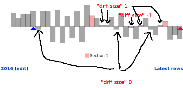
Another question remains how such revisions should be presented in the chart. The border of zero-height bar would be visible but hovering it to see e.g. a summary is rather far from easy.