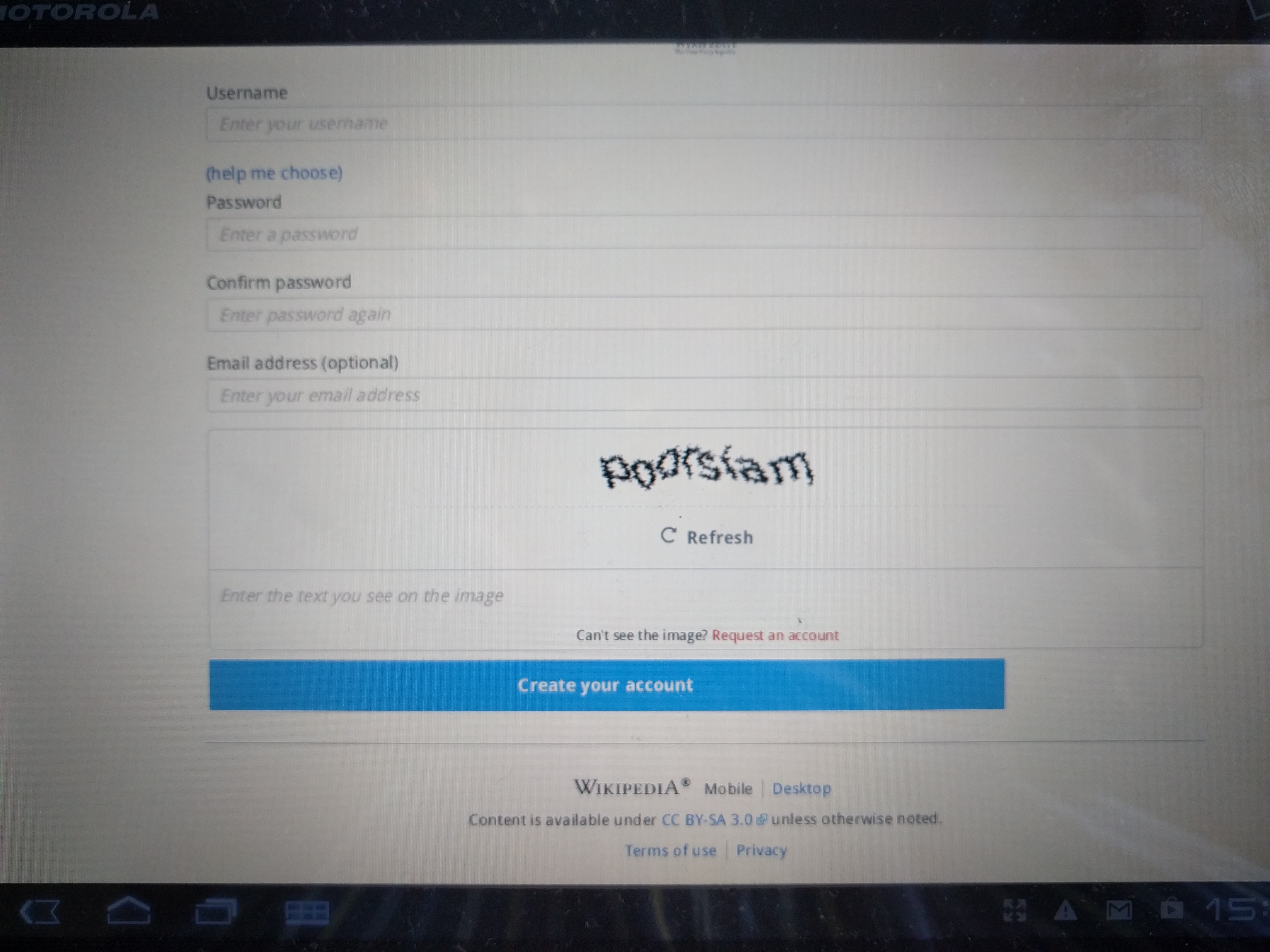
Various styles are shipped by MobileFrontend to provide a nice sign up screen:
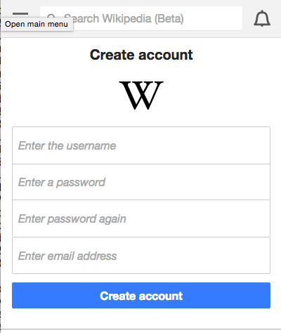
These don't appear to be applied to the new sign up screen.
| Jdlrobson | |
| May 19 2016, 9:29 PM |
| F4137456: IMG_20160606_180835.jpg | |
| Jun 6 2016, 10:18 PM |
| F4137427: Screenshot_20160606-180338.png | |
| Jun 6 2016, 10:18 PM |
| F4137454: IMG_20160606_180805.jpg | |
| Jun 6 2016, 10:18 PM |
| F4032172: Screen Shot 2016-05-19 at 2.28.19 PM.png | |
| May 19 2016, 9:29 PM |
| F4032171: Screen Shot 2016-05-19 at 2.28.09 PM.png | |
| May 19 2016, 9:29 PM |
Various styles are shipped by MobileFrontend to provide a nice sign up screen:
These don't appear to be applied to the new sign up screen.
| Status | Subtype | Assigned | Task | ||
|---|---|---|---|---|---|
| Resolved | • Deskana | T75616 Tracking: API/backend issues blocking Wikipedia app development | |||
| Resolved | Anomie | T32788 Allow triggering of user password reset email via the API | |||
| Open | None | T90925 General authentication improvements for MediaWiki | |||
| Resolved | Anomie | T48179 Allow a challenge stage during authentication | |||
| Open | None | T5709 Refactoring to make external authentication and identity systems easier | |||
| Resolved | Tgr | T43201 UserLoadFromSession considered evil | |||
| Resolved | Anomie | T67493 Session is started by EditAction (problem for extensions using UserLoadFromSession hook) | |||
| Open | Feature | None | T55156 Provide option to force a login session to end within a certain time | ||
| Open | None | T89459 Modernize MediaWiki authentication system (AuthManager) | |||
| Open | None | T110278 Improve interaction between AuthManager and the UI layer | |||
| Resolved | Jdlrobson | T132501 Spike [1 HR]: Test mobile web interface of AuthManager | |||
| Resolved | Tgr | T135775 Sign up page not applying mobile styles correctly |
WHere do those styles live? Some class names might have changed since the signup form is now a proper HTMLForm instead of a hand-crafted template.
The ResourceLoader module skins.minerva.special.userlogin.styles
Note that the .htmlform-tip help me log in link also breaks the rendering of the login form. Either hide it or if essential seek Design help.
Change 290750 had a related patch set uploaded (by Gergő Tisza):
Restore Userlogin error/warning URL parameter
Change 290782 had a related patch set uploaded (by Gergő Tisza):
Fix various AuthManager style regressions
Change 291311 had a related patch set uploaded (by Gergő Tisza):
Restore Userlogin error/warning URL parameter
Some more issues:
#1 I think there's a short term simple CSS fix, and we should do that in MobileFrontend and SWAT it. This shouldn't be done in Core, and therefore doesn't block a group 0, 1, 2 progressive rollout.
#2, I'm going to try to reproduce with some other devices. So far, I haven't been able to observe it, but I'll check on a Nexus 7 and an iPad. As it is, the mobile styles normally seem to suppress the checkbox for sufficiently narrow viewports, in effect keeping users logged in, whereas sufficiently wide viewports show the checkbox below the password field. We should figure out a fix for what here appears to be an issue isolated to the specific browser, but unless I see this as an endemic issue (not likely), I think we can do this on a more relaxed timeline - @bmansurov, do you think you'd have a one liner to address this particular issue? We could SWAT a patch. I believe this one is for MFE as well.
#3, the element historically hasn't expanded to full width (although in phone form factor it fills the space). The historical version has been centered on tablet landscape, though (n.b., old and new are left aligned in portrait on a Nexus 7 as on a phone; on iPad portrait it's centered, it looks due to media selectors). This said, the new left alignment matches the existing left aligned sign on button (historically on both landscape and portrait). This one we should analyze if we want to left align both buttons (no active intervention required, although maybe stale styles), center align both buttons (something needs to be modified), or something different. I'm comfortable doing that on a more relaxed timeline. This one should arguably also be done in MFE.
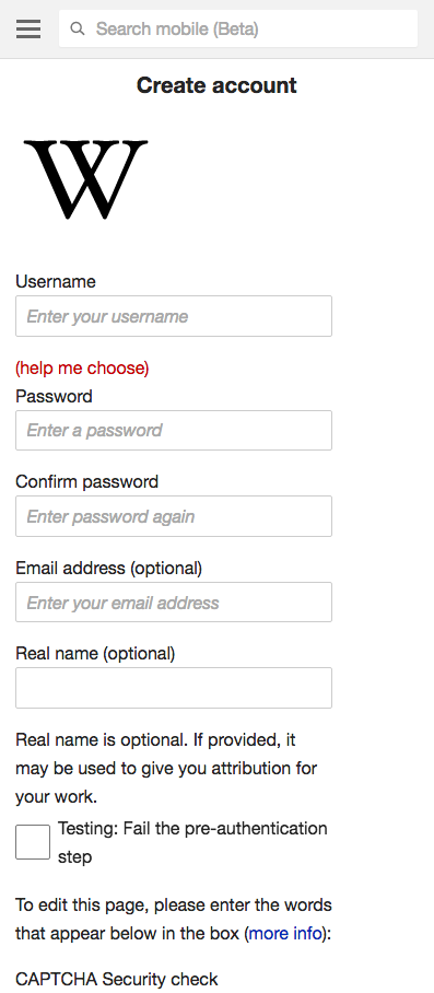
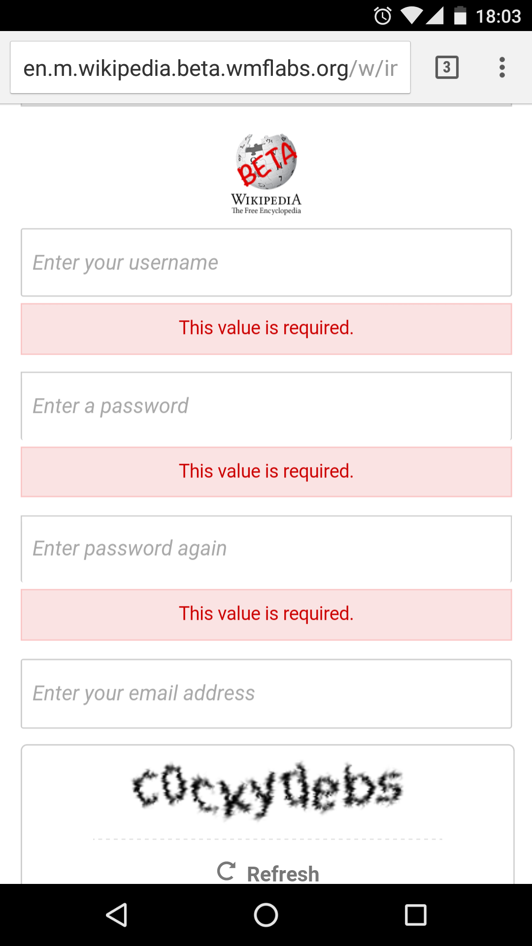
In the phone form factor styling, it appears that you're hiding all the labels and compressing the fields into one visual block. As part of this, you're hiding the bottom borders on the password fields and removing all margins.
The problem comes when HTMLForm inserts validation errors, you haven't removed the margins there so the missing bottom border becomes visible.
Possible solutions include removing this line or adding a CSS rule for #userlogin2 .mw-input .error { margin-top: 0; } to remove the space between the field and the error box.
Following up on my Firefox on Android check: Firefox on a Nexus 7 with Android 5 does not have the issue in #2. I believe what we're seeing in that screenshot is a symptom of the particular browser on the particular OS.
I think we can do this on a more relaxed timeline - @bmansurov, do you think you'd have a one liner to address this particular issue?
@dr0ptp4kt I haven't looked at the codebase, so I don't know.
Following up on my Firefox on Android check: Firefox on a Nexus 7 with Android 5 does not have the issue in #2. I believe what we're seeing in that screenshot is a symptom of the particular browser on the particular OS.
Yes looks about right. I used the Firefox version I had on the tablet, which seems really old.
I guess the only remaining issue is #1 and we can apply @Anomie's suggested fix.
Change 293349 had a related patch set uploaded (by Gergő Tisza):
Do not remove bottom border of fields in signup form
https://gerrit.wikimedia.org/r/#/c/293349/ is the quick fix for #1 but eventually a designer should look at it; the concept of collapsing the fields together just doesn't work very well with error messages placed between the fields.
Change 293349 merged by jenkins-bot:
Do not remove bottom border of fields in signup form
Change 293638 had a related patch set uploaded (by Gergő Tisza):
Do not remove bottom border of fields in signup form
Change 293638 merged by jenkins-bot:
Do not remove bottom border of fields in signup form
Change 296525 had a related patch set uploaded (by Gergő Tisza):
Do not remove bottom border of fields in signup form
Change 296525 merged by jenkins-bot:
Do not remove bottom border of fields in signup form