For now we only have a few controls on the map:
- Zoom In/Out controls
- Full Screen control
- Annotations
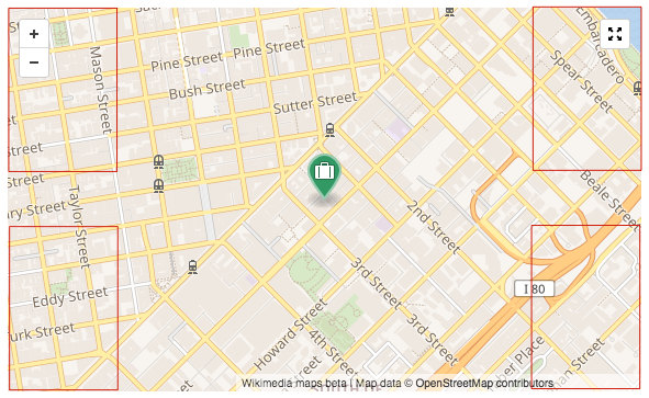
The four corners available:
And our actions are positioned this way:
| Zoom In/Out | - | Full Screen |
| - | - | - |
| - | - | Annotations |
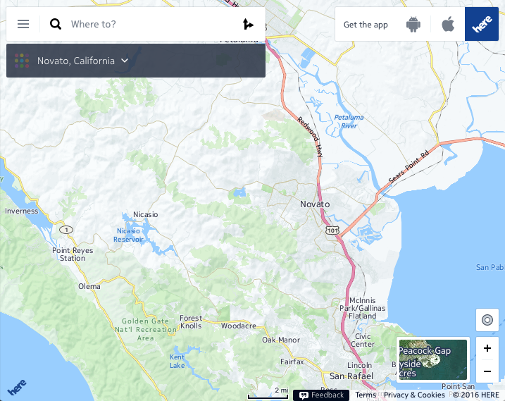
However, the map already gets more crowded with the Wikivoyage implementation. The resulting map has :
- Zoom In/Out controls
- Explore nearby destinations control
- Full Screen control
- Toggle tile layers and overlays control
- Annotations
- Scale
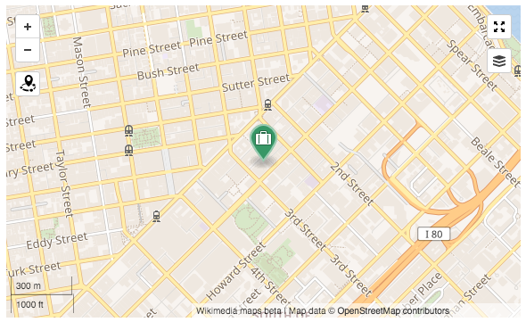 | 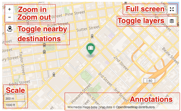 |
To bring consistency and make interactive with the map an intuitive and seamless experience, we want to make sure that all controls in a same corner convey a similar category of messages/actions. I think we can sort these as:
- actions impacting the current map position: zooming in and out, going back to initial position...
- actions impacting the current map data: toggling layers, changing the data displayed on map...
- actions not impacting the current map position/data: full screen mode, share a map...
- informative elements: annotations, scale...
(Please help improving/defining these categories)
As a very first draft, and based on what we seem to currently have, I would suggest:
| Actions impacting current position | - | Non-impacting actions + Actions impacting current data |
| - | - | - |
| Informative: scale | - | Informative: annotations |
Please share your opinion :)