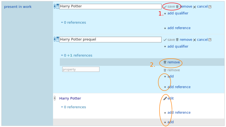
How it currently looks:
- The check mark as well as the trashcan seem to belong to 'save' since they are all in one color. Additionally the check mark in the back is not helpful in making clear which text belongs to which icon.
- All actions have two colors for no good reason. Except when entirely grayed out.
How it should look:
The gray icons should match the text. This means that, if the text is blue, the icon belonging to it, should be too.
Usability Guidelines: Consistency and standards, Minimalism