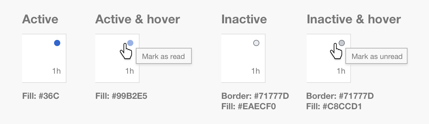
After the adjustments on the read/unread indicator on notifications (T126214), status is indicated by some circles (filled or not). While the active state (blue dot) was already adjusted to comply with the accessibility guidelines and the new design palette, the inactive state (grey circle) was pending.
After discussions with @Volker_E, about the right level of contrast we may need in this context, the proposal is as follows:
- Inactive state should use #71777D for the border, and #EAECF0 as fill.
- When the inactive state is hovered, the colors should be #71777D for the border and #C8CCD1 as fill.
The final set of colors for all states is captured below: