Page MenuHomePhabricator

Decrease margin on Checkbox*-/Radio*Widget and labels in order to clarify what belongs together
Closed, ResolvedPublic

Description

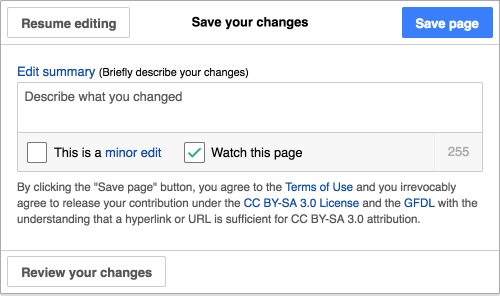
Current implementation as of v.0.17.6 features padding-left of 1em between label and widget.
This can be misleading and hurts gestalt principle of proximity.
Let's fix this by decreasing it to .5em or 50% of font-size.

What belongs together?
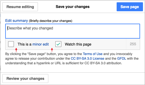
T140800 checkbox principle of proximity - Editing Front end - Wikipedia 2016-07-19.png (295×501 px, 43 KB)

After:

T140800 checkbox principle of proximity - Editing Front end - Wikipedia 2016-07-22.png (296×500 px, 43 KB)

Event Timeline

Change 299813 had a related patch set uploaded (by VolkerE):
MediaWiki theme: Decrease distance between label and Checkbox*-/Radio*Widget

https://gerrit.wikimedia.org/r/299813

Change 299813 merged by jenkins-bot:
MediaWiki theme: Decrease distance between label and Checkbox*-/Radio*Widget

https://gerrit.wikimedia.org/r/299813

Volker_E removed a project: Patch-For-Review.
Volker_E moved this task from Backlog to Done on the UI-Standardization-Kanban board.
Jdforrester-WMF moved this task from Backlog to OOjs-UI-0.17.7 on the OOUI board.
Jdforrester-WMF edited projects, added OOUI (OOjs-UI-0.17.7); removed OOUI.