See screenshot.
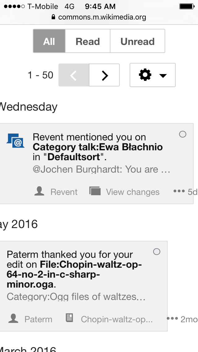
The notification divs don't properly fit on the screen and the content overflows them, causing them to have horizontal scrolling. Also there's a white margin on the left side that obscures any content behind it.
| kaldari | |
| Aug 1 2016, 4:51 PM |
| F4330905: IMG_1585 (1).PNG | |
| Aug 2 2016, 11:37 PM |
| F4330907: IMG_1584 (1).PNG | |
| Aug 2 2016, 11:37 PM |
| F4312959: IMG_1167.PNG | |
| Aug 1 2016, 9:29 PM |
| F4312968: IMG_1168.PNG | |
| Aug 1 2016, 9:29 PM |
| F4312985: IMG_1169.PNG | |
| Aug 1 2016, 9:29 PM |
| F4326847: IMG_2054.PNG | |
| Aug 1 2016, 4:51 PM |
See screenshot.
The notification divs don't properly fit on the screen and the content overflows them, causing them to have horizontal scrolling. Also there's a white margin on the left side that obscures any content behind it.
I think this is another case where the bottom "action" line is pushing outwards, making the div too wide and ending up pushing the notification sideways.
We are having a lot of issues (browser bug combined with some other technical stuff) limiting the width of the action line, and it shows most on smaller screens.
My current recommendation is to consider maybe putting all secondary actions inside the dotdotdot menu in mobile. This will make all lines equal and "compressed", it fits the mobile experience mostly, and it will most likely fix this bug too.
Pinging @jmatazzoni @Pginer-WMF and @Catrope for input.
Or just get rid of the secondary actions and use links in the notification text :P But I guess that ship has sailed.
I actually don't think that would've made the mobile experience better; links are smaller to click on and having multiple links can be annoying to click specifically, especially in small screens.
But anyways, as you say, the ship sailed on that one...
There's definitely funny business going on in Kaldari's screenshot beyond the overflowing secondary actions. Look at the second second: the header is cut off on the left side, and the notifications' width is smaller. I just played with the special page on Joe's iPhone and I noticed that the second section (and only that one) is horizontally scrollable.
I agree that we should do something about the too-wide secondary links, and that's already captured at T131498: Secondary links overflow the width on mobile. But I feel like there's more to this bug than just that.
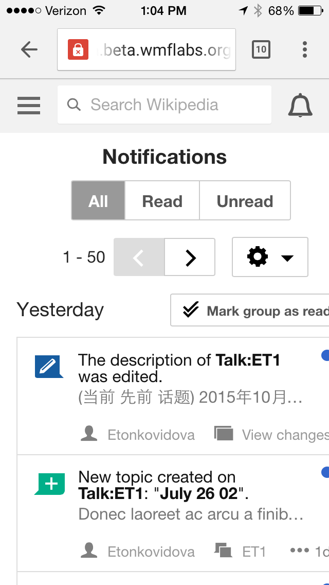
I'm seeing that the page doesn't fit on my iphone 5 screen. (See the screenshot below.) This may be because the dotdotdot menus don't fit within the page frame when the links are longish? (See the second screenshot below.)
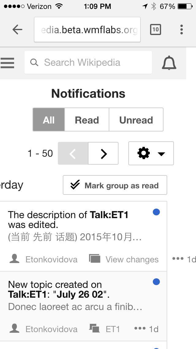
I see it also happens, though to a lesser degree, on the Notifications panel, which fits better but still has the dotdotdot problem, as you can see in the third screenshot (first message missing dotdot).

Change 302369 had a related patch set uploaded (by Mooeypoo):
Reduce number of prioritized actions in mobile
Change 302370 had a related patch set uploaded (by Mooeypoo):
Reduce notification items' prioritized actions in mobile popup
Change 302370 merged by jenkins-bot:
Reduce notification items' prioritized actions in mobile popup
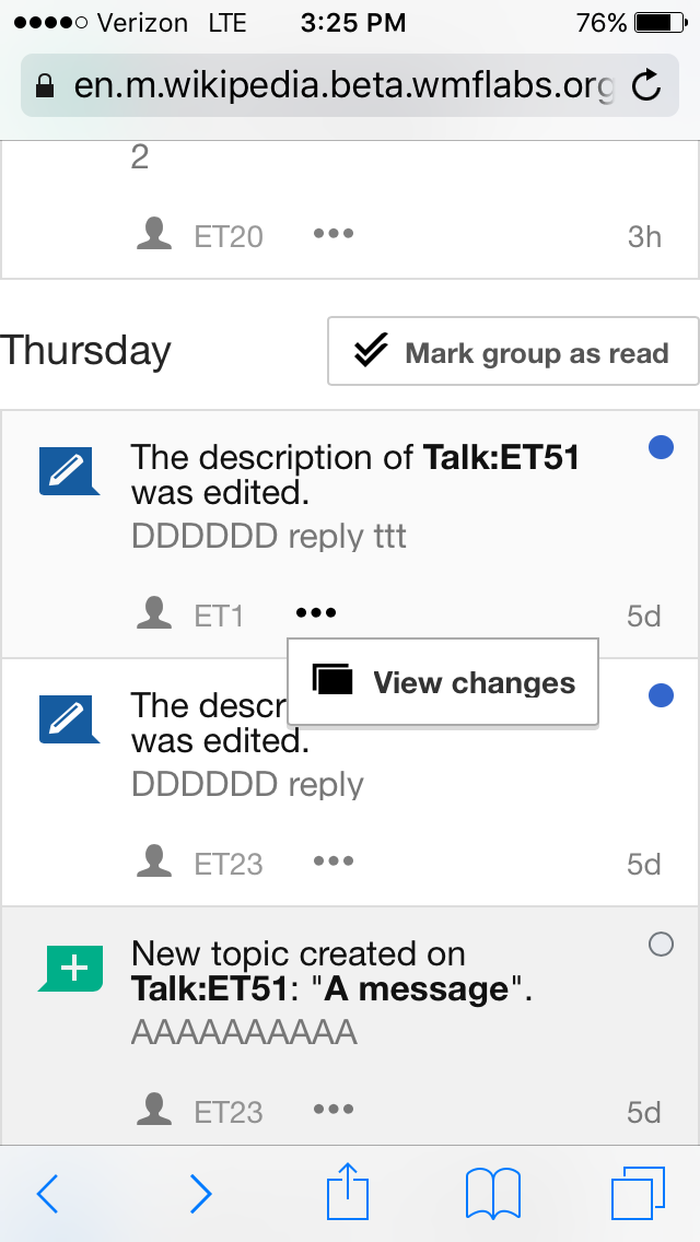
Checked in betalabs - 'View changes' option has been moved inside the dotdotdot menu; the problem with overflowing the screen is solved
Notifications overlay:
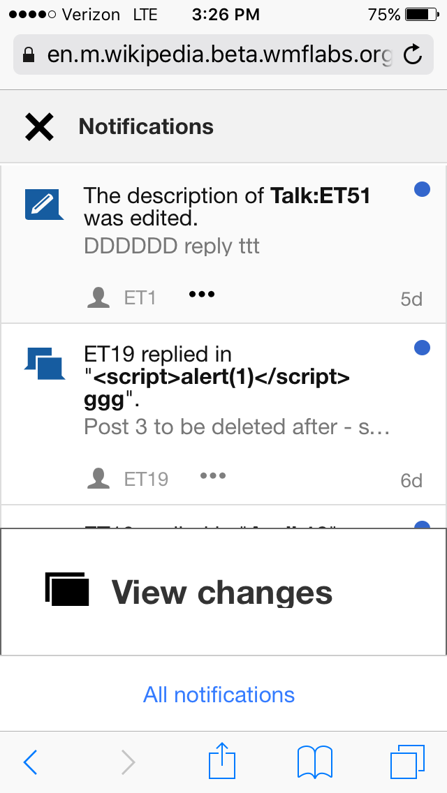
Special:Notifications page
The Special:Notification page still has unnecessary scrollable horizontal action - filed it as a separate issue T141949: [mobile] Special:Notification page has horizontal scrolling
The usability of the dotdotdot menu on the Notifications overlay is severely impacted - see the task filed previously as T132393: [iOS mobile] Notification overlay: the dotdotdot menu does not work properly