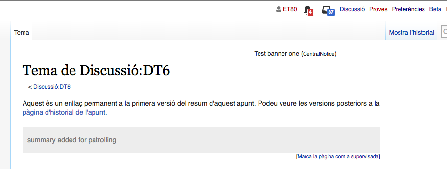
The figures are so tiny they're unreadable, and the contrast (black on colour) is poor too - I can only just make out that there's a character there, which I'm ''guessing'' is a figure. When we first got the icons, the contrast was good, as it used white figures on a dark-coloured background, and the figures were large compared to the links at either side - I think they were boldfaced too. I could fix this by working out the CSS rules ([//meta.wikimedia.org/w/index.php?title=User:Redrose64/global.css&action=history&offset=20160804223000&limit=5 yet again]) that would make it readable for me, but I shouldn't need to. This is an accessibility issue.
Reported at https://en.wikipedia.org/wiki/Wikipedia:Village_pump_(technical)#Notification_icons