It also isn't necessary when the group is expanded
Description
Description
Details
Details
Event Timeline
Comment Actions
I think this is how it was originally designed. @Pginer-WMF is on vacation for a few more days but should hopefully be able to respond to this once he gets back.
Comment Actions
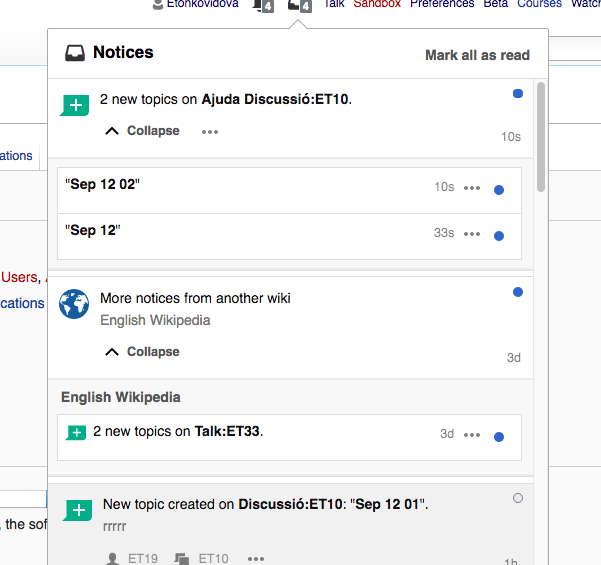
The visual metaphor used for bundles was about notifications being stacked on top of each other. The line is a subtle indicator that these are not a single notification but a stack of many.
When expanded, it seems that the additional line is still visible, and as noted by @Esanders, it should not be the case.
Comment Actions
That line generates a separation which is intended to be consistent with how the notification opens (notice in your example of F4339766 the bottom white element that helps separate what's inside the notification from what is outside, especially when the next one is a read one).
We can explore other options, but I'd keep it in the subtle side since the "expand" label and icon already communicate clearly the functionality.
Comment Actions
Sorry, I'm a little confused, which of the lines should not be visible when expanded?
Comment Actions
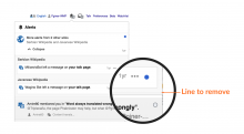
It is a light grey line on a lighter grey background, so it may not be easy to notice depending on the contrast settings of your screen. I tried to zoom it below to clarify:

If my DOM inspection is correct, it is the "mw-echo-ui-crossWikiNotificationItemWidget-separator" element which should be visible when the bundle is collapsed but hidden when expanded.
Comment Actions
Change 308001 had a related patch set uploaded (by Mooeypoo):
Hide xwiki widget separator when widget is expanded
Comment Actions
Awesome, thank you!
I added a class for the expanded widget and I'm using that to hide that separator when the widget is expanded in this patch.
Comment Actions
Change 308001 merged by jenkins-bot:
Hide xwiki widget separator when widget is expanded
Comment Actions
@Pginer-WMF and @Mooeypoo - for bundled notifications the grey additional line should be removed too?
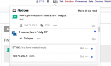
Checked in betalabs
- "mw-echo-ui-crossWikiNotificationItemWidget-separator" is gone
@Pginer-WMF and @Mooeypoo - for bundled notifications the grey additional line should be removed too?

Comment Actions
Change 309205 had a related patch set uploaded (by Mooeypoo):
Hide separator when bundled item is expanded
Comment Actions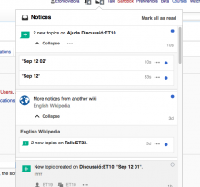
For both bundled cases - cross-wiki and local bundles - the additional grey line is removed.