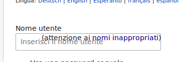
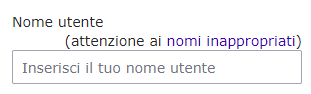
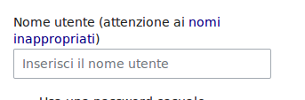
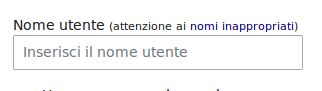
"(help me choose)" link near the username field in the signup form looks out of place. It's for the username, but it's placed in the middle and doesn't look connected to anything.
https://en.wikipedia.org/wiki/Special:CreateAccount
It was positioned next to the "Username" label until recently:
http://wayback.archive.org/web/20160507232833/https://en.wikipedia.org/wiki/Special:UserLogin/signup
Possibly a regression from the AuthManager/HTMLForm rewrite?