Page MenuHomePhabricator

Special:Nuke — space separation between select toggles and the delete button
Closed, ResolvedPublic

Description

On the Special:Nuke / Mass delete function the selection toggle [Select: All, None, Invert] is too close to the the delete button

mass delete.png (169×275 px, 6 KB)
and it is possible that when trying to select "None" that the delete key can be hit (especially when environmental factors work against you).

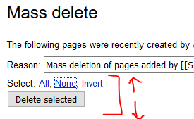
Further separation between the delete and the selection toggles would be highly beneficial.

In fact there are some stylistic issues that are probably worthwhile reviewing on the page against the current design schema.

Event Timeline

We could probably remove the submit button at the top and just have a submit button at the bottom like other normal forms. That might make people do some more scrolling when there's a huge list of pages but they should be reviewing the list anyway before doing a deletion. ;-)

What other "stylistic issues" do you see on this page?

Change 310330 had a related patch set uploaded (by Glaisher):
Special:Nuke: Remove submit button at the top of the form

https://gerrit.wikimedia.org/r/310330

Change 310330 merged by jenkins-bot:
Special:Nuke: Remove submit button at the top of the form

https://gerrit.wikimedia.org/r/310330

I think this should be closed now. Right?

Billinghurst claimed this task.

has been done