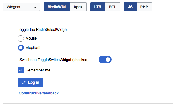
Based on the widget demo, it seems that checkboxes, radio buttons and toggle switches use a different shade of blue than the one used for primary buttons.
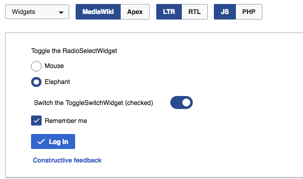
I think we should aim for a unified use of the accent color (#36c) for these elements.
In previous discussions we identified the case of toggle buttons as a particular case where we wanted to make sure they can be differentiated from the default action. For that purpose, a different shade was suggested: the darker blue used when buttons are pressed. This makes them consistent with buttons and allows to differentiate even a single toggle button from a primary button.
For elements such as checkboxes, radio buttons and toggle switches we want to convey the selection which does not necessarily map to a pressed/:active state. So I'd consider using the regular accent color for them making consistent with primary buttons, even if toggle buttons are darker:
It seems that several guidelines faced a similar decision, and keeping selection elements (checkboxes, radio buttons, toggles) and primary buttons consistent (even if toggle buttons are different) seems to be a common approach:
- Material design shows selection elements to be consistent with actions in the dialog examples.
- On OSX, there are some contextual rules, but they keep selection elements consistent with primary buttons and toggle buttons can also use the same (F4467324) or a different color (F4467252).