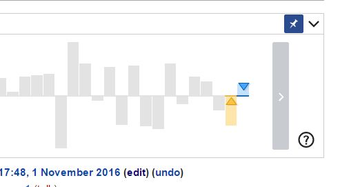
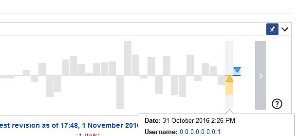
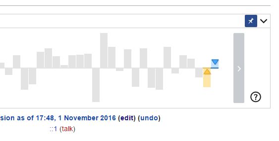
Story: As a user I would like to see easily in which state the pin button of the revision slider is.
There are some minor enhancements I would like to propose. They may be not possible in the OOUI framework. If that is the case, please tell me, so I can consider such things in the future.
- Margin:
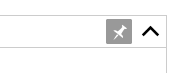
The button (which shape is only visible when activated) is as big as the title bar of the revision slider. Thus, the button looks not very button-ish anymore if it is activated
If we make it 2 or 3 px smaller on each side it would look more like something you can click again
- Active status: The dark gray as the activated status seems unusual to me. According to the OOUI demo it seems to be darkblue.(see ToggleButtonWidget (icon only))
So darkblue might be better according to the styleguide.
Problem is: It looks very heavvy:

Does anyone of you know any alternative way or could subscribe someone who knows about the visual design of OOUI well?
- active status icon: If active, the icon should look pinned.
@Charlie_WMDE – I remember you designed once a "pinned pin" icon. If I'm right, could you link it here?